21-C Rain ENSO IPO: Scatterplot

The anomaly of monthly rainfall at Manilla, NSW varied with that of ENSO for only a part of the 21st century to date.

Scatterplot Rainfall vs ENSO

This connected scatterplot relates the smoothed anomaly of the El Niño-Southern Oscillation (ENSO) to the smoothed and 2-month-lagged anomaly of monthly rainfall at Manilla, NSW. The earlier data, from September 1999 to September 2011, is plotted in blue, and the later data, from October 2011 to November 2018, in red.

The same data was displayed as a dual-axis line plot in an earlier post titled “21-C Rain-ENSO-IPO: Line graphs”. Data sources are linked there.

The line plot revealed two things: the relationship changed from earlier to later times, and there was a better match when the rainfall data was lagged by two months. To clarify, I prepared various scatterplots with fitted regressions.

Raw data scatterplots

Scatterplots of the raw data values yielded regressions with very low values of the coefficient of determination (R-squared). For the whole population, R-squared was 0.028. I then checked the coefficient when I lagged the rainfall by 1-, 2-, or 3-months. A 1-month lag almost doubled the coefficient to 0.041; a 2-month lag gave 0.055, and a 3-month lag gave 0.041 again.
My observation that Manilla rainfall typically leads ENSO by 2 months is confirmed.

Connected scatterplots of smoothed and lagged data

The smoothing function used in the dual-axis line plot of the earlier post makes a good visual match. That suggests that local rainfall and ENSO are physically related at a periodicity no shorter than 12 months.
Using the smoothed and 2-month-lagged data, I have made the scatterplots shown in the graph above.
The better-matched data from September 1999 to September 2011 (blue) has a satisfactory R-squared of 0.498, nearly 20 times greater than that of the raw data. The very poorly-matched data from October 2011 to November 2018 (red) has an R-squared value of 0.040, no better than the raw data.

Patterns in the sequence of rainfall and ENSO values

In the above graph, I have joined the consecutive smoothed data points to make a connected scatterplot. Because little noise remains, clear patterns appear.

Matched rainfall and ENSO

The pattern up to September 2011 (blue) is mainly a series of ellipses, some clockwise and some anti-clockwise. They are almost parallel to the regression line:

y = -0.047x-0.246

The blue point furthest to the top left is that for September 2002, a time of extreme drought and El Niño.
The blue point furthest to the bottom right is that for December 2010, a time of very high rainfall and La Niña.

Discordant rainfall and ENSO

The pattern from October 2011 (red) swings about wildly and does not repeat. The regression (with a trivial coefficient of determination) is nearly horizontal. Near its ends are the extreme drought of June 2018 and the deluge of January 2012, both at times when ENSO was near neutral. At the top of the graph is the Super El Niño of November 2015, when Manilla rainfall was normal.

Conclusion

Scatterplots, connected scatterplots and regressions confirm that a strong relation between rainfall at Manilla and ENSO failed in 2011 as the IPO was rising from a negative toward a positive regimen.

21-C Rain-ENSO-IPO: Line graphs

From 1999, rainfall at Manilla NSW matched ENSO only up to 2011, before the IPO became positive.

Manilla rain, ENSO, IPO

This graphical log compares the rainfall at Manilla NSW with the El Niño-Southern Oscillation (ENSO) and the Inter-decadal Pacific Oscillation (IPO) through the 21st century to date. Values shown are anomalies, smoothed. (See Notes below on “Data”, “Smoothing”, and “Lagged Rainfall”.)

Rainfall (black) uses the left axis scale; the ENSO (magenta) and the IPO (green) use the inverted right axis scale.

[21st century temperature and rainfall at Manilla are compared as smoothed data in the post “21-C Climate: Mackellar cycles”.]

Matches between rainfall and ENSO

There is an excellent match between the rainfall and ENSO values in the left part of the graph.
I improved the visual match by various means:
1. The ENSO scale (magenta) is inverted, because positive values of the ENSO anomaly relate to negative values of rainfall anomaly here.
2. The scales are harmonised: the zero values are aligned, and 20 mm of monthly rainfall anomaly is scaled to (minus) one degree of ENSO anomaly.
3. Smoothing is applied to suppress cycles shorter than 12 months.
4. Rainfall anomaly values are lagged by two months. (See the Note below.)
As lagged, most peaks and troughs of rainfall coincide with troughs and peaks of ENSO, and their sizes (as scaled) are often similar.

Failure to match rainfall and ENSO

In the right part of the graph, the match between rainfall and ENSO fails. There are extreme mismatches: the Super-El Niño of 2014-16 had no effect on local rainfall, the rainfall deluge of 2011-12 came with a mild and declining La Niña, and the extreme drought of 2018 came while ENSO was neutral.
By visual inspection, I judge that a close relation of rainfall to ENSO, which had applied for the twelve years up to September 2011, then failed for the following seven years.

Influence of the IPO

The inter-decadal Pacific Oscillation (IPO) affects the relation between ENSO and Australian weather. (See note below “Effect of the IPO”.)

Power et al.(1999) show that Australian seasonal weather and its prediction align with ENSO only when the IPO is negative. It follows that a good match between ENSO and Manilla rainfall was expected while the IPO (green) was negative from 1999 to 2013, and was not expected from 2014 to 2017. The trend of the IPO through 2016-17 makes it likely that the IPO continued positive through 2018, as the mismatch between rainfall and ENSO persisted.
Power et al. note that the relation is not sensitive to the width of a neutral zone chosen to separate the positive and negative regimens of the IPO. In this particular case, the rainfall/ENSO match failed as the IPO rose through minus one degrees. However, the rainfall/ENSO match began in 1999, much earlier than the time when the IPO fell through minus one degrees.

Scatter plots

In a following post I show scatter plots and regressions for the periods of match and mismatch on this graphical log.


NOTES

Data

Rainfall

Continue reading

Global Warming Bent-Line Regression

HadCRUT global near-surface temperatures

HadCRUtemp2lineThis graph, posted with permission, shows a bent line fitted to the HadCRUT annual data series for global near-surface temperature. Professor Thayer Watkins of San Jose State University Department of Economics posted it on his blog about 2009.

HadCRUTsmoothWithout knowing of this work, I constructed the second graph. I used data from the same HadCRUT source, but a data set smoothed by the authors.

In April 2013 I posted it to a forum thread in”weatherzone”.

Next, I added to that graph a logarithmic plot of global carbon emissions, similarly fitted with a series of straight trend lines.

Log from 1850 of world surface air temperature and carbon emissionsThis I included in posts to several forums: in a post to “weatherzone”, in a post to the Alternative Technology Association forum, and finally in a post to this blog.

Both Professor Watkins and I have fitted bent lines to the data. I fitted the lines by eye (for which I was accused of “cherry-picking”). Professor Watkins used an explicit process of Bent-Line Regression, minimising the deviations by the method of least-squares. Like me, he initially chose by eye the dates of the change points where the straight lines meet. But he then adjusted them so as to minimise the least squares deviations.
[See notes below on the method of Bent-Line Regression.]

The trend lines and change points are practically the same in the Thayer Watkins and the “Surly Bond” graphs:
1. (Up to Down) TW: 1881; SB: 1879.
2. (Down to Up) TW: 1911; SB: 1909.
3. (Up to Down) TW: 1940; SB: 1943.
4. (Down to Up) TW: 1970; SB: 1975.
As I said at the time, once straight trend lines are chosen, the dates of change points to fit this data series closely do not allow of much variation.

Relation to the IPO (or PDO) of the Pacific

Not by coincidence, Watkins and I both went on to relate the multi-decadal oscillations of Pacific Ocean temperatures to the global near-surface average temperatures.

My approach

I merely plotted my chosen global temperature change points on to the Pacific graphs (I chose to cite the IPO (Inter-decadal Pacific Oscillation)). In two posts I noted (i) the way the change points in the HadCRUT global temperature series were close to those in the IPO, and (ii) the way the IPO seemed able to explain why the trend in global warming was “bent” in 1943 and 1975 but, in that case, could only sharpen the bends of 1910 and 1880.

Professor Watkins’ approach

AGT_PDO7Professor Watkins did a separate Bent Line Regression Analysis on the Pacific graphs (He chose to cite the earlier-developed PDO (Pacific inter-Decadal Oscillation)). His analysis “A Major Source of the Near-Sixty Year Cycle in Average Global Temperatures is the Pacific (Multi)Decadal Oscillation” is here.

He admits the match is poor, with various lags and a different period. He concludes:
“Thus while the Pacific (Multi)Decadal Oscillation appears to be involved in the cycles of the average global temperature there have to be other factors also involved.”

The significance of the IPO

Continue reading

Hammering Global Warming Into Line

Global temp and IPO graph

In my post of 18 Sep 2014 “The record of the IPO”, I showed a graph of the Inter-decadal Pacific Oscillation,plotted as a cumulative sum of anomalies (CUSUM).

Log from 1850 of world surface air temperature and carbon emissions
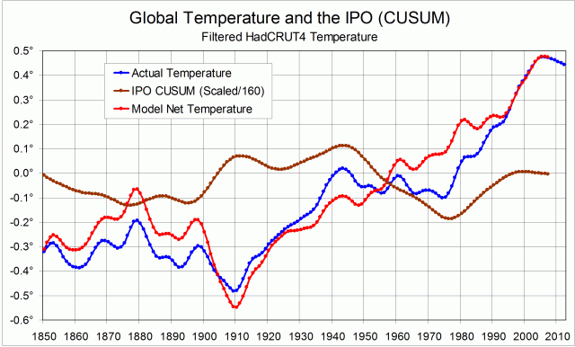
This CUSUM plot has a shape that makes it seem that it could be used to straighten the dog-leg (zig-zag) trace of global temperature that we see. A straighter trace of global warming would support the claim that a log-linear growth in carbon dioxide emissions is the main cause of the warming.

My attempt to straighten the trace depends on the surmise (or conjecture) that the angles in the global temperature record are caused by the angles in the IPO CUSUM record. That is, the climatic shifts that appear in the two records are the same shifts.
I have adopted an extremely simple model to link the records:
1. Any global temperature changes due to the Inter-decadal Pacific Oscillation are directly proportional to the anomaly. (See Note 1.);
2. Temperature changes driven by the IPO are cumulative in this time-frame.

To convert IPO CUSUM values to temperature anomalies in degrees, they must be re-scaled. By trial and error, I found that dividing the values by 160 would straighten most of the trace – the part from 1909 to 2008. (See Note 2.) The first graph shows (i) the actual HadCRUT4 smoothed global temperature trace, (ii) the re-scaled IPO CUSUM trace, and (iii) a model global temperature trace with the supposed cumulative effect of the IPO subtracted.


The second graph compares the actual and model temperature traces. I note, in a text-box, that the cooling trend of the actual trace from 1943 to 1975 has been eliminated by the use of the model.
The graph includes a linear trend fitted to the model trace for the century 1909 to 2008, with its equation: y = 0.0088x – 0.9714 and R² = 0.9715.

Continue reading

The record of the IPO

Graphical record of the IPO, plus CUSUM plot and climate shift dates

My post showing shifting trends in world surface temperature and in carbon emissions brought a suggestion from Marvin Shafer that allowing for the PDO could straighten the trend. I think that perhaps it could, but I have tried the IPO (Inter-decadal Pacific Oscillation) rather than the PDO (Pacific inter-Decadal Oscillation). (See below.)

Along the top of the graph I have marked in the climate shifts that prevent the trace of world temperature from being anything like a straight line. The blue line is the IPO, as updated to 2008.
The IPO is positive in the space between the last two climate shifts, negative in the next earlier space, and positive in part of the space before that. By plotting the CUSUM values of the IPO (red), it is clear that the pattern of the IPO relates very closely to the climate shift dates. Four of the seven extreme points of the IPO CUSUM trace match climate shifts. In addition, since 1925, the CUSUM trace between the sharply-defined extreme points has been a series of nearly straight lines. These represent near-constant values of the IPO, a rising line representing a positive IPO and a falling line a negative one.

As shown by the map in the Figure copied below, a positive extreme of the IPO has higher than normal sea surface temperatures in the equatorial parts of the Pacific. Could the transfer of heat from the ocean to the atmosphere be enhanced at such times?

This conjecture is developed in the post “Hammering Global Warming Into Line”.

[Note added August 2019.
The IPO was negative from 1999 to 2014, then became postive again.
The paper by Power et al.(1999) linked below showed that Australian rainfall and its prediction was more closely related to the El Nino-Southern Oscillation (ENSO) when the IPO was negative. Data for Manilla NSW confirms that. See “21-C Rain-ENSO-IPO: Line graphs” and “21-C Rain ENSO IPO: Scatterplot”.]


The PDO and the IPO

The PDO is the Pacific Decadal Oscillation (or Pacific inter-Decadal Oscillation). It is one of a number of climate indicators that rise and fall over periods of a decade or more. These indicators have been introduced by different research groups at different times.
A current list of such indicators is in the contribution of Working Group I to the Fifth Assessment Report (5AR) of the Intergovernmental Panel on Climate Change (IPCC). The list is in Chapter 2 (38MB). It is at the end, in a special section: “Box 2.5: Patterns and Indices of Climate Variability”. Continue reading