Log of the Southern Oscillation Index with climate shifts

SOI plot with climate shifts

This graph relates to a graph of the cumulative values of the Southern Oscillation Index, posted earlier and copied below.

SOI CUSUM plotThe graph above is in a more familiar form . It may help to explain what the earlier graph means. That is, that the SOI was dominated by positive values (towards La Niña) for about fifty-nine years before 1976, and was dominated by negative values (towards El Niño) for twenty-four years after that date. From 2000 the trend seems to be upward, showing La Niña dominance again. Broadly, these were straight-line CUSUM  relationships throughout each of the periods, as shown by the coloured trend lines. Slopes on a CUSUM plot represent offsets of the mean monthly value: the mean SOI in the earlier period was +1.4 units, and that in the second period was -3.5 units. Since 2000, the mean monthly value is around +1.0 units. Continue reading

Southern Oscillation Index: CUSUM plot

SOI CUSUM plot

This graph is a log of cumulative values of the monthly Southern Oscillation Index for the last 139 years. (See Note added 25th August 2014 below.)

(See also Note Added 19 December 2015 regarding the mis-match between this SOI record and the climate record at Manilla.)

(See Note added 27/3/2016 below, for a prior construction of this graph.)

High values of the SOI (contrary to NINO3.4 values for the ENSO index) relate to deluges in Australia and low values relate to droughts.

This is the CUSUM technique, invented in 1954 by E.S.Page. Pay attention to the slopes on the graph.

I have identified major El Niño and La Niña events on the graph. La Niñas have extreme upward slopes and El Niños exteme downward slopes.
The main feature of the graph, which is obscure in graphs that do not use CUSUM, is that La Niñas dominated the 60-year period from 1917 to 1976, and El Niños dominated the 25-year period from 1976 to 2000. I have drawn linear trend lines to make this clear. The first trend line (La Niña dominant) begins at an SOI CUSUM value of -30 in May 1917 and ends at a value of +960 in February 1976, yielding a slope of +1.4 SOI units per month. The second trend line (El Niño dominant) ends at a value of -40 in December 1999, yielding a slope of -3.5 SOI units per month.
The tendency to El Niños in the second period was greater than the tendency to La Niñas in the first period by a factor of more than two.
Although the period since 2000 is very short, the trend seems to slope upward at about +1.0 SOI units per month.

These decadal changes in the short-term mean value of the SOI are graphed in a later post. That graph does not use the CUSUM concept, and the changes in the mean value are overwhelmed by month-to-month variation.


I posted discussion of an earlier version of this graph in “Weatherzone” Forums >> Weather >> Climate and Climate Change >> ENSO Discussion 2012 Post #1103736


Note added 25th August 2014

Another CUSUM SOI graph

By searching the net for “cusum soi” I find that a plot of the cumulative sum of values of the Southern Oscillation Index was published by Cordery and Yao in 1993: “Non stationarity of phenomena related to drought”.

Neither the data nor the approach of Cordery and Yao are the same as mine.

Data

Cordery and Yao used monthly normalised SOI anomaly data supplied by the Bureau of Meteorology, as I did. They mention that “Prior to 1933 there are 7 gaps in the SOI sequence resulting from a total of 102 months of data missing from the Papeete pressure record.” I have not found any note of this with the Bureau’s current data table.
Apart from an (unexplained) reduction in the scale of CUSUM values by a factor of 500, there are important differences in detail. During the time of La Niña dominance, I find that the major CUSUM peaks (La Niña turning to El Niño) in 1918, 1939, and 1976 lie almost in one line. Cordery and Yao’s plot has the 1939 peak relatively much higher: the second highest on the record after the 1976 peak, and almost as high.

Approach

Cordery and Yao used CUSUM to show that the SOI series was not stationary for a part of the time. I used it to identify persistent shifts in the SOI mean value.


Note added 19 December 2015

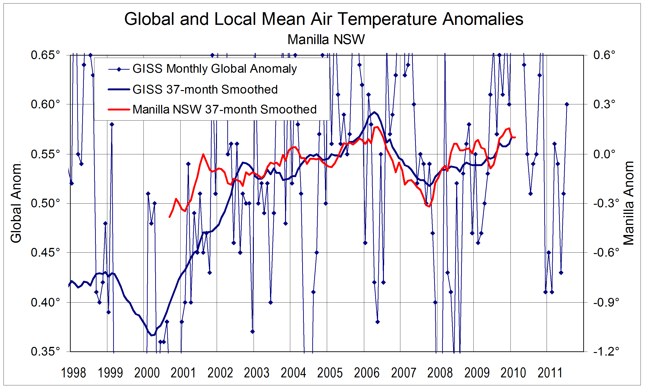
The influence of the Southern Oscillation index on the climate of Manilla, NSW is cryptic at best.
In particular, the inter-decadal changes shown on this graph are not expressed at all in the episodes of drought at this station. Extreme droughts were concentrated in the period from 1900 to 1950 as shown here.

I have discussed the mis-match with the SOI in another post.

In that post, I also pointed out:
“The record for this site provides no support for any relation at all between global temperature and drought.”

Note added 22 March 2018, amended 21 May 2018.
I have since found a relation of that kind, described in the post “Rainfall kurtosis vs. HadCRUT4, revised”.
Patterns of rainfall kurtosis and global temperature.Leptokurtosis of Manilla 12-monthly rainfall totals, which indicates extremes of rainfall – both positive and negative – has a pattern that matches that of global temperature anomalies when detrended.


Note added 27 March 2016

Prior construction of this graph.
I constructed this CUSUM SOI graph in 2012 on my own initiative, without knowledge of a prior construction by David Archibald in 2010. His graph (yellow background colour) appears to have an identical trace. Without adding linear trend lines, Archibald identifies the same end points of the long period of La Nina dominance followed in 1976 by a period of El Nino dominance.
Archibald published his graph in a guest post in “Watt’s Up With That”:

My graph and Archibald’s can both by found in a search of images for “southern oscillation index”.


Manilla in Global Warming Context: II

Logs of smoothed world and local temperatures. (25/7/14)

This post updates a similar post that was based on data available in July 2011. I now have data from three more years.

World surface air temperature

The blue line shows how the air has warmed and cooled during the 21st century. It is based on GISS, which is one of three century-long records that estimate the surface air temperature of the whole earth. The other two are HadCRUT and NCDC.
Monthly values of GISS vary wildly, and I have smoothed them with a 37-month moving average. Ole Humlum uses 37-month smoothing in many graphs on his website.

The 37-month smoothing allows plotting only up to 18 months ago, in December 2012. As you see, the GISS air temperature anomaly (See Note 1.), when smoothed in this way, moves rather steadily in one direction for years at a time.

The world’s surface air warmed rapidly from early 2000 to late 2002, then warmed slowly to a peak in early 2006. This is the warmest the world surface air has been in hundreds of years. After that peak, the air cooled rapidly by two-thirtieths of a degree to a trough in late 2007. It warmed again slowly to a lower peak in early 2010, steadied for a year, then fell to a trough in January 2012 that was like the previous trough. The air warmed rapidly through 2012. Continue reading

Manilla NSW in Global Warming Context

Logs of smoothed world and local temperatures.

[I posted an Up-dated version of this graph in July 2014]

Up-to -date data on global temperature change can easily be down-loaded from Ole Humlum’s website “climate4you“.
Humlum favours sampling windows 37 months wide. For my own data at Manilla, NSW, I have always used windows about six months wide, which show up Australia’s vigorous Quasi-biennial oscillations of climate. I tried Humlum’s 37-month window on my data, with quite startling results, as shown in the graph above.

Humlum re-presents three records since 1979 of global monthly air surface temperature anomalies:
* HadCRUT3: by the (UK Met Office) Hadley Centre for Climate Prediction and Research, and the University of East Anglia’s Climatic Research Unit (CRU), UK.
* NCDC: National Climatic Data Centre, NOAA, USA.
* GISS: Goddard Institute for Space Studies, Columbia University, New York, NASA, USA.
When smoothed by a 37-month running average, these data sets give very similar results. I use the GISS data because it matches my data best.

The match is very good, particularly in the sharp fall from the maximum in April 2006 to the minimum in September 2007. Where my data begins in September 2000, both curves rise steeply from low values, but mine peaks in August 2001, more than a year before a corresponding peak in global temperature (September 2002). After that, there is a plateau, where the graphs rise together to the highest peak (April 2006).
The other global data sets, HadCRUT and NCDC, have temperature falling or steady along the 2002-2006 plateau.
There are two reasons for plotting my data on a separate axis (on the right). First, the reference periods are different: GISS uses 1951-1980, while I use the decade from April 1999. Second, temperature varies much more at a single station than in the average of many stations around the world. I use a scale six times larger.

It turns out that the cold time in Manilla in late 2007, which I had mentioned in several contexts, was a cold time world-wide.

Home-made thermometer screen

Giant Mixing Bowl Thermometer Screen

I am over the moon at getting agreement between data from my home-made thermometer screen and the best that world climatologists can do. It makes me inclined to believe some of the things they say.


This article and graph were posted on 18th August 2011 in a weatherzone forum: General Weather/ Observations of Climate Variation.


3-year trends to August 2008

Parametric plots of smoothed climate variables at Manilla
“Years with unusual trends”

Trends to August 2008

These graphs, ending with raw data for August 2008, show fully-smoothed data from September 2005 to February 2008. They include all months of the calendar years 2006 and 2007.
Smoothed daily maximum temperature anomaly (X-axis on all graphs) began 2006 high in the “normal” range, fell to normal by June, and rose again to +0.63°  in November and December. It then fell from high to very low through 2007, reaching the record low value of -1.61°  by February 2008. (Note added: This record low maximum temperature anomaly stood for only 19 months, until September 2010.)
Smoothed rainfall anomaly peaked at +20.6 mm in November 2005, fell rapidly to -11.7 mm in June 2006 and slowly to -14.6 mm in October 2006. It rose again to just above normal by February 2007, and changed little in the following year.
Smoothed percent cloudy mornings followed a similar course to that of rainfall but, as temperature fell through 2007, cloudiness (unlike rainfall) increased, as is normal,  along the blue trend-line.
(Note added in May 2014: Although the minimum value of the cloudiness anomaly in August 2006 (-7.7%) is less negative than the record minimum in August 2002 (-11.3%) (or even than the minimum in February 2005 (-9.1%)) it is more negative than any later value. No smoothed negative values at all were recorded in almost seven years between February 2007 and October 2013.)
Smoothed dew point anomaly also followed a similar course to that of rainfall but, unlike cloudiness, actually declined as temperature fell during 2007. Temperature range anomaly moved like dew point anomaly.
Daily minimum temperature mainly varied in the same sense as daily maximum temperature, but at a higher rate. As an exception, from January to June 2007, it rose slightly as maximum temperature fell. That moved the curve towards a more “maritime” climate for the rest of the time. Subsoil temperature anomaly moved in a similar pattern.

Unusual trends

Through the years 2006 and 2007 shown here, the climate moved as much along the axis from top left to bottom right, as along the usual axis from top right to bottom left. It departed from the typical Quasi-biennial oscillation of “droughts and flooding rains”*. (Note added: The extreme negative maximum temperature anomaly of February 2008 was the only one on this record that was not linked to an extreme positive rainfall anomaly.)
(Note added concerning global temperature: At this time there was a sudden major cooling in mean air temperature, both locally and globally. This linked post  shows that, when 37-month averages of global and local values are plotted, mean temperature fell from a peak in April or May 2006 to a trough in October 2007, breaking the global warming trend. The global (GISS) value fell by 0.074° (and the Manilla value by 0.48°). The connection is enigmatic. The unusual trends shown here do not match the dates of the cooling event, but come mainly before or after it.)

* By arrangement with the Licensor, The Dorothea Mackellar Estate, c/- Curtis Brown (Aust) Pty Ltd.

Note:
Fully smoothed data – Gaussian smoothing with half-width 6 months – are plotted in red, partly smoothed data uncoloured, and raw data for the last data point in orange. January data points are marked by squares.
Normal values are based on averages for the decade from March 1999. They appear on these graphs as a turquoise (turquoise) circle at the origin (0,0). A range of anomalies called “normal” is shown by a dashed rectangle in aqua (aqua). For values in degrees, the assigned normal range is +/-0.7°; for cloudiness, +/-7%; for monthly rainfall, +/-14 mm.

(Note added in May 2014: A much later post titled “3-year trends to May 2010” is the first of a consecutive series of parametric plots, updated monthly at the time of observation and originally posted elsewhere.
This earlier data was not edited in this form at the time.
To display all existing fully-smoothed data points at least once, I have prepared these back-dated posts in the same format for:
“3-year trends to August 2002” which includes smoothed data September 1999 to February 2002, covering the calendar years 2000 and 2001.
“3-year trends to August 2004” which includes smoothed data September 2001 to February 2004, covering the calendar years 2002 and 2003.
“3-year trends to August 2006” which includes smoothed data September 2003 to February 2006, covering the calendar years 2004 and 2005.
“3-year trends to August 2008” (this post) which includes smoothed data September 2005 to February 2008, covering the calendar years 2006 and 2007.
In these back-dated posts the anomaly values depend on climate normals that are based on the decade ending February 2009, and were thus not available until after that date. I have written the posts as if they were available at the time.
In places I have written some “Notes added in May 2014” (like this) commenting on how values observed at that time relate to more recent events.)