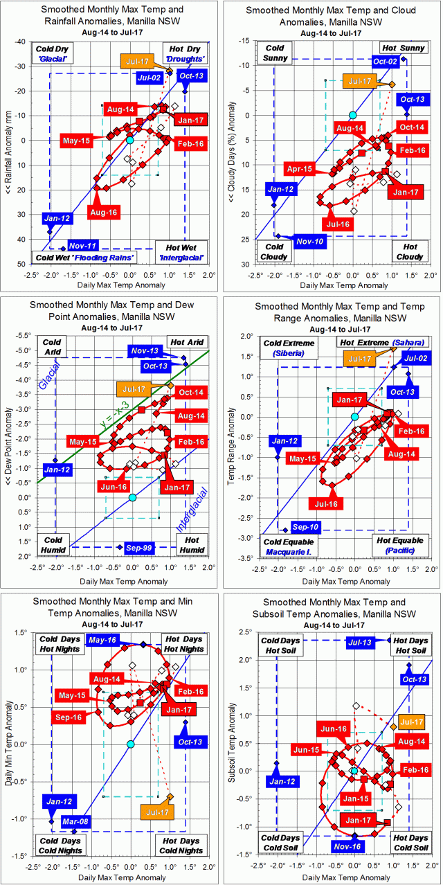
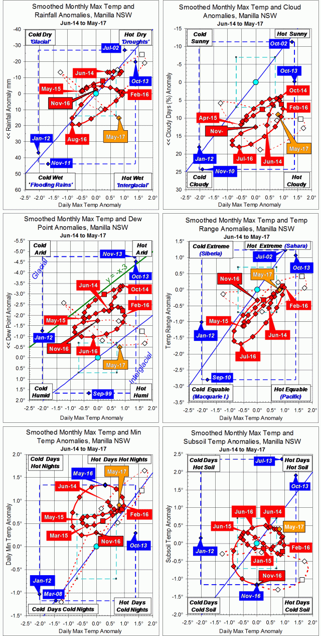
Parametric plots of smoothed climate variables at Manilla
A 13-month “Mackellar cycle”

June raw anomaly data (orange)
In June 2017 the daily maximum temperature was normal. Moisture variables were low on the graphs, showing rather high moisture. Both daily minimum temperature and subsoil temperature were high. For each variable, the raw value was close to the smoothed value of June 2016, just twelve months earlier.
Fully smoothed data (red)
The latest available fully-smoothed data point, December 2016, showed warming and drying. Only the dew point anomaly had just passed a “dry” peak. Smoothed subsoil temperature anomaly, which had reached a record low value in November, began to rise, like both of the air temperature anomalies.
The Mackellar cycle
Manilla’s climate variables often move in the cycle of “droughts and flooding rains” from Dorothea Mackellar’s poem “My Country”.*
In that cycle, temperature and moisture move together: hot with dry, cold with wet. On my graphs, hot is to the right. The top four graphs have dry at the top. (I count daily temperature range anomaly as a moisture indicator: high values show dryness.)
The “Mackellar cycle” drives the anomaly values up and down the blue trend lines that skew from cold-and-wet at the lower left to hot-and-dry at the upper right. The path is seldom straight, as any lead or lag of moisture will curve it into an ellipse.
Ellipses on the graphs show the cycle has been strong for two years since the winter of 2015. Its period has been very short: only twelve or thirteen months. Daily maximum air temperature anomaly reached a peak in February of both 2016 and 2017 (hot in late summer-autumn), and reached a trough in August-September 2016 (cold in late winter-spring).
On the top four graphs the cycle advances around an ellipse clockwise. A peak of dryness (up) comes several months before the related peak of daily maximum temperature anomaly (right). Similarly, wetness (down) comes before low temperature (left). I have posted already about the way this cycle skewed the seasons in 2016.
The two graphs at the bottom contain only temperatures. Circles on those graphs show that both the daily minimum temperature anomaly and the subsoil temperature anomaly have been lagging the daily maximum temperature anomaly by several months during these last two years (and not before).
In a post to a “weatherzone” forum, I have annotated (in green) the graph for Dew Point Anomaly versus Daily Max Temp Anomaly. It is the one that shows most clearly the elliptical trace caused by the cycles. That forum thread: “Climate Driver Discussion 2017 (Enso, IOD, PDO, SAM etc.)” has almost no reports of climate cycles observed in Australia.
Note:
Fully smoothed data – Gaussian smoothing with half-width 6 months – are plotted in red, partly smoothed data uncoloured, and raw data for the last data point in orange. January data points are marked by squares.
Blue diamonds and the dashed blue rectangle show the extreme values in the fully smoothed data record since September 1999.
Normal values are based on averages for the decade from March 1999.* They appear on these graphs as a turquoise (turquoise) circle at the origin (0,0). A range of anomalies called “normal” is shown by a dashed rectangle in aqua (aqua). For values in degrees, the assigned normal range is +/-0.7°; for cloudiness, +/-7%; for monthly rainfall, +/-14 mm.
* Normal values for rainfall are based on averages for the 125 years beginning 1883.
*By arrangement with the Licensor, The Dorothea Mackellar Estate, c/- Curtis Brown (Aust) Pty Ltd.