House June warmth profiles: IV

Part IV: Solar gain in the clear-story


In a solar-passive house, do clear-story windows trap much heat?
How about overcast days?

Graph of clear-story temps, 2 days

[This post repeats some data of an earlier post, headed  “Part III: Daily temperature cycles, east wing”. Please refer to that post for more details.]

The graph above shows records of temperature for two days in mid-winter. Records of cloud cover (plotted in purple) show that the first day was overcast and the second mainly sunny.
Through the sunny second day, the temperature readings taken just inside the clear-story windows (black) rose and fell just like the outdoor temperature (red), but they were much higher. I have drawn a dotted red line at a temperature 13.5° higher than outdoors. It fits well to the clear-story temperature (black) on that day. During the previous day, which was overcast, the dotted red line does not fit. It is about 6° higher than the actual clear-story temperature.
By experiment, I found that I could make a model (plotted in green) that would match the actual clear-story temperature as the cloud cover changed. As well as adding 13.5° to the outdoor temperature, I subtracted two thirds of the cloud cover measured in octas. As plotted (green), this model matches the clear-story temperature through both days. At two data points there was a mis-match: those points have not been plotted.

 Graph of clear-story temps, 5 days

The second graph shows all five days of the experiment. My model of temperature in the clear-story space (plotted green), fits the actual readings (black) on all days.

Photo of clear-story area with winter sun and a fan

Clear-story fan set for winter

The model includes one other feature: the maximum temperature that I allow is 26°. That also matches. As mentioned in Part III, a thermostat turns on fans at 26°. That prevented the temperature from rising higher.

Comment

A solar passive house is likely to gain more winter heat if it has north-facing windows in a clear-story above room level. It may also lose more heat. If so, the cost of the clear-story design may not be justified.
This experiment shows that, in this particular house during one harsh winter, the clear-story performed very well.

People may be as surprised as I was at the closely-matching pattern of outdoor and clear-story temperatures in mid-winter, and at how very much warmer the clearstory was: more than thirteen degrees warmer in fine weather.
It may also provoke some thought that the match persisted in overcast weather, but with the clearstory being only eight degrees warmer than outdoors in that case.

Back to Part I: Average temperature values.
Back to Part II: The two-storied west wing’s daily temperature cycles
Back to Part III: the single-storied east wing’s daily temperature cycles

House June warmth profiles: III

Part III: Daily temperature cycles, east wing

Graph showing the daily temperature cycles for five days at mid-winter

This five-day period was a testing time for the unheated solar-passive house. Days were at their shortest, some nights were frosty, and overcast persisted for two days. It fell within a cold, wet, and cloudy winter.

This post is about the single-storied east wing of the house. It is the main part of the house, with most of the clearstory windows.

Back to Part I: Average temperature values.

Back to Part II: Daily temperature cycles, west wing

Forward to Part IV: Solar gain in the clear-story

Observations

View of the house from the street

House From the Street

In this wing, seen on the left in the photo, five thermometer stations define a profile in height. They are:

Subsoil in the heat bank beneath the house;
On the floor slab;
On the room wall;
In the clearstory space;
OUTDOORS, in a Gill Screen, 1.5 metres above the ground and eight metres from the house.

During the five days I made 84 observations at each station at intervals as shown. They define the daily temperature cycles. I observed the amount of cloud in Octas (eighths of the sky) at the same intervals.

Table of east wing temperatures.This table lists for each thermometer station the five-day values of the average, maximum, and minimum temperatures, and the temperature range.

The daily cycles

Subsoil

Continue reading

House June warmth profiles: II

Part II: Daily temperature cycles, west wing

Graph of temperatures in the house west wing in mid-winter

I report here on the thermal performance of a solar-passive house in Manilla, NSW, during five days at the winter solstice of 2016. The house is described briefly in a Note below.
This post is about the 2-storied west wing of the house, which is less successful. The more successful east wing will be considered later. An earlier post showed that average temperatures decreased with height. Go to Part I.

This five-day period was a testing time for the unheated solar-passive house. Days were at their shortest, some nights were frosty, and overcast persisted for two days. It fell within a cold, wet, and cloudy winter.

Observations

View of the house from the street

House From the Street

In this wing, seen on the right in the photo, five thermometer stations define a profile in height. They are:

Subsoil in the garden near the house;
On the downstairs floor slab;
On the downstairs wall;
On the upstairs wall;
OUTDOORS, on the wall of the upstairs veranda.

During the five days I made 84 observations at each station at intervals as shown. They define the daily temperature cycles. I observed the amount of cloud in Octas (eighths of the sky) at the same intervals.

Table of west wing temperaturesThis table lists for each thermometer station the five-day values of the average, maximum, and minimum temperatures, and the temperature range.

The daily cycles

Subsoil

Continue reading

House June warmth profiles: I

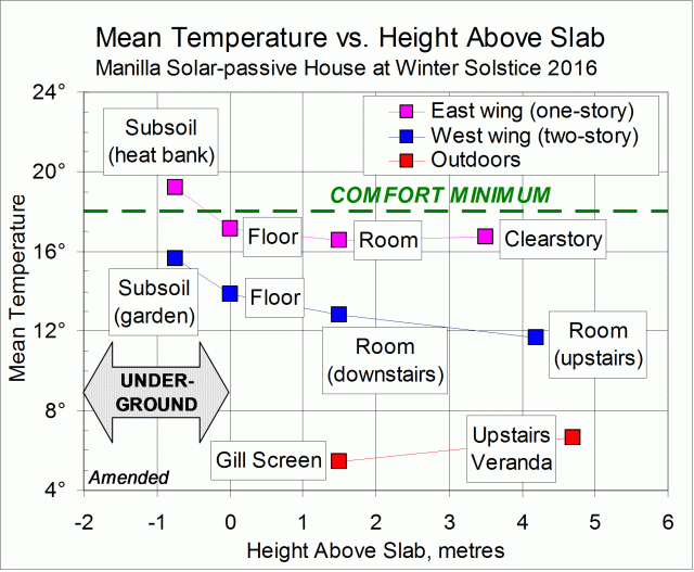
Graph of house temperatures versus height

Where is the warmth in a house?

People are building houses that should keep warm in winter with little heating.
Some parts of the house will stay warmer than other parts. Which parts? How warm?
Answers are not easily found. I hope this temperature record from a house with only personal heating may be useful. This was a time when the house was under extreme stress due to cold weather.

Over a five-day period in winter 2016, I read thermometers frequently at a number of stations around the house. I have selected those stations that form profiles from top to bottom of two wings of the house: the two-storied west wing, and the east wing that is one-storied with a clearstory.
To find how my house differs from yours, see the note below: “Key features of the house”.

Selected thermometer stations

In the West Wing (two-storied)

OUTDOORS, upstairs veranda (+4.7 metres);
Wall upstairs at head height (+4.2 metres);
Wall downstairs at head height (+1.5 metres);
Floor slab surface downstairs (0.0 metres);
Garden subsoil at -0.75 metres.

In the East Wing (single-storied)

Clearstory space at +3.5 metres;
Wall in the hallway at head height (+1.5 metres);
OUTDOORS, in a Gill Screen (+1.5 metres);
Floor slab surface in the en-suite (0.0 metres);
Solid “heat bank” beneath the floor slab (-0.75 metres).

Part I: Average temperature values

SUMMARY RESULT
In the ground under the floor slab the temperature would be just warm enough for winter comfort. Above the floor slab, the higher you go, the colder it gets.

Results

The graph above plots mean temperature against height above the floor slab. (The mean temperature is the time-average over the five days.)

Comparing east wing, west wing, and outdoors

The single-storied east wing was several degrees warmer at all heights than the two-storied west wing. The east wing has advantages: thermal mass, perimeter insulation in the footings, less shading, and a more compact shape.
Continue reading

Hard Winter for Solar-passive

Graphical log of daily indoor and outdoor temperatures for winter 2016.

Temperature log: main features

This graph, for 2016, shows a winter pattern of indoor and outdoor temperatures that is typical for this house. Indoor temperatures vary much less than outdoor temperatures, they rise and fall with them, and they are higher nearly all the time.
While the outdoor temperatures shown go as low as minus three degrees, those indoors lie within the winter “comfort zone” from 17° to 24° (see this post) nearly all the time.

Weather this winter

This winter was harsh for a solar-passive house. Near-record rainfall (227 mm) came with the greatest number of cloudy days of any winter in the new century. There were 53 mornings with more than four octas of cloud, when the average is 33.

Heater use

Because cloud limited the the solar gain, I had to use blower heaters far more than in previous winters. My records show that I used 320 kWh ($80) in these heaters this winter, when I normally use about 40 kWh ($10).
Heaters were also used by guests who were present on the six days shown. As well as being unused to the climate, the guests lived in the colder west wing of the house. They may have used 72 kWh ($18). Those guests have kindly written reviews of their visit.
Even using 400 kWh of electricity for personal heating in a winter could not make a detectable change in house temperature. I have found that blower heaters are surprisingly good at making a room in this house comfortable. As the radiant temperature of the walls is only 2° or 3° too low for comfort, it can be compensated by making the air temperature only slightly higher.

The pattern in detail

While cloudy days are not plotted here (Cloud observations for this winter are plotted elsewhere.), cloudy days can be recognised on the graph. In this climate, days with low maximum temperature and high minimum temperature are always due to cloud. Only in fine weather are days warm and nights frosty. The graph shows how the weather goes through a cycle every week or two: sunny days get warmer, then rain sets in. As it clears, the air gets even colder, before warming up again.
Indoor temperatures follow the same cycle, but there are differences. There may be a delay of up to a day, and sometimes longer.

Correlations

I did scatter plots comparing all the variables shown in the first graph and I fitted linear regressions. I present the four scatter-plots that had the highest coefficients of determination (“R-squared”). Continue reading