21-C Rain ENSO IPO: Scatterplot

The anomaly of monthly rainfall at Manilla, NSW varied with that of ENSO for only a part of the 21st century to date.

Scatterplot Rainfall vs ENSO

This connected scatterplot relates the smoothed anomaly of the El Niño-Southern Oscillation (ENSO) to the smoothed and 2-month-lagged anomaly of monthly rainfall at Manilla, NSW. The earlier data, from September 1999 to September 2011, is plotted in blue, and the later data, from October 2011 to November 2018, in red.

The same data was displayed as a dual-axis line plot in an earlier post titled “21-C Rain-ENSO-IPO: Line graphs”. Data sources are linked there.

The line plot revealed two things: the relationship changed from earlier to later times, and there was a better match when the rainfall data was lagged by two months. To clarify, I prepared various scatterplots with fitted regressions.

Raw data scatterplots

Scatterplots of the raw data values yielded regressions with very low values of the coefficient of determination (R-squared). For the whole population, R-squared was 0.028. I then checked the coefficient when I lagged the rainfall by 1-, 2-, or 3-months. A 1-month lag almost doubled the coefficient to 0.041; a 2-month lag gave 0.055, and a 3-month lag gave 0.041 again.
My observation that Manilla rainfall typically leads ENSO by 2 months is confirmed.

Connected scatterplots of smoothed and lagged data

The smoothing function used in the dual-axis line plot of the earlier post makes a good visual match. That suggests that local rainfall and ENSO are physically related at a periodicity no shorter than 12 months.
Using the smoothed and 2-month-lagged data, I have made the scatterplots shown in the graph above.
The better-matched data from September 1999 to September 2011 (blue) has a satisfactory R-squared of 0.498, nearly 20 times greater than that of the raw data. The very poorly-matched data from October 2011 to November 2018 (red) has an R-squared value of 0.040, no better than the raw data.

Patterns in the sequence of rainfall and ENSO values

In the above graph, I have joined the consecutive smoothed data points to make a connected scatterplot. Because little noise remains, clear patterns appear.

Matched rainfall and ENSO

The pattern up to September 2011 (blue) is mainly a series of ellipses, some clockwise and some anti-clockwise. They are almost parallel to the regression line:

y = -0.047x-0.246

The blue point furthest to the top left is that for September 2002, a time of extreme drought and El Niño.
The blue point furthest to the bottom right is that for December 2010, a time of very high rainfall and La Niña.

Discordant rainfall and ENSO

The pattern from October 2011 (red) swings about wildly and does not repeat. The regression (with a trivial coefficient of determination) is nearly horizontal. Near its ends are the extreme drought of June 2018 and the deluge of January 2012, both at times when ENSO was near neutral. At the top of the graph is the Super El Niño of November 2015, when Manilla rainfall was normal.

Conclusion

Scatterplots, connected scatterplots and regressions confirm that a strong relation between rainfall at Manilla and ENSO failed in 2011 as the IPO was rising from a negative toward a positive regimen.

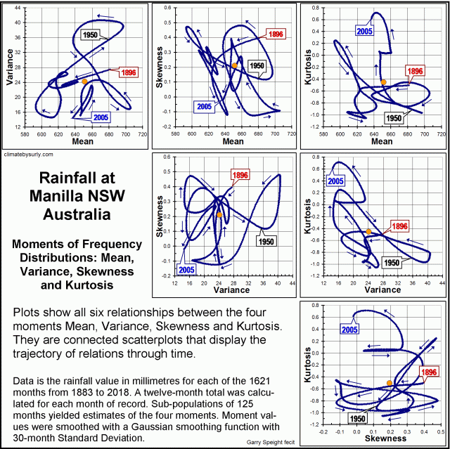
Relations Among Rainfall Moments

Six graphs of rainfall moment relations

Twelve-monthly values of rainfall since 1883 at Manilla NSW yield the four moments of their frequency distributions: mean, variance, skewness, and kurtosis. I plotted the history of each moment (when smoothed) in an earlier post.
Here, I compare the moments in pairs. Connected scatterplots reveal the trajectory of each relationship with time.
Some linear and cyclic trends persist through decades, but none persists through the whole record.
The first image is an index to the suite of six graphs of pair-wise relationships that I present below.

Rainfall variance vs. mean

Trajectory of Variance versus Mean

Continue reading

Rainfall kurtosis vs. HadCRUT4 Scatterplots

These scatterplots and Connected Scatterplots support a relationship between the kurtosis of annual rainfall at Manilla NSW and the de-trended smoothed HadCRUT4 series of global temperatures.

Scatterplot rainfall kurtosis vs. HadCRUT all data

[SUPERSEDED
This post had inadequated data. It is now superseded by a section in the post “Rainfall kurtosis vs. HadCRUT4, revised” of 20 May 2018.]

The raw data, as observed

The first scatterplot compares (y-axis) all the calculated unsmoothed values of kurtosis of annual rainfall at Manilla, NSW with (x-axis) the unsmoothed values of the HadCRUT4 series of global near-surface temperature at those dates.
[I have plotted rainfall values lagged by five years on all of the scatterplots shown. This lagging makes little difference to the first two scatterplots.]

On this first graph, the fitted linear trend barely supports a positive relation of kurtosis to temperature. The slope is low (1.05) and the R-squared only 0.16. There is an aberrant cloud of points in the top left corner.

Scatterplot rainfall kurtosis vs. HadCRUT detrended (all data)

The raw data, HadCRUT4 de-trended

This graph takes a first step towards a better model for the relationship: the secular trend of the temperature series (that is, the global warming) is removed. For comparison, I have not re-scaled the x-axis.
Although still very weak, the relation is much enhanced. The slope (2.35) is twice as steep and the R-squared (0.24) increased by 50%.

Connected Scatterplot rainfall kurtosis vs. HadCRUT all data

Smoothed data, HadCRUT4 de-trended

This third graph uses smoothed data. The HadCRUT4 series is  “decadally-smoothed” (as published) with a 21-point binomial filter to remove high frequency noise. The rainfall data, already damped by its 21-year sampling window, has been further smoothed with a 9-point Gaussian filter.
This graph is a Connected Scatterplot, that shows the trajectory of the rainfall-temperature relation with the passing of time.

Line chart rainfall kurtosis vs. HadCRUT (detrended)Smoothing both data sets has given a much closer relation. The R-squared value is almost doubled again, to 0.43, and the slope is increased to 3.70. The date labels show that the relation before 1910 was different from that at later dates. (This had also been clear in the Dual axis line chart, copied here, from the post “Rainfall Kurtosis Matches HadCRUT4”.)

Connected Scatterplot rainfall kurtosis vs. HadCRUT from 1908

Smoothed data, HadCRUT4 de-trended, from 1908 to 2002

In this final graph, I have discarded the first eleven years. The linear regression based on smoothed values from 1908 to 2002 has a steep slope of 5.21 and a respectable R-squared value of 0.84.

I had prepared similar graphs for lag values of rainfall kurtosis from zero up to nine. The lag value of five years tends to maximise the slope and the R-squared values.
Choice of a five-year lag tends to form hair-pin loops in the trace, while shorter lags give wider clockwise loops and longer lags give wider anti-clockwise loops.
The lag value of five years implies that the Manilla annual rainfall kurtosis value for a given year matches the de-trended HadCRUT value that occurs five years later.

[Back to the main post on this topic: “Rainfall kurtosis matches HadCRUT4”.]