Rainfall kurtosis vs. HadCRUT4, revised

Patterns of rainfall kurtosis and global temperature.

The kurtosis of annual rainfall at Manilla NSW forms a time-series that matches the time-series of global surface temperature when detrended.

[REVISED:
Earlier posts were based on rainfall data sets that were too small. Estimates of kurtosis and skewness were unstable. For details please read “Rainfall kurtosis matches HadCRUT4” and “Rainfall kurtosis vs. HadCRUT4: scatterplots”.]

The variables

These two climate variables have little in common. Manilla, NSW, is a single station that has a 134-year record of daily rainfall only. That yields estimates of rainfall kurtosis, an indicator of the relative frequency of extreme values.
HadCRUT4 is one of several century-long estimates of near-surface temperature for the whole world. [See Note below: “Data Sources”.]

The visual match of the patterns

The first graph (a dual-axis line chart) shows that these two variables have similar patterns of variation over time.

I found the best visual match by:
* scaling 0.5 units of Manilla rainfall kurtosis to 0.1° of detrended HadCRUT4 temperature;
* aligning the kurtosis value of -0.3 units with the zero of detrended temperature;
* lagging the rainfall by two years.

Features that the two patterns have in common are:
* matching main peaks at 1897, 1942 and 2005, each higher than the one before;
* persistent low values in the 1910’s, 1920’s, 1950’s, 1960’s, 1970’s and early 1980’s;
*some matching minor peaks and troughs.

Regression rainfall kurtosis on HadCRUT4.

The correlation chart

The second graph is a correlation chart. The linear regression of kurtosis on detrended temperature has the reasonable R-squared value of 0.67.
As I have made it a connected scatterplot, you can see how the relation has changed through time. From the first data point in 1898 (in red) both variables decreased together to the lowest temperature in 1910. Both peaked in 1942, having risen since 1920, later falling until 1955-56. The final rise to the highest peak (2005) was continuous from 1984 for temperature, but the rise in kurtosis was not. It fell slightly in 1990, then remained static until 1998.
All rainfall figures actually came two years earlier. [See note below: “Manilla’s 2-year lead”.] The assigned two-year lag not only makes peaks match on the first graph. It sharpens the reversals on the second graph. On a trial connected scatterplot without lag, these reversals had been smooth clockwise curves.

What it means

As evidence of extreme behaviour in climate

It is said that more extremes in climate will occur as the world becomes warmer. The evidence is not strong. Most data sets are overwhelmed by noise, and “extreme” is seldom defined with rigor.
In the present case, I believe that the definition of “extreme” that I use is sound: that is, the kurtosis of a frequency-distribution. The instability of kurtosis when based on my small samples had been an issue. In this revision I have increased the sample population size from 21 to 125.

My rainfall data set that displays more and less extreme behaviour is not general but local. It can merely suggest that data elsewhere may reveal functional relationships.

De-trended global temperature

Continue reading

Rainfall kurtosis vs. HadCRUT4 Scatterplots

These scatterplots and Connected Scatterplots support a relationship between the kurtosis of annual rainfall at Manilla NSW and the de-trended smoothed HadCRUT4 series of global temperatures.

Scatterplot rainfall kurtosis vs. HadCRUT all data

[SUPERSEDED
This post had inadequated data. It is now superseded by a section in the post “Rainfall kurtosis vs. HadCRUT4, revised” of 20 May 2018.]

The raw data, as observed

The first scatterplot compares (y-axis) all the calculated unsmoothed values of kurtosis of annual rainfall at Manilla, NSW with (x-axis) the unsmoothed values of the HadCRUT4 series of global near-surface temperature at those dates.
[I have plotted rainfall values lagged by five years on all of the scatterplots shown. This lagging makes little difference to the first two scatterplots.]

On this first graph, the fitted linear trend barely supports a positive relation of kurtosis to temperature. The slope is low (1.05) and the R-squared only 0.16. There is an aberrant cloud of points in the top left corner.

Scatterplot rainfall kurtosis vs. HadCRUT detrended (all data)

The raw data, HadCRUT4 de-trended

This graph takes a first step towards a better model for the relationship: the secular trend of the temperature series (that is, the global warming) is removed. For comparison, I have not re-scaled the x-axis.
Although still very weak, the relation is much enhanced. The slope (2.35) is twice as steep and the R-squared (0.24) increased by 50%.

Connected Scatterplot rainfall kurtosis vs. HadCRUT all data

Smoothed data, HadCRUT4 de-trended

This third graph uses smoothed data. The HadCRUT4 series is  “decadally-smoothed” (as published) with a 21-point binomial filter to remove high frequency noise. The rainfall data, already damped by its 21-year sampling window, has been further smoothed with a 9-point Gaussian filter.
This graph is a Connected Scatterplot, that shows the trajectory of the rainfall-temperature relation with the passing of time.

Line chart rainfall kurtosis vs. HadCRUT (detrended)Smoothing both data sets has given a much closer relation. The R-squared value is almost doubled again, to 0.43, and the slope is increased to 3.70. The date labels show that the relation before 1910 was different from that at later dates. (This had also been clear in the Dual axis line chart, copied here, from the post “Rainfall Kurtosis Matches HadCRUT4”.)

Connected Scatterplot rainfall kurtosis vs. HadCRUT from 1908

Smoothed data, HadCRUT4 de-trended, from 1908 to 2002

In this final graph, I have discarded the first eleven years. The linear regression based on smoothed values from 1908 to 2002 has a steep slope of 5.21 and a respectable R-squared value of 0.84.

I had prepared similar graphs for lag values of rainfall kurtosis from zero up to nine. The lag value of five years tends to maximise the slope and the R-squared values.
Choice of a five-year lag tends to form hair-pin loops in the trace, while shorter lags give wider clockwise loops and longer lags give wider anti-clockwise loops.
The lag value of five years implies that the Manilla annual rainfall kurtosis value for a given year matches the de-trended HadCRUT value that occurs five years later.

[Back to the main post on this topic: “Rainfall kurtosis matches HadCRUT4”.]

Rainfall kurtosis matches HadCRUT4

Line chart rainfall kurtosis vs. HadCRUT (detrended)

The kurtosis of annual rainfall at Manilla NSW forms a time-series that matches the time-series of global surface temperature when de-trended.

[SUPERSEDED
This post had inadequate data. It is now superseded by the post “Rainfall kurtosis vs. HadCRUT4, revised” of 20 May 2018.]

Features of the data

Data sources, noted on the graph, are specified below. The best match is achieved by decadal smoothing, by scaling 1.0 units of kurtosis to 0.16 degrees of temperature, and by lagging the rainfall data five years.

Closeness of the match

Although both variables have irregular traces, their patterns are almost the same. They begin and end very high, have a broad peak near 1943, and are low in the 1910’s, 1920’s, 1950’s, 1960’s and 1970’s.
The match is very close for ninety years from 1915 to 2005, except for one decade (at 1972). In all this time, both the values and the slopes (as scaled) agree. [See the Note below “1991-1992”.]

Before 1915, the patterns do not match well, but they remain similar. Both traces descend rapidly together from 1903 to 1910. The initial peak in the rainfall trace at 1903 (actually 1898) is similar in height (as scaled) to a peak of the de-trended temperature trace just off the graph at 1879.

Discovering the pattern match

I was seeking a robust measure of the occurrence of extreme values in annual rainfall at Manilla, NSW. As kurtosis is just such a measure, I calculated it. I then plotted out the time-series, as shown here. It reminded me of the well-established time-series of smoothed HadCRUT4 global near-surface temperature. In particular, I recalled a locally-dominant peak near 1940.

Line chart rainfall kurtosis vs. HadCRUT
Simply reconciling the vertical scales of the two time-series gave me the second graph.
While not matching in details, the two curves remain very close from 1940 to 1995. Matching over the whole rainfall record is prevented by a difference in trend. While the rainfall kurtosis has no trend, the HadCRUT4 curve has a secular trend rising at half a degree per century (known as “global warming”).
To extend and improve the match, I subtracted the linear trend from the global temperature curve, and lagged the rainfall points by five years. The first graph is the closely-matching result.

What it means

As evidence of extreme behaviour in climate

It is said that more extremes in climate will occur as the world becomes warmer. The evidence is not strong. Most data sets are overwhelmed by noise, and “extreme” is seldom defined with rigor.
In the present case, I believe that the definition of “extreme” that I use is sound: that is, the kurtosis of a frequency-distribution. Only the instability of kurtosis when based on small samples is an issue.

My rainfall data set that displays more and less extreme behaviour is not general but local. It can merely suggest that data elsewhere may reveal functional relationships.

Connected Scatterplot rainfall kurtosis vs. HadCRUT from 1908A very strong and persistent empirical relationship is shown by the graphical logs above. In another post, “Rainfall Kurtosis vs. HadCRUT4  Scatterplots”, I show scatterplots like this in support of it.

De-trended global temperature

This strong link between local annual rainfall kurtosis and global climate has a surprising feature. Although this extreme behaviour seems to relate to global temperature, it does not relate to global warming! It relates to a temperature trace from which the global warming trend has been removed. Times of high kurtosis, denoting enhanced extremes, correspond to times when the global temperature was highest above trend. Such times occurred not only in the twenty-first century, but equally in the nineteenth century. There was another (widely-known), lower peak in de-trended global temperature near 1940: at that time also kurtosis was above normal.

Should global temperature remain static for a time, it would be falling rapidly below its rising trend. According to this data set, that should bring reduced extreme behaviour in annual rainfall at Manilla.


Data Sources

(i) Global temperature time-series

From the three available century-long time series of global near-surface temperature I have chosen to use HadCRUT4, published by the British Met Office Hadley Centre. The link is here.

I selected from the section: “HadCRUT4 time series: ensemble medians and uncertainties”.
From this, I downloaded two files:
(i) “Global (NH+SH)/2, annual”;
(ii) “Global (NH+SH)/2, decadally smoothed”.
[The “Decadally smoothed” data supplied is annual data smoothed with a 21-point binomial filter.]
From each data file, I used only the first column: the year date, and the second column: the median value.

I established the secular trend of global warming using the linear trend function in Charts for “Excel”. I found the linear trend of the whole HadCRUT4 annual series data (1850 to 2016) to be:

y = 0.005x – 0.52.

I then subtracted the annual value at the trend line from the decadally smoothed HadCRUT4 value to get the de-trended smoothed value shown on the first graph.

(ii) Kurtosis of Manilla annual rainfall

The rainfall data is that for Manilla Post Office, Station 055031 of the Australian Bureau of Meteorology. Station 055031 functioned without gaps from 1883 to March 2015. Since then, the official record is fragmentary.
I found kurtosis values for annual rainfall by using the (excess) kurtosis function in “Excel”. I used sub-populations of 21 successive years, referred to the median year. I found values for the years 1893 to 2006. I smoothed these values with a 9-point gaussian filter (yielding similar smoothing to that of HadCRUT4). Smoothing reduced the plottable years to those from 1897 to 2002.

Manilla yearly rainfall history: four momentsI posted a line graph of this kurtosis data earlier, in “Moments of Manilla’s Yearly Rainfall History”.


Note: 1991-1992

The most striking match in the graph is that both traces pause at 1991-1992 within a two-decade-long steady rapid rise. That pause in the global temperature series has been attributed with little doubt to the injection into the atmosphere of seventeen million tonnes of sulphur dioxide by the eruption of Mount Pinatubo in the Philippines. That eruption cannot have affected the rainfall kurtosis five years earlier.

Hammering Global Warming Into Line

Global temp and IPO graph

In my post of 18 Sep 2014 “The record of the IPO”, I showed a graph of the Inter-decadal Pacific Oscillation,plotted as a cumulative sum of anomalies (CUSUM).

Log from 1850 of world surface air temperature and carbon emissions
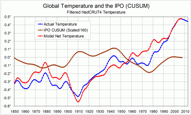
This CUSUM plot has a shape that makes it seem that it could be used to straighten the dog-leg (zig-zag) trace of global temperature that we see. A straighter trace of global warming would support the claim that a log-linear growth in carbon dioxide emissions is the main cause of the warming.

My attempt to straighten the trace depends on the surmise (or conjecture) that the angles in the global temperature record are caused by the angles in the IPO CUSUM record. That is, the climatic shifts that appear in the two records are the same shifts.
I have adopted an extremely simple model to link the records:
1. Any global temperature changes due to the Inter-decadal Pacific Oscillation are directly proportional to the anomaly. (See Note 1.);
2. Temperature changes driven by the IPO are cumulative in this time-frame.

To convert IPO CUSUM values to temperature anomalies in degrees, they must be re-scaled. By trial and error, I found that dividing the values by 160 would straighten most of the trace – the part from 1909 to 2008. (See Note 2.) The first graph shows (i) the actual HadCRUT4 smoothed global temperature trace, (ii) the re-scaled IPO CUSUM trace, and (iii) a model global temperature trace with the supposed cumulative effect of the IPO subtracted.


The second graph compares the actual and model temperature traces. I note, in a text-box, that the cooling trend of the actual trace from 1943 to 1975 has been eliminated by the use of the model.
The graph includes a linear trend fitted to the model trace for the century 1909 to 2008, with its equation: y = 0.0088x – 0.9714 and R² = 0.9715.

Continue reading