Hammering Global Warming Into Line

Global temp and IPO graph

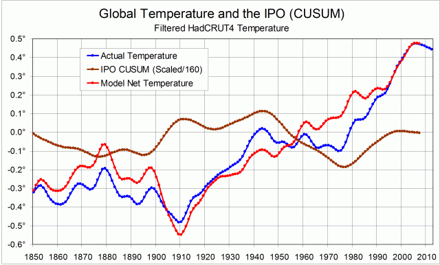
In my post of 18 Sep 2014 “The record of the IPO”, I showed a graph of the Inter-decadal Pacific Oscillation,plotted as a cumulative sum of anomalies (CUSUM).

Log from 1850 of world surface air temperature and carbon emissionsThis CUSUM plot has a shape that makes it seem that it could be used to straighten the dog-leg (zig-zag) trace of global temperature that we see. A straighter trace of global warming would support the claim that a log-linear growth in carbon dioxide emissions is the main cause of the warming.

My attempt to straighten the trace depends on the surmise (or conjecture) that the angles in the global temperature record are caused by the angles in the IPO CUSUM record. That is, the climatic shifts that appear in the two records are the same shifts.
I have adopted an extremely simple model to link the records:
1. Any global temperature changes due to the Inter-decadal Pacific Oscillation are directly proportional to the anomaly. (See Note 1.);
2. Temperature changes driven by the IPO are cumulative in this time-frame.

To convert IPO CUSUM values to temperature anomalies in degrees, they must be re-scaled. By trial and error, I found that dividing the values by 160 would straighten most of the trace – the part from 1909 to 2008. (See Note 2.) The first graph shows (i) the actual HadCRUT4 smoothed global temperature trace, (ii) the re-scaled IPO CUSUM trace, and (iii) a model global temperature trace with the supposed cumulative effect of the IPO subtracted.


The second graph compares the actual and model temperature traces. I note, in a text-box, that the cooling trend of the actual trace from 1943 to 1975 has been eliminated by the use of the model.
The graph includes a linear trend fitted to the model trace for the century 1909 to 2008, with its equation: y = 0.0088x – 0.9714 and R² = 0.9715.

Continue reading

The record of the IPO

Graphical record of the IPO, plus CUSUM plot and climate shift dates

My post showing shifting trends in world surface temperature and in carbon emissions brought a suggestion from Marvin Shafer that allowing for the PDO could straighten the trend. I think that perhaps it could, but I have tried the IPO (Inter-decadal Pacific Oscillation) rather than the PDO (Pacific inter-Decadal Oscillation). (See below.)

Along the top of the graph I have marked in the climate shifts that prevent the trace of world temperature from being anything like a straight line. The blue line is the IPO, as updated to 2008.
The IPO is positive in the space between the last two climate shifts, negative in the next earlier space, and positive in part of the space before that. By plotting the CUSUM values of the IPO (red), it is clear that the pattern of the IPO relates very closely to the climate shift dates. Four of the seven extreme points of the IPO CUSUM trace match climate shifts. In addition, since 1925, the CUSUM trace between the sharply-defined extreme points has been a series of nearly straight lines. These represent near-constant values of the IPO, a rising line representing a positive IPO and a falling line a negative one.

As shown by the map in the Figure copied below, a positive extreme of the IPO has higher than normal sea surface temperatures in the equatorial parts of the Pacific. Could the transfer of heat from the ocean to the atmosphere be enhanced at such times?

This conjecture is developed in the post “Hammering Global Warming Into Line”.

[Note added August 2019.
The IPO was negative from 1999 to 2014, then became postive again.
The paper by Power et al.(1999) linked below showed that Australian rainfall and its prediction was more closely related to the El Nino-Southern Oscillation (ENSO) when the IPO was negative. Data for Manilla NSW confirms that. See “21-C Rain-ENSO-IPO: Line graphs” and “21-C Rain ENSO IPO: Scatterplot”.]


The PDO and the IPO

The PDO is the Pacific Decadal Oscillation (or Pacific inter-Decadal Oscillation). It is one of a number of climate indicators that rise and fall over periods of a decade or more. These indicators have been introduced by different research groups at different times.
A current list of such indicators is in the contribution of Working Group I to the Fifth Assessment Report (5AR) of the Intergovernmental Panel on Climate Change (IPCC). The list is in Chapter 2 (38MB). It is at the end, in a special section: “Box 2.5: Patterns and Indices of Climate Variability”. Continue reading

Manilla Dew Point leads ENSO by three months

Manilla dew point lags NINO3.4 sea surface temperature by 3 months.

(This material justifies a statement in the post “Predict weather from ENSO?”)

The graphs above are like those in two previous posts, but show how Manilla smoothed monthly dew point anomalies, like temperature anomalies and rainfall anomalies, relate to the El Niño-Southern Oscillation (ENSO).

High (El Niño) values of Sea Surface Temperature (NINO3.4) are shown here to relate to low humidity at Manilla, NSW. As humidity data, I estimate dew points daily at sunrise. Dew points, like Sea Surface Temperatures, are expressed in degrees celsius, but corresponding anomalies take the opposite sense. The first graph plots the Manilla dew point anomaly, given a  negative sign, and the NINO3.4 anomaly. To improve the match, I have lagged the Manilla dew points by three months. As an example, I have noted on the graph the match of Manilla’s November 2005 humidity peak with the La Nina ENSO peak of February 2006.

To the eye, the over-all match is better than in either the rainfall or the maximum temperature plots of earlier posts. The two curves here match very well from 2000 to 2007.

The second graph shows the discrepancy between the two curves. Dashed lines show limits of a good match at +/-0.5 degrees. The nature of each larger discrepancy is noted. (“Here” in text boxes means “at Manilla”.)
After 2007 there are large mis-matches between Manilla dew point and ENSO. Dew point fluctuations suddenly become less than might be expected from NINO3.4 values. It may be relevant that, as I posted elsewhere  in July 2010, skies suddenly became very much cloudier at Manilla after August 2007.

I have also tried plotting the following variables against NINO3.4:

Daily minimum temperature;
Daily temperature range;
Percent cloudy mornings;
Subsoil temperature.

None of them matches NINO3.4 well enough to display.

The three sets of graphs show “teleconnections” between Sea Surface Temperatures in the equatorial Pacific and climate variables at Manilla in inland NSW, Australia. Climatic peaks come earlier at Manilla than in the Pacific:

Peaks of daily maximum temperature come one month earlier;
peaks of rainfall come two months earlier;
peaks of Dew Point come three months earlier.

In a simple-minded way, it seems to me more likely that Australia’s climate drives the Southern Oscillation than the other way around. I know that this is speculation. (Sort of like Abraham Ortellius suggesting in 1587 that Africa and South America might have drifted apart.)

Notes
1. High frequency noise is reduced in the case of the Manilla monthly data by a Gaussian smoothing function of half-width six months.
2. On advice, I represent the El Nino – Southern Oscillation phenomenon (ENSO) by the NINO3.4 area anomalies from the OISSTv2 data set.
My enquiries about the best data to use are in this “weatherzone”  thread.
The ensemble of sea surface temperatures does not have much high-frequency noise. There is some, however, and I have used the same smoothing as used in the (formerly authoritative) Oceanic Nino Index (ONI), that is, a running mean of each three monthly values.


This was posted originally in a “weatherzone” forum, with the date 12 November 2011. It is posted here with the nominal date 29 November 2011.


Manilla rainfall extremes reflect NINO3.4 temperature

Manilla rainfall matches NINO3.4 sea surface temperature.

(This material justifies a statement in the post “Predict weather from ENSO?”)

The graphs above are like those in an earlier post, but show how Manilla monthly rainfall anomalies, rather than maximum temperature anomalies relate to the El Nino-Southern Oscillation (ENSO). Most people using ENSO  want to predict Australian regional rainfall.

In the second graph I have improved the match at peaks and troughs of smoothed Manilla monthly rainfall anomalies and NINO3.4 sea surface temperature anomaly data in two ways.
1. I converted the sea surface temperature anomaly (degrees C) into a model of resultant rainfall anomaly (mm) by multiplying by minus fifteen.
2. I added 3.7 mm of rainfall to the Manilla figures, and I lagged the data by two months.

To the eye, the over-all correspondence between actual and modelled rainfall is good, but not quite as good as in the temperature graphs. One form of mis-match is that two of the greatest rainfall deficits (“El Nino” Nov-06, Dec-09) are broader and shallower than in the model. (Perhaps an arithmetic measure of rainfall anomaly is not the best.)

The third graph shows how much Manilla rainfall, as adjusted, differs from the rainfall “predicted” by the NINO3.4 model. Dashed lines show limits of a good match at +/- 7.5 mm (corresponding to +/-0.5 degrees). The nature of each larger discrepancy is noted.

A good match demands lagging actual rainfall at Manilla by two months. That implies that peaks and troughs in Manilla rainfall anomalies happen two months before the matching anomalies of NINO3.4. I wonder if prediction is even practical if that is the case in other parts of Australia.

Notes
1. High frequency noise is reduced in the case of the Manilla monthly data by a Gaussian smoothing function of half-width six months.
2. On advice, I represent the El Nino – Southern Oscillation phenomenon (ENSO) by the NINO3.4 area anomalies from the OISSTv2 data set.
My enquiries about the best data to use are in this “weatherzone”  thread.
The ensemble of sea surface temperatures does not have much high-frequency noise. There is some, however, and I have used the same smoothing as used in the (formerly authoritative) Oceanic Nino Index (ONI), that is, a running mean of each three monthly values.


This was posted originally in a “weatherzone” forum, with the date 28 October 2011. It is posted here with the nominal date 16 November 2011.

(Note added: Updated to include 2013 here.)


Manilla temperature matches NINO3.4 temperature.

Manilla maximum air temperature matches NINO3.4 sea surface temperature.

[This material justifies a statement in the post “Predict weather from ENSO?”]

[Note added:
This post relating ENSO to Manilla temperature is matched by similar posts relating ENSO to Manilla rainfall and to Manilla humidity (dew point). Manilla climate peaks and troughs generally happen before the related ENSO peaks and troughs, not after them.]

Smoothed daily maximum temperature anomalies for 140 months at Manilla, NSW are compared with NINO3.4 region Sea Surface Temperature anomalies. They match very closely, especially at peaks and troughs of the Southern Oscillation. The first graph is a log of the data as described in the notes below.
The match can be improved, as in the second graph, by making two adjustments. The reference periods for the anomalies are not the same. In any case it is pure coincidence that the temperature values are so close. I have chosen to add 0.2 degrees to the Manilla figures. At several of the major peaks and troughs the Manilla temperature leads the Sea Surface temperature by one month. I have chosen to lag all the Manilla temperatures by one month.
The third graph quantifies the remaining discrepancies. For most of this short record, the adjusted, one-month lagged Manilla smoothed daily maximum temperatures agreed with ENSO3.4 Sea Surface Temperatures within a margin of 0.5 degrees. Periods when the discrepancy was greater are noted on the graph.
At first (Sep-99 to Nov-00: 15 months) Manilla temperatures were in phase with the Southern Oscillation but one degree warmer.
For a time (Dec-00 to Dec-01: 13 months) there was no agreement.
From Jan-02 to Jun-03 (18 months) temperatures agreed.
From Jul-03 to May-06 (35 months) there was again no agreement.
In the long period (59 months) from Jun-06 to the end of the record in Apr-11, temperatures agreed except for one interruption: Manilla temperature lagged by three months at the La Nina trough of Feb-08, causing a discrepancy of minus one degrees.
In the 140-month record, Manilla temperatures faithfully followed Sea Surface temperatures in 77 months (55%), and were in phase in another 15 months (11%). Times when there were large discrepancies were generally times when the Southern Oscillation was near-neutral.


Notes
1. High frequency noise is reduced in the case of the Manilla monthly data by a gaussian smoothing function of half-width six months.
2. On advice, I represent the El Nino – Southern Oscillation phenomenon (ENSO) by the NINO3.4 area anomalies from the OISSTv2 data set.
My enquiries about the best data to use are in this “weatherzone”  thread.
The ensemble of sea surface temperatures does not have much high-frequency noise. There is some, however, and I have used the same smoothing as used in the (formerly authoritative) Oceanic Nino Index (ONI), that is, a running mean of each three monthly values.


This was posted originally in a “weatherzone” forum, with the date 25 October 2011. It is posted here with the nominal date 28 October 2011, and made “sticky” on 27 May 2014.