Autumn 2018 dry and very warm

Gum nuts and blossoms

Gumnut and Gum-Blossum

The air became four degrees warmer than normal by day and by night in mid-March and continued warm until late in April. As normal temperatures returned the climate became dry, with no rain for thirty-nine days.

Graphical weather log for autumn 2018

Both autumn 2016 and autumn 2018 had record high average temperatures. This season had the highest mean daily maximum (27.7°), but 2016 had the highest mean daily minimum (12.1°). In the combined average, 2016, with 19.9°, was warmer than 2018, with 19.7°.

All four indicators of moisture (rainfall, dew point, cloud, and daily temperature range) agree in showing this autumn to be drier than last autumn, and even than the three autumns before that.
The total rainfall of 45 mm was the 12th driest on record, but it was not the driest in the 21st century. Similarly dry autumns occurred in 2002 (60 mm), 2005 (35 mm), 2006 (53 mm), and 2008 (37 mm). That is about twice as many as history would suggest.

Climate for autumn 2018


Data. A Bureau of Meteorology automatic rain gauge operates in the museum yard. From 17 March 2017, 9 am daily readings are published as Manilla Museum, Station 55312.  These reports use that rainfall data when it is available. During this autumn season 30 daily readings were missed, and I replaced them with my own readings.

All other data, including subsoil at 750 mm, are from 3 Monash Street, Manilla.

May 2018 third driest

Sunset clouds

the heavens’ embroidered cloths

Temperatures did not stray far from normal. The first (black) frost that I observed was on the 15th, near the normal date for it (13th May). That began a week of sunny skies and very dry air.
There was only one rain day. An early morning shower gave a reading of 1.2 mm on the 30th.

May 2018 weather log

Comparing May months

The May months in 2018, 2017, and 2016, as well as in 2014, were all warm. The average temperature was more than half a degree above the normal value of 13.3°. While May 2017 was warm, wet, and humid, May 2018 was warm, dry, and arid. The air was exceptionally dry, with the mean early morning dew point (0.0°) the lowest for May, and the relative humidity at that time 68% instead of the usual 80% to 90%.
The rainfall total of 1.2 mm was third driest for May, equal with May 2002, but not as dry as May 2006 ( 0.2 mm). Only May 1927 was drier, with zero. May rainfall values have been low in the 21st century, with an average of 23 mm, compared to the long-term average of 41 mm.

Climate in May months

Rainfall Shortages

Last month, April 2018, had only two rainfall shortages classed as “serious” (below the 10th percentile): those for durations of five years and six years. Since then, more shortages have appeared. Those five-year and six-year shortages remain, but there are now serious shortages for durations of five months and twelve months, and severe shortages (below the 5th percentile) for one month, two months and three months. The current three-month total (45 mm) is at the 4th percentile.


Data. A Bureau of Meteorology automatic rain gauge operates in the museum yard. From 17 March 2017, 9 am daily readings are published as Manilla Museum, Station 55312.  These reports use that rainfall data when it is available.  The gauge, which had last reported on 24 September 2017, came on line again on the 16th of March. However, during the month of May eleven daily readings were blank. I have substituted my own gauge readings, which were all zero.

All data, including subsoil at 750 mm, are from 3 Monash Street, Manilla.

3-year trends to May 2018

Warm and Very Dry

3-year trends to May 2018

May raw anomaly data (orange)

The raw maximum temperature anomaly for May 2018 was rather high, as was that of the subsoil. The anomaly of daily minimum temperature was low. Very low moisture was shown by the rainfall, daily temperature range, and dew point anomalies, but cloudiness was normal.

 Fully smoothed data (red)

Fully-smoothed data are now available for the spring months (SON) of 2017. In that season, all three temperatures were within their normal range. Both air temperatures were rising, but subsoil temperature was falling.
Rainfall was moving up the graph to less than normal (i.e. arid). The other three moisture measures were moving down their graphs towards humidity: cloudiness more than normal (i.e. humid), dew point still less than normal (i.e. arid), and daily temperature range still wider than normal (i.e. arid).


Note:

Fully smoothed data – Gaussian smoothing with half-width 6 months – are plotted in red, partly smoothed data uncoloured, and raw data for the last data point in orange. January data points are marked by squares.
Blue diamonds and the dashed blue rectangle show the extreme values in the fully smoothed data record since September 1999.

Normal values are based on averages for the decade from March 1999.* They appear on these graphs as a turquoise (turquoise) circle at the origin (0,0). A range of anomalies called “normal” is shown by a dashed rectangle in aqua (aqua). For values in degrees, the assigned normal range is +/-0.7°; for cloudiness, +/-7%; for monthly rainfall, +/-14 mm.

 * Normal values for rainfall are based on averages for the 125 years beginning 1883.

Relations Among Rainfall Moments

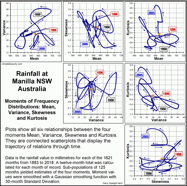
Six graphs of rainfall moment relations

Twelve-monthly values of rainfall since 1883 at Manilla NSW yield the four moments of their frequency distributions: mean, variance, skewness, and kurtosis. I plotted the history of each moment (when smoothed) in an earlier post.
Here, I compare the moments in pairs. Connected scatterplots reveal the trajectory of each relationship with time.
Some linear and cyclic trends persist through decades, but none persists through the whole record.
The first image is an index to the suite of six graphs of pair-wise relationships that I present below.

Rainfall variance vs. mean

Trajectory of Variance versus Mean

Continue reading

Rainfall kurtosis vs. HadCRUT4, revised

Patterns of rainfall kurtosis and global temperature.

The kurtosis of annual rainfall at Manilla NSW forms a time-series that matches the time-series of global surface temperature when detrended.

[REVISED:
Earlier posts were based on rainfall data sets that were too small. Estimates of kurtosis and skewness were unstable. For details please read “Rainfall kurtosis matches HadCRUT4” and “Rainfall kurtosis vs. HadCRUT4: scatterplots”.]

The variables

These two climate variables have little in common. Manilla, NSW, is a single station that has a 134-year record of daily rainfall only. That yields estimates of rainfall kurtosis, an indicator of the relative frequency of extreme values.
HadCRUT4 is one of several century-long estimates of near-surface temperature for the whole world. [See Note below: “Data Sources”.]

The visual match of the patterns

The first graph (a dual-axis line chart) shows that these two variables have similar patterns of variation over time.

I found the best visual match by:
* scaling 0.5 units of Manilla rainfall kurtosis to 0.1° of detrended HadCRUT4 temperature;
* aligning the kurtosis value of -0.3 units with the zero of detrended temperature;
* lagging the rainfall by two years.

Features that the two patterns have in common are:
* matching main peaks at 1897, 1942 and 2005, each higher than the one before;
* persistent low values in the 1910’s, 1920’s, 1950’s, 1960’s, 1970’s and early 1980’s;
*some matching minor peaks and troughs.

Regression rainfall kurtosis on HadCRUT4.

The correlation chart

The second graph is a correlation chart. The linear regression of kurtosis on detrended temperature has the reasonable R-squared value of 0.67.
As I have made it a connected scatterplot, you can see how the relation has changed through time. From the first data point in 1898 (in red) both variables decreased together to the lowest temperature in 1910. Both peaked in 1942, having risen since 1920, later falling until 1955-56. The final rise to the highest peak (2005) was continuous from 1984 for temperature, but the rise in kurtosis was not. It fell slightly in 1990, then remained static until 1998.
All rainfall figures actually came two years earlier. [See note below: “Manilla’s 2-year lead”.] The assigned two-year lag not only makes peaks match on the first graph. It sharpens the reversals on the second graph. On a trial connected scatterplot without lag, these reversals had been smooth clockwise curves.

What it means

As evidence of extreme behaviour in climate

It is said that more extremes in climate will occur as the world becomes warmer. The evidence is not strong. Most data sets are overwhelmed by noise, and “extreme” is seldom defined with rigor.
In the present case, I believe that the definition of “extreme” that I use is sound: that is, the kurtosis of a frequency-distribution. The instability of kurtosis when based on my small samples had been an issue. In this revision I have increased the sample population size from 21 to 125.

My rainfall data set that displays more and less extreme behaviour is not general but local. It can merely suggest that data elsewhere may reveal functional relationships.

De-trended global temperature

Continue reading