Manilla rainfall extremes reflect NINO3.4 temperature

Manilla rainfall matches NINO3.4 sea surface temperature.

(This material justifies a statement in the post “Predict weather from ENSO?”)

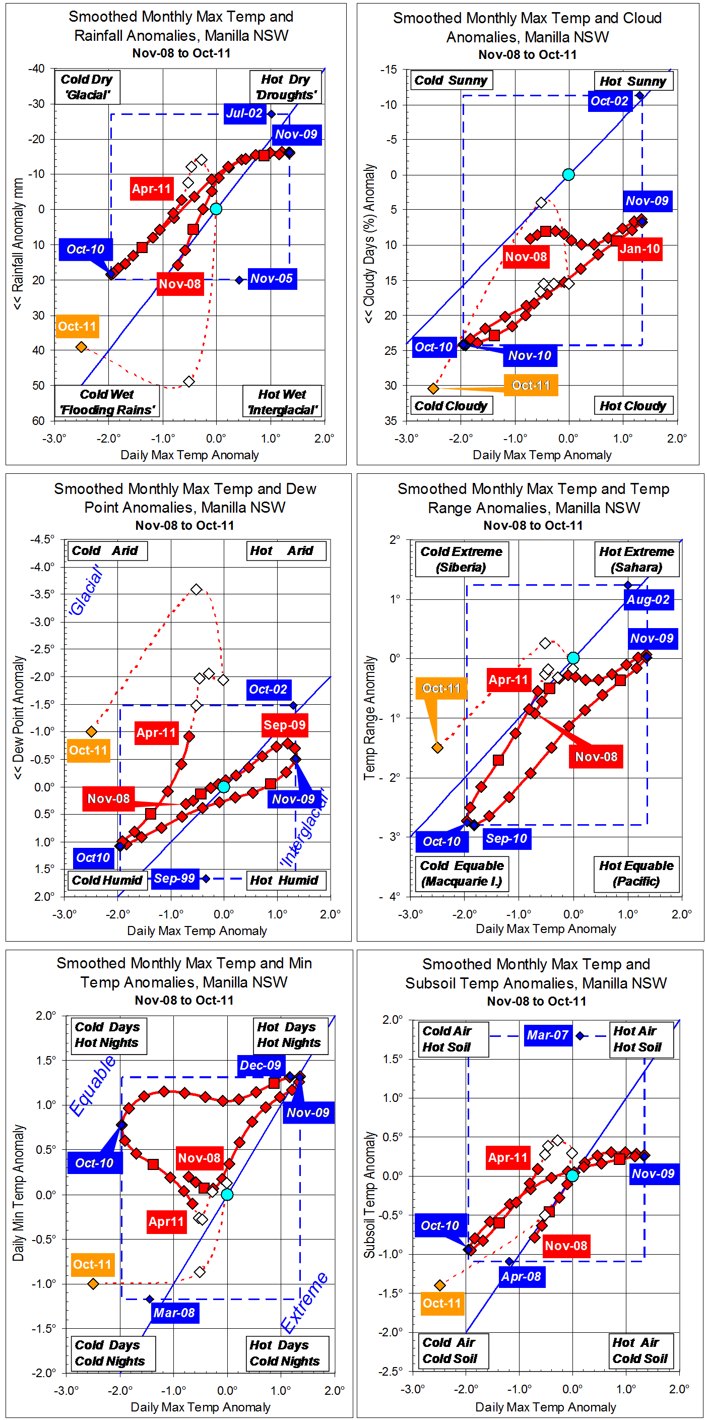
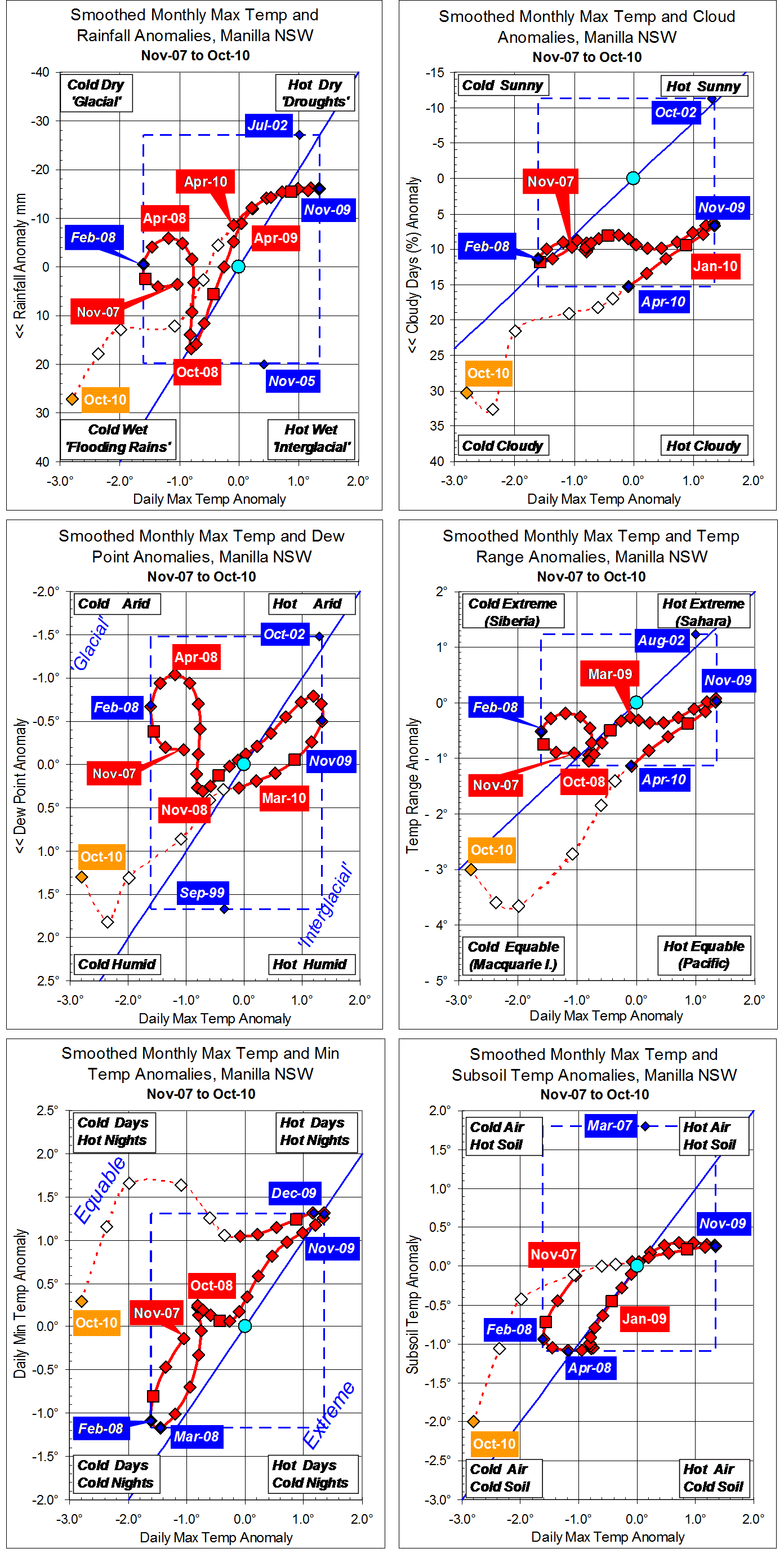
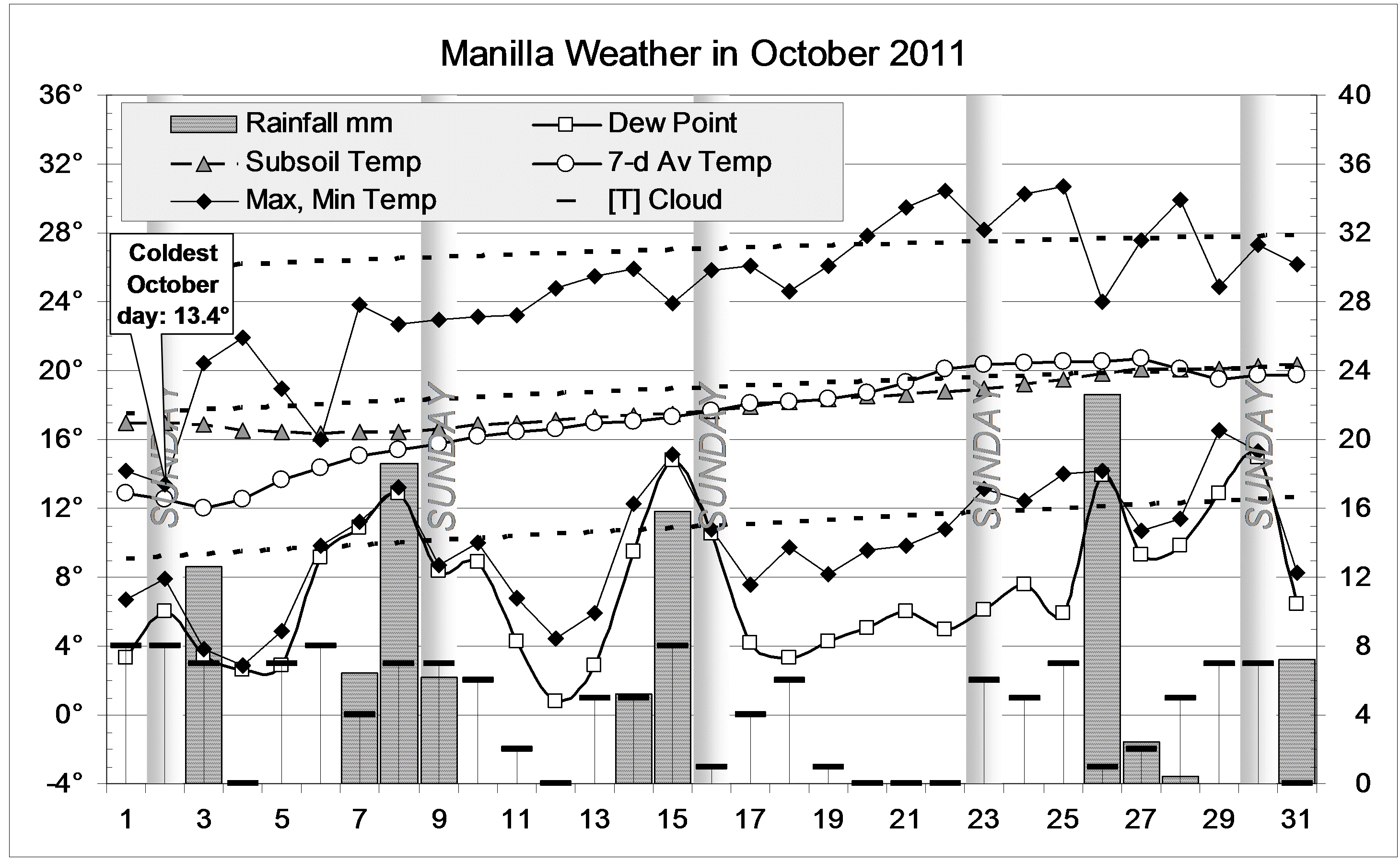
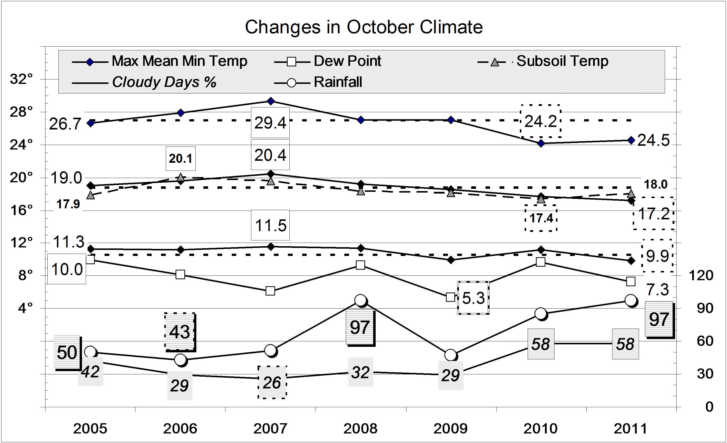
The graphs above are like those in an earlier post, but show how Manilla monthly rainfall anomalies, rather than maximum temperature anomalies relate to the El Nino-Southern Oscillation (ENSO). Most people using ENSO  want to predict Australian regional rainfall.

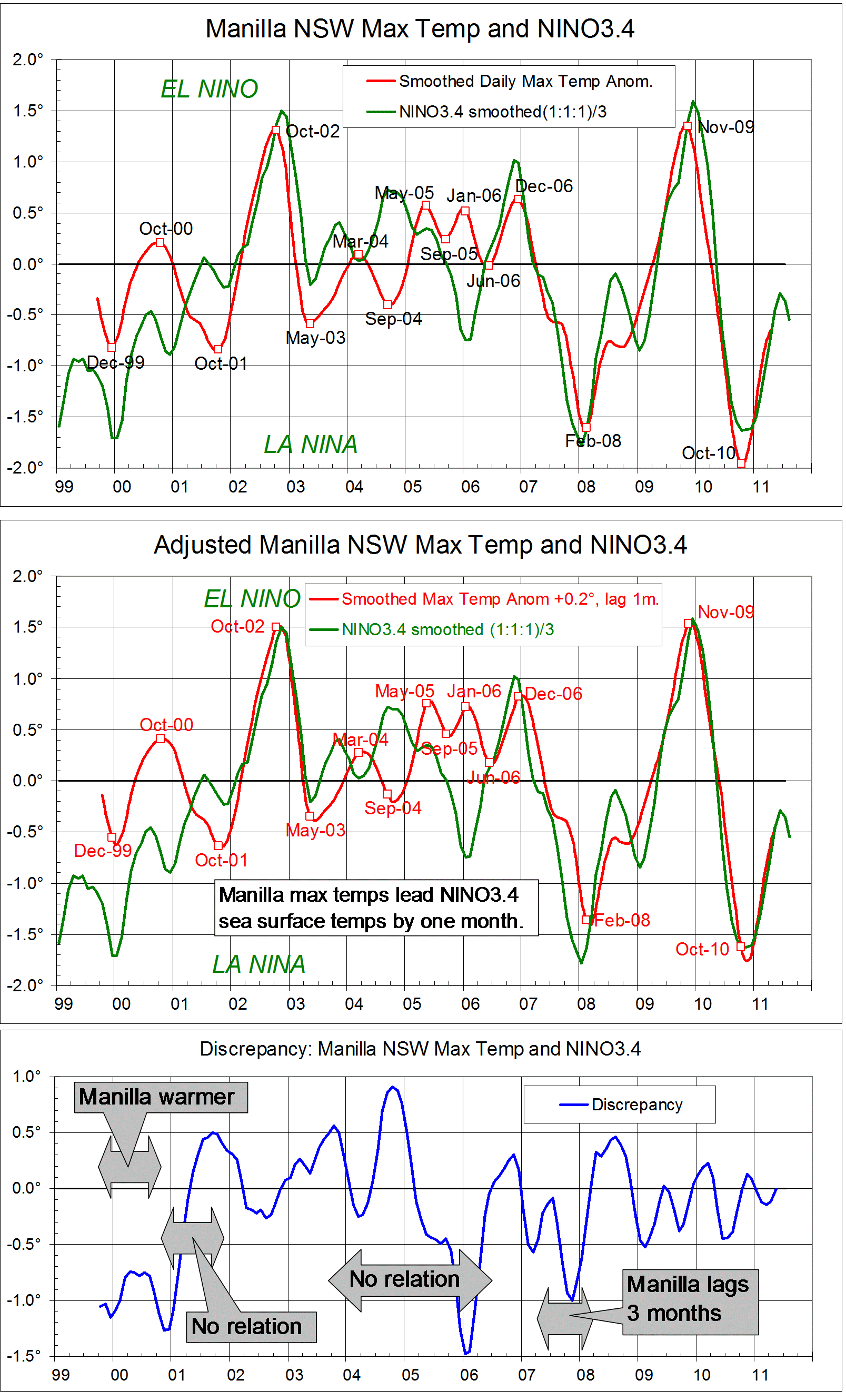
In the second graph I have improved the match at peaks and troughs of smoothed Manilla monthly rainfall anomalies and NINO3.4 sea surface temperature anomaly data in two ways.
1. I converted the sea surface temperature anomaly (degrees C) into a model of resultant rainfall anomaly (mm) by multiplying by minus fifteen.
2. I added 3.7 mm of rainfall to the Manilla figures, and I lagged the data by two months.

To the eye, the over-all correspondence between actual and modelled rainfall is good, but not quite as good as in the temperature graphs. One form of mis-match is that two of the greatest rainfall deficits (“El Nino” Nov-06, Dec-09) are broader and shallower than in the model. (Perhaps an arithmetic measure of rainfall anomaly is not the best.)

The third graph shows how much Manilla rainfall, as adjusted, differs from the rainfall “predicted” by the NINO3.4 model. Dashed lines show limits of a good match at +/- 7.5 mm (corresponding to +/-0.5 degrees). The nature of each larger discrepancy is noted.

A good match demands lagging actual rainfall at Manilla by two months. That implies that peaks and troughs in Manilla rainfall anomalies happen two months before the matching anomalies of NINO3.4. I wonder if prediction is even practical if that is the case in other parts of Australia.

Notes
1. High frequency noise is reduced in the case of the Manilla monthly data by a Gaussian smoothing function of half-width six months.
2. On advice, I represent the El Nino – Southern Oscillation phenomenon (ENSO) by the NINO3.4 area anomalies from the OISSTv2 data set.
My enquiries about the best data to use are in this “weatherzone”  thread.
The ensemble of sea surface temperatures does not have much high-frequency noise. There is some, however, and I have used the same smoothing as used in the (formerly authoritative) Oceanic Nino Index (ONI), that is, a running mean of each three monthly values.


This was posted originally in a “weatherzone” forum, with the date 28 October 2011. It is posted here with the nominal date 16 November 2011.

(Note added: Updated to include 2013 here.)


3-year trends to October 2011

Parametric plots of smoothed climate variables at Manilla

“Suddenly cold and wet”

Trends to October 2011.

Raw values of some climate variables for October 2011 are like those of October 2010 which, when smoothed, turned out to be a record cold-wet climate peak. Using the two sets of graphs (above and below), one can see:

1. Raw data values (orange) and little-smoothed data values flail around wildly, but the fully-smoothed values (red) near October 2010 (at the left edge of each graph above) trace simpler, more regular curves with points more closely spaced.
2. The approach routes to the two sets of raw data October values were quite different.

Graphs from one year earlier: October 2010.

Trends to October 2010.Maximum temperature anomaly values (x-axis, all graphs)

(a) Maximum temperature partly-smoothed values in 2010 fell from normal to extremely low values taking six months;
(b) The maximum temperature smoothed value for October 2010 became the peak of a cold time: a new record low;
(c) Maximum temperature partly-smoothed values in 2011 fell from normal to extremely low values (LIKE 2010) taking only two months (UNLIKE 2010).

Rainfall anomaly values (y-axis, top left graphs)

(a) Extremely high rainfall in October 2010 followed values that had been rising steadily for eight months;
(b) The smoothed rainfall value for October 2010 became the peak of a wet time: a near-record wet;
(c) Extremely high rainfall in October 2011 (UNLIKE 2010) followed even higher rainfall in September, but normal rainfall just before that.

Cloud anomaly values (y-axis, top right graphs)

(a) Extreme cloudiness in October 2010 followed values that had been rising steadily for ten months;
(b) The smoothed cloudiness value for October 2010 was near the November 2010 peak of a cloudy time: a record for smoothed cloudiness;
(c) Extremely cloudiness in October 2011 (UNLIKE 2010) broke a 10-month trend towards LESS cloudiness.

Dew Point anomaly values (y-axis, centre left graphs)

(a) Very high Dew Points in Aug-Sep-Oct 2010 followed values that had been rising steadily for almost a year;
(b) The smoothed Dew Point value for October 2010 became the peak of a humid time: a near-record;
(c) The Dew Point in October 2011 (UNLIKE 2010) was NOT very high: it was still below normal (i.e. arid) following five months of even lower values.

Temperature Range anomaly values (y-axis, centre right graphs)

(a) Extremely low temperature range in October 2010 followed even lower values;
(b) The smoothed temperature range value for October 2010 was close to the September 2010 record peak low value (-2.80 degrees), more than twice as low as the earlier record set in June 2007 (-1.09 degrees);
(c) The temperature range in October 2011 (UNLIKE 2010) was not very low, but it was much lower than the normal values of the preceding six months.

Min temp anomaly values (y-axis, bottom left graphs)

(a) The min temp in October 2010 was normal, following a full year of very high values;
(b) The smoothed min temp for October 2010 was rather high and falling steadily;
(c) The min temps in September and October 2011 (UNLIKE 2010) were very low, following six months of normal values (UNLIKE 2010).

Subsoil temp anomaly values (y-axis, bottom right graphs)

(a) Extremely low subsoil temp in October 2010 followed a rapid fall in the preceding two months;
(b) The smoothed subsoil temp value for October 2010 was near the peak (November 2010) of a near-record time of low subsoil temp;
(c) As in October 2010, extremely low subsoil temp in October 2011 followed a rapid fall in the preceding two months (LIKE 2010).

Note: Fully smoothed data – Gaussian smoothing with half-width 6 months – are plotted in red, partly smoothed data uncoloured, and raw data for the last data point in orange. January data points are marked by squares. Blue diamonds and the dashed blue rectangle show the extreme values in the fully smoothed data record since September 1999.

Wet cloudy October 2011 began cold

The daily weather logWeather log October 2011.

October began very cold throughout NSW, southern Queensland and central Australia. At Manilla the maximum on Sunday the 2nd was only 13.4°: 12.6° below normal, and the coldest October day in 13 years. During the month, the air slowly warmed up to normal. The subsoil was also very cold in the second week, but only slightly cool later.
Rain fell every few days except for the week beginning on Sunday the 16th. Most rain came as showers or storms. The highest reading was 22.6 mm on the 26th. In 10 rain days (3 more than usual) the total was 97.4 mm.

 Comparing October monthsClimate October 2011.

Mean temperature readings and the Dew Point were well below normal. The average October temperature has fallen steadily since October 2007.  While that month was rather dry and sunny, October 2002 was much drier (15 mm rain) and sunnier (only 6% cloudy days).
Fifty-eight percent cloudy mornings is a record high value for October, equal with last year, and more than twice normal.
The rainfall of 97.4 mm is very high, in the 84th percentile for October (Average: 58.1 mm.). Most rainfall totals for groups of months are now high. Among groups of 108 months or less, the driest is the 30-month total which is not very dry: in the 37th percentile. In that 30 months there was 1516 mm of rain, just 100 mm below normal.


Data. Rainfall data is from Manilla Post Office, courtesy of Phil Pinch. Temperatures, including subsoil at 750 mm, and other data are from 3 Monash Street, Manilla.


Manilla temperature matches NINO3.4 temperature.

Manilla maximum air temperature matches NINO3.4 sea surface temperature.

[This material justifies a statement in the post “Predict weather from ENSO?”]

[Note added:
This post relating ENSO to Manilla temperature is matched by similar posts relating ENSO to Manilla rainfall and to Manilla humidity (dew point). Manilla climate peaks and troughs generally happen before the related ENSO peaks and troughs, not after them.]

Smoothed daily maximum temperature anomalies for 140 months at Manilla, NSW are compared with NINO3.4 region Sea Surface Temperature anomalies. They match very closely, especially at peaks and troughs of the Southern Oscillation. The first graph is a log of the data as described in the notes below.
The match can be improved, as in the second graph, by making two adjustments. The reference periods for the anomalies are not the same. In any case it is pure coincidence that the temperature values are so close. I have chosen to add 0.2 degrees to the Manilla figures. At several of the major peaks and troughs the Manilla temperature leads the Sea Surface temperature by one month. I have chosen to lag all the Manilla temperatures by one month.
The third graph quantifies the remaining discrepancies. For most of this short record, the adjusted, one-month lagged Manilla smoothed daily maximum temperatures agreed with ENSO3.4 Sea Surface Temperatures within a margin of 0.5 degrees. Periods when the discrepancy was greater are noted on the graph.
At first (Sep-99 to Nov-00: 15 months) Manilla temperatures were in phase with the Southern Oscillation but one degree warmer.
For a time (Dec-00 to Dec-01: 13 months) there was no agreement.
From Jan-02 to Jun-03 (18 months) temperatures agreed.
From Jul-03 to May-06 (35 months) there was again no agreement.
In the long period (59 months) from Jun-06 to the end of the record in Apr-11, temperatures agreed except for one interruption: Manilla temperature lagged by three months at the La Nina trough of Feb-08, causing a discrepancy of minus one degrees.
In the 140-month record, Manilla temperatures faithfully followed Sea Surface temperatures in 77 months (55%), and were in phase in another 15 months (11%). Times when there were large discrepancies were generally times when the Southern Oscillation was near-neutral.


Notes
1. High frequency noise is reduced in the case of the Manilla monthly data by a gaussian smoothing function of half-width six months.
2. On advice, I represent the El Nino – Southern Oscillation phenomenon (ENSO) by the NINO3.4 area anomalies from the OISSTv2 data set.
My enquiries about the best data to use are in this “weatherzone”  thread.
The ensemble of sea surface temperatures does not have much high-frequency noise. There is some, however, and I have used the same smoothing as used in the (formerly authoritative) Oceanic Nino Index (ONI), that is, a running mean of each three monthly values.


This was posted originally in a “weatherzone” forum, with the date 25 October 2011. It is posted here with the nominal date 28 October 2011, and made “sticky” on 27 May 2014.

3-year trends to September 2011

Parametric plots of smoothed climate variables at Manilla

“Paradoxical Trends.”Trends to September  2011.

September values are paradoxical.They show sudden reversals of trend and unusual relationships between the attributes.

Daily maximum temperature anomaly (x-axis, all graphs), which had been accelerating upwards, fell suddenly below normal.

Monthly rainfall anomaly (y-axis, top left graph), from very low in July, became extremely high.

Cloudiness (top right graph) fell suddenly to a value that was normal three years ago, but not since.

Dew Point anomaly (centre left), having been briefly near normal in August, resumed a trend to extreme aridity.

Temperature range anomaly (centre right) hovered near normal.

Daily minimum temperature anomaly (bottom left) suddenly fell even faster than that of daily maximum temperature

Subsoil temperature anomaly (bottom right), which had been above normal, fell along with daily maximum temperature anomaly.

Note: Fully smoothed data – Gaussian smoothing with half-width 6 months – are plotted in red, partly smoothed data uncoloured, and raw data for the last data point in orange. January data points are marked by squares. Blue diamonds and the dashed blue rectangle show the extreme values in the fully smoothed data record since September 1999.