Manilla temperature matches NINO3.4 temperature.

Manilla maximum air temperature matches NINO3.4 sea surface temperature.

[This material justifies a statement in the post “Predict weather from ENSO?”]

[Note added:
This post relating ENSO to Manilla temperature is matched by similar posts relating ENSO to Manilla rainfall and to Manilla humidity (dew point). Manilla climate peaks and troughs generally happen before the related ENSO peaks and troughs, not after them.]

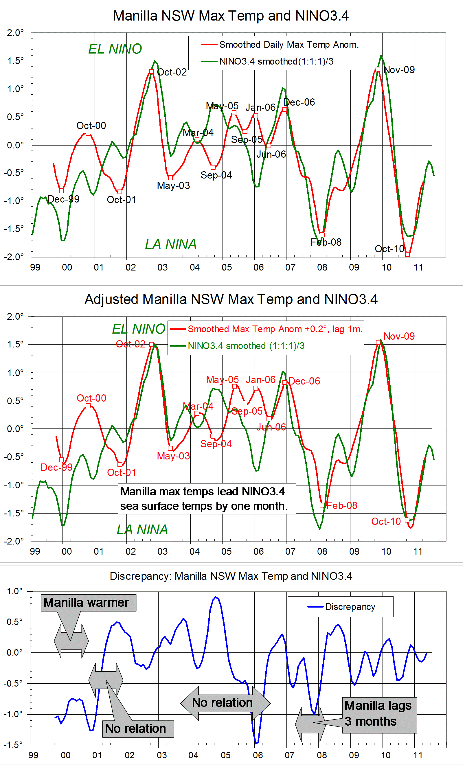
Smoothed daily maximum temperature anomalies for 140 months at Manilla, NSW are compared with NINO3.4 region Sea Surface Temperature anomalies. They match very closely, especially at peaks and troughs of the Southern Oscillation. The first graph is a log of the data as described in the notes below.
The match can be improved, as in the second graph, by making two adjustments. The reference periods for the anomalies are not the same. In any case it is pure coincidence that the temperature values are so close. I have chosen to add 0.2 degrees to the Manilla figures. At several of the major peaks and troughs the Manilla temperature leads the Sea Surface temperature by one month. I have chosen to lag all the Manilla temperatures by one month.
The third graph quantifies the remaining discrepancies. For most of this short record, the adjusted, one-month lagged Manilla smoothed daily maximum temperatures agreed with ENSO3.4 Sea Surface Temperatures within a margin of 0.5 degrees. Periods when the discrepancy was greater are noted on the graph.
At first (Sep-99 to Nov-00: 15 months) Manilla temperatures were in phase with the Southern Oscillation but one degree warmer.
For a time (Dec-00 to Dec-01: 13 months) there was no agreement.
From Jan-02 to Jun-03 (18 months) temperatures agreed.
From Jul-03 to May-06 (35 months) there was again no agreement.
In the long period (59 months) from Jun-06 to the end of the record in Apr-11, temperatures agreed except for one interruption: Manilla temperature lagged by three months at the La Nina trough of Feb-08, causing a discrepancy of minus one degrees.
In the 140-month record, Manilla temperatures faithfully followed Sea Surface temperatures in 77 months (55%), and were in phase in another 15 months (11%). Times when there were large discrepancies were generally times when the Southern Oscillation was near-neutral.


Notes
1. High frequency noise is reduced in the case of the Manilla monthly data by a gaussian smoothing function of half-width six months.
2. On advice, I represent the El Nino – Southern Oscillation phenomenon (ENSO) by the NINO3.4 area anomalies from the OISSTv2 data set.
My enquiries about the best data to use are in this “weatherzone”  thread.
The ensemble of sea surface temperatures does not have much high-frequency noise. There is some, however, and I have used the same smoothing as used in the (formerly authoritative) Oceanic Nino Index (ONI), that is, a running mean of each three monthly values.


This was posted originally in a “weatherzone” forum, with the date 25 October 2011. It is posted here with the nominal date 28 October 2011, and made “sticky” on 27 May 2014.

3-year trends to August 2008

Parametric plots of smoothed climate variables at Manilla
“Years with unusual trends”

Trends to August 2008

These graphs, ending with raw data for August 2008, show fully-smoothed data from September 2005 to February 2008. They include all months of the calendar years 2006 and 2007.
Smoothed daily maximum temperature anomaly (X-axis on all graphs) began 2006 high in the “normal” range, fell to normal by June, and rose again to +0.63°  in November and December. It then fell from high to very low through 2007, reaching the record low value of -1.61°  by February 2008. (Note added: This record low maximum temperature anomaly stood for only 19 months, until September 2010.)
Smoothed rainfall anomaly peaked at +20.6 mm in November 2005, fell rapidly to -11.7 mm in June 2006 and slowly to -14.6 mm in October 2006. It rose again to just above normal by February 2007, and changed little in the following year.
Smoothed percent cloudy mornings followed a similar course to that of rainfall but, as temperature fell through 2007, cloudiness (unlike rainfall) increased, as is normal,  along the blue trend-line.
(Note added in May 2014: Although the minimum value of the cloudiness anomaly in August 2006 (-7.7%) is less negative than the record minimum in August 2002 (-11.3%) (or even than the minimum in February 2005 (-9.1%)) it is more negative than any later value. No smoothed negative values at all were recorded in almost seven years between February 2007 and October 2013.)
Smoothed dew point anomaly also followed a similar course to that of rainfall but, unlike cloudiness, actually declined as temperature fell during 2007. Temperature range anomaly moved like dew point anomaly.
Daily minimum temperature mainly varied in the same sense as daily maximum temperature, but at a higher rate. As an exception, from January to June 2007, it rose slightly as maximum temperature fell. That moved the curve towards a more “maritime” climate for the rest of the time. Subsoil temperature anomaly moved in a similar pattern.

Unusual trends

Through the years 2006 and 2007 shown here, the climate moved as much along the axis from top left to bottom right, as along the usual axis from top right to bottom left. It departed from the typical Quasi-biennial oscillation of “droughts and flooding rains”*. (Note added: The extreme negative maximum temperature anomaly of February 2008 was the only one on this record that was not linked to an extreme positive rainfall anomaly.)
(Note added concerning global temperature: At this time there was a sudden major cooling in mean air temperature, both locally and globally. This linked post  shows that, when 37-month averages of global and local values are plotted, mean temperature fell from a peak in April or May 2006 to a trough in October 2007, breaking the global warming trend. The global (GISS) value fell by 0.074° (and the Manilla value by 0.48°). The connection is enigmatic. The unusual trends shown here do not match the dates of the cooling event, but come mainly before or after it.)

* By arrangement with the Licensor, The Dorothea Mackellar Estate, c/- Curtis Brown (Aust) Pty Ltd.

Note:
Fully smoothed data – Gaussian smoothing with half-width 6 months – are plotted in red, partly smoothed data uncoloured, and raw data for the last data point in orange. January data points are marked by squares.
Normal values are based on averages for the decade from March 1999. They appear on these graphs as a turquoise (turquoise) circle at the origin (0,0). A range of anomalies called “normal” is shown by a dashed rectangle in aqua (aqua). For values in degrees, the assigned normal range is +/-0.7°; for cloudiness, +/-7%; for monthly rainfall, +/-14 mm.

(Note added in May 2014: A much later post titled “3-year trends to May 2010” is the first of a consecutive series of parametric plots, updated monthly at the time of observation and originally posted elsewhere.
This earlier data was not edited in this form at the time.
To display all existing fully-smoothed data points at least once, I have prepared these back-dated posts in the same format for:
“3-year trends to August 2002” which includes smoothed data September 1999 to February 2002, covering the calendar years 2000 and 2001.
“3-year trends to August 2004” which includes smoothed data September 2001 to February 2004, covering the calendar years 2002 and 2003.
“3-year trends to August 2006” which includes smoothed data September 2003 to February 2006, covering the calendar years 2004 and 2005.
“3-year trends to August 2008” (this post) which includes smoothed data September 2005 to February 2008, covering the calendar years 2006 and 2007.
In these back-dated posts the anomaly values depend on climate normals that are based on the decade ending February 2009, and were thus not available until after that date. I have written the posts as if they were available at the time.
In places I have written some “Notes added in May 2014” (like this) commenting on how values observed at that time relate to more recent events.)


3-year trends to August 2004

Parametric plots of smoothed climate variables at Manilla

“An extreme 1-year drought”

Trends to August 2004

At Manilla a sudden extreme drought peaked in winter and spring of 2002. Each of seven climate variables went through a large cycle, with a peak at the top right-hand corner of its graph.

(Note added in May 2014: This 2002 event is the most extreme rainfall drought at Manilla so far in the 21st century. Current conditions may perhaps be similar.)

Extreme values of anomalies.

The smoothed anomaly of daily maximum temperature (X-axis on all graphs) exceeded +0.7° in June 2002, and remained above that value until December. It peaked at +1.30° in September-October 2002. (Note added: This stood as a record high value for seven years until October 2009.)
Smoothed monthly rainfall anomaly fell below -14 mm in February 2002, and remained below that value until November. It peaked (negative) at -27.1 mm in July 2002. (Note added: In May 2014 this still stands as a record low value.)
The smoothed anomaly of percent cloudy mornings (more than 4 octas) fell below -7% in July 2002, and remained below that value until December 2002. It peaked (negative) at -11.3% in October 2002. (Note added: In May 2014 this still stands as a record low value. More cloud in recent years has made negative anomalies rare.)
The smoothed anomaly of early morning dew point fell below -0.7° in May 2002, and remained below that value until January 2003. It peaked (negative) at -1.48°  in September-October 2002. (Note added: This stood as a record low value until June 2011. Since then, the air has become much drier, taking anomaly values three times as low.)
The smoothed anomaly of daily temperature range, like that of daily maximum temperature, was positive during the drought. It exceeded +0.7° in April 2002, and remained above that value until November. It peaked at +1.23°  in July-August 2002. (Note added: In May 2014 this still stands as a record high value.)
Smoothed daily minimum temperature anomaly reached a maximum of only +0.38° at the peak of the drought in November 2002. It had risen smoothly from the strongly negative value of -0.91° in November 2001. Through 2002, the rise in daily minimum temperature lagged behind that of daily maximum temperature, resulting in a “continental” type of climate with wide daily temperature range. (Note added: Higher daily minimum temperature anomalies occurred in winter 2007, and much higher ones in spring 2009.)
The smoothed anomaly of subsoil temperature, like that of daily maximum temperature, was positive during the drought. It exceeded +0.7° in August 2002, and remained above that value until February 2003. It peaked at +1.48°  in November 2002. (Note added: This value was exceeded from January to May 2007, and further exceeded in winter 2013.)

Leads and lags.

The climate variables did not all peak at once: some led, and some lagged. In the table below I show three estimates of lead or lag (in months):

  1. I identified dates of peak value on the graphs;
  2. I noted a point mid-way between the date of departure from normal and that of return to normal as the median date;
  3. Where the line on the graph formed a hysteresis loop (shown by a curved arrow), I drew other graphs with a lead or lag imposed to compensate for the actual lead or lag. I estimated the amount of lead or lag that would make the loop into a straight line.

Table of leads and lags of climate anomaly variables

In the table, I take the dates for highest excess of daily maximum temperature as the standard, to show the pattern of leads and lags of the other variables. Rainfall deficit led by 2.3 months and daily temperature range excess led by 1.8 months. Early morning dew point deficit (dry air) did not lead or lag. The deficit in cloud amount lagged by 0.4 months, and the excess of both daily minimum temperature and subsoil temperature lagged by 1.8 months.
(Note added: Leads and lags in more recent climate events at Manilla have a pattern that is similar, but not the same.)

Note:
Fully smoothed data – Gaussian smoothing with half-width 6 months – are plotted in red, partly smoothed data uncoloured, and raw data for the last data point in orange. January data points are marked by squares.
Normal values are based on averages for the decade from March 1999. They appear on these graphs as a turquoise (turquoise) circle at the origin (0,0). A range of anomalies called “normal” is shown by a dashed rectangle in aqua (aqua). For values in degrees, the assigned normal range is +/-0.7°; for cloudiness, +/-7%; for monthly rainfall, +/-14 mm.

(Note added in May 2014: A much later post titled “3-year trends to May 2010” is the first of a consecutive series of parametric plots, updated monthly at the time of observation and originally posted elsewhere.
This earlier data was not edited in this form at the time.
To display all existing fully-smoothed data points at least once, I have prepared these back-dated posts in the same format for:
“3-year trends to August 2002” which includes smoothed data September 1999 to February 2002, covering the calendar years 2000 and 2001.
“3-year trends to August 2004” (this post) which includes smoothed data September 2001 to February 2004, covering the calendar years 2002 and 2003.
“3-year trends to August 2006” which includes smoothed data September 2003 to February 2006, covering the calendar years 2004 and 2005.
“3-year trends to August 2008” which includes smoothed data September 2005 to February 2008, covering the calendar years 2006 and 2007.
In these back-dated posts the anomaly values depend on climate normals that are based on the decade ending February 2009, and were thus not available until after that date. I have written the posts as if they were available at the time.
In places I have written some “Notes added in May 2014” (like this) commenting on how values observed at that time relate to more recent events.)