Rainfall kurtosis matches HadCRUT4

Line chart rainfall kurtosis vs. HadCRUT (detrended)

The kurtosis of annual rainfall at Manilla NSW forms a time-series that matches the time-series of global surface temperature when de-trended.

[SUPERSEDED
This post had inadequate data. It is now superseded by the post “Rainfall kurtosis vs. HadCRUT4, revised” of 20 May 2018.]

Features of the data

Data sources, noted on the graph, are specified below. The best match is achieved by decadal smoothing, by scaling 1.0 units of kurtosis to 0.16 degrees of temperature, and by lagging the rainfall data five years.

Closeness of the match

Although both variables have irregular traces, their patterns are almost the same. They begin and end very high, have a broad peak near 1943, and are low in the 1910’s, 1920’s, 1950’s, 1960’s and 1970’s.
The match is very close for ninety years from 1915 to 2005, except for one decade (at 1972). In all this time, both the values and the slopes (as scaled) agree. [See the Note below “1991-1992”.]

Before 1915, the patterns do not match well, but they remain similar. Both traces descend rapidly together from 1903 to 1910. The initial peak in the rainfall trace at 1903 (actually 1898) is similar in height (as scaled) to a peak of the de-trended temperature trace just off the graph at 1879.

Discovering the pattern match

I was seeking a robust measure of the occurrence of extreme values in annual rainfall at Manilla, NSW. As kurtosis is just such a measure, I calculated it. I then plotted out the time-series, as shown here. It reminded me of the well-established time-series of smoothed HadCRUT4 global near-surface temperature. In particular, I recalled a locally-dominant peak near 1940.

Line chart rainfall kurtosis vs. HadCRUT
Simply reconciling the vertical scales of the two time-series gave me the second graph.
While not matching in details, the two curves remain very close from 1940 to 1995. Matching over the whole rainfall record is prevented by a difference in trend. While the rainfall kurtosis has no trend, the HadCRUT4 curve has a secular trend rising at half a degree per century (known as “global warming”).
To extend and improve the match, I subtracted the linear trend from the global temperature curve, and lagged the rainfall points by five years. The first graph is the closely-matching result.

What it means

As evidence of extreme behaviour in climate

It is said that more extremes in climate will occur as the world becomes warmer. The evidence is not strong. Most data sets are overwhelmed by noise, and “extreme” is seldom defined with rigor.
In the present case, I believe that the definition of “extreme” that I use is sound: that is, the kurtosis of a frequency-distribution. Only the instability of kurtosis when based on small samples is an issue.

My rainfall data set that displays more and less extreme behaviour is not general but local. It can merely suggest that data elsewhere may reveal functional relationships.

Connected Scatterplot rainfall kurtosis vs. HadCRUT from 1908A very strong and persistent empirical relationship is shown by the graphical logs above. In another post, “Rainfall Kurtosis vs. HadCRUT4  Scatterplots”, I show scatterplots like this in support of it.

De-trended global temperature

This strong link between local annual rainfall kurtosis and global climate has a surprising feature. Although this extreme behaviour seems to relate to global temperature, it does not relate to global warming! It relates to a temperature trace from which the global warming trend has been removed. Times of high kurtosis, denoting enhanced extremes, correspond to times when the global temperature was highest above trend. Such times occurred not only in the twenty-first century, but equally in the nineteenth century. There was another (widely-known), lower peak in de-trended global temperature near 1940: at that time also kurtosis was above normal.

Should global temperature remain static for a time, it would be falling rapidly below its rising trend. According to this data set, that should bring reduced extreme behaviour in annual rainfall at Manilla.


Data Sources

(i) Global temperature time-series

From the three available century-long time series of global near-surface temperature I have chosen to use HadCRUT4, published by the British Met Office Hadley Centre. The link is here.

I selected from the section: “HadCRUT4 time series: ensemble medians and uncertainties”.
From this, I downloaded two files:
(i) “Global (NH+SH)/2, annual”;
(ii) “Global (NH+SH)/2, decadally smoothed”.
[The “Decadally smoothed” data supplied is annual data smoothed with a 21-point binomial filter.]
From each data file, I used only the first column: the year date, and the second column: the median value.

I established the secular trend of global warming using the linear trend function in Charts for “Excel”. I found the linear trend of the whole HadCRUT4 annual series data (1850 to 2016) to be:

y = 0.005x – 0.52.

I then subtracted the annual value at the trend line from the decadally smoothed HadCRUT4 value to get the de-trended smoothed value shown on the first graph.

(ii) Kurtosis of Manilla annual rainfall

The rainfall data is that for Manilla Post Office, Station 055031 of the Australian Bureau of Meteorology. Station 055031 functioned without gaps from 1883 to March 2015. Since then, the official record is fragmentary.
I found kurtosis values for annual rainfall by using the (excess) kurtosis function in “Excel”. I used sub-populations of 21 successive years, referred to the median year. I found values for the years 1893 to 2006. I smoothed these values with a 9-point gaussian filter (yielding similar smoothing to that of HadCRUT4). Smoothing reduced the plottable years to those from 1897 to 2002.

Manilla yearly rainfall history: four momentsI posted a line graph of this kurtosis data earlier, in “Moments of Manilla’s Yearly Rainfall History”.


Note: 1991-1992

The most striking match in the graph is that both traces pause at 1991-1992 within a two-decade-long steady rapid rise. That pause in the global temperature series has been attributed with little doubt to the injection into the atmosphere of seventeen million tonnes of sulphur dioxide by the eruption of Mount Pinatubo in the Philippines. That eruption cannot have affected the rainfall kurtosis five years earlier.

Moments of Manilla’s Yearly Rainfall History

Manilla Annual rainfall history: Four moments

Comparing all four moments of the frequency-distributions

Annual rainfall for Manilla, NSW, has varied widely from decade to decade, but it is not only the mean amounts that have varied. Three others measures have varied, all in different ways.

I based the graph on 21-year sub-populations of the 134-year record, centred on consecutive years. I analysed each sub-population as a frequency-distribution, to give values of the four moments: mean (drawn in black), variance (drawn in red), skewness (drawn in blue) and kurtosis (drawn in magenta).

[For more about the moments of frequency-distributions, see the recent post: “Kurtosis, Fat Tails, and Extremes”. See also the Note below: “Instability in the third and fourth moments.”]

Each trace of a moment measure seems to have a pattern: they are not like random “noise”. Yet each trace is quite unlike the others.

The latest values are on the right. They show that the annual rainfall is now remarkable in all four respects. First, the mean rainfall (black) closely matches the long-term mean, which has seldom happened before. By contrast, the other three moments are now near historical extremes: variance (red) is very low, skewness (blue) very negative, and kurtosis (magenta) very positive.

To my knowledge, such a result has not been observed or predicted, or even suspected, anywhere.

[SEE A REVISED VERSION OF THIS WORK
A revised version of this post uses twelve times as much data. It is “Moments of Manilla’s 12-monthly Rainfall” posted on 15 May 2018.]

Manilla Annual rainfall history: Mean

The mean yearly rainfall (the first moment)

As I have shown before, the mean annual rainfall was low in the first half of the 20th century, and high in the 1890’s, 1960’s and 1970’s. Rainfall crashed in 1900 and again in 1980.

Manilla Annual rainfall history: Variance

Yearly rainfall variance (the second moment)

Continue reading

Kurtosis, Fat Tails, and Extremes

sketch demonstrating kurtosis

PLATYKURTIC left; LEPTOKURTIC right

Why must I explain “kurtosis”?

Manilla 21-year rainfall mediansThe annual rainfall at Manilla, NSW has changed dramatically decade by decade since the record began in 1883. One way that it has changed is in the amount of rain each year, as shown in this graph that I posted earlier.

Another way, unrelated to the amount of rain, is in its kurtosis. Higher kurtosis brings more rainfall values that are extreme; lower kurtosis brings fewer. We would do well to learn more about rainfall kurtosis.

[A comment on the meaning of kurtosis by Peter Westfall is posted below.]

Describing Frequency Distributions

The Normal Distribution

Many things vary in a way that seems random: pure chance causes values to spread above and below the average.
If the values are counted into “bins” of equal width, the pattern is called a frequency-distribution. Randomness makes this pattern form the unique bell-shaped curve of Normal Distribution.

Histogram of annual rainfall frequency at Manilla NSWThe values of annual total rainfall measured each year at Manilla have a frequency-distribution that is rather like that. This graph compares the actual distribution with a curve of Normal Distribution.

Moments of a Normal Distribution: (i) Mean, and (ii) Variance

The shape of any frequency-distribution is described in a simple way by a set of four numbers called moments. A Normal Distribution is described by just the first two of them.
The first moment is the Mean (or average), which says where the middle line of the values is. For Manilla annual rainfall, the Mean is 652 mm.
The second moment is the Variance, which is also the square of the Standard Deviation. This second moment says how widely spread or scattered the values are. For Manilla annual rainfall, the Standard Deviation is 156 mm.

Moments of other (non-normal) distributions: (iii) Skewness, and (iv) Kurtosis

The third moment, Skewness, describes how a frequency-distribution may have one tail longer than the other. When the tail on the right is longer, that is called right-skewness, and the skewness value is positive in that case. For the actual frequency-distribution of Manilla annual rainfall, the Skewness is slightly positive: +0.268. (That is mainly due to one extremely high rainfall value: 1192 mm in 1890.)
Kurtosis is the fourth moment of the distribution. It describes how the distribution differs from Normal by being higher or lower in its peak (but see the comments below) or its tails, as compared to its shoulders.
As it was defined at first, a Normal Distribution had the kurtosis value of 3, but I (and Excel) use the convention “excess kurtosis” from which 3 has been subtracted. Then the excess kurtosis value for a Normal Distribution is zero, while the kurtosis of other, non-normal distributions is either positive or negative.

Smoothed rainfall frequency and a platykurtic curveManilla’s total frequency distribution of annual rainfall has a Kurtosis of -0.427. As shown here (copied from an earlier post), I fitted a curve with suitably negative kurtosis to Manilla’s (smoothed) annual rainfall distribution.

Platykurtic, Mesokurtic, and Leptokurtic distributions

Karl Pearson invented the terms: platykurtic for (excess) kurtosis well below zero, mesokurtic for kurtosis near zero, and leptokurtic for kurtosis well above zero.
The sketch by W S Gosset at the top of this page shows the typical shapes of platykurtic and leptokurtic curves.
(See the Note below: ‘The sketch by “Student”‘.)

In the two graphs that follow, I show how a curve of Normal Distribution can be modified to be leptokurtic (+ve) or platykurtic (-ve) while remaining near-normal in shape. (See the note “Constructing the kurtosis adjuster”)
In both of these graphs, I have drawn the curve of Normal Distribution in grey, with call-outs to locate the mean point and the two “shoulder” points that are one Standard Deviation each side of the mean.

A leptokurtic curve

A leptokurtic (+ve) curve

By adding the “adjuster curve” (red) to the Normal curve, I get the classical leptokurtic shape (green) as was sketched by Gosset. It has a higher peak, lowered shoulders, and fat tails. The shape is like that of a volcanic cone: the peak is narrow, and the upper slopes steep. The slopes get gentler as they get lower, but not as gentle as on the Normal Curve.

A platykurtic curve

A platykurtic (-ve) curve

Continue reading

A drought has begun

A year ago, I showed that Manilla was far from being in a drought. That is not true now. There are severe shortages of rain.

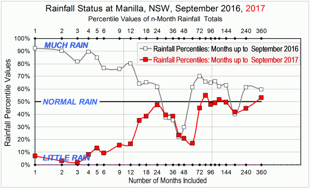
Rainfall status at Manilla, September 2016 and September 2017.

The first graph has rainfall totals up the left margin. They are not expressed in millimetres but as percentile values, Along the bottom margin is the number of months included in calculating each rainfall total.

On the graph, I have compared the rainfall situation today, September 2017, plotted in red with that of September 2016, plotted in grey. Much has changed.

Take, for example, the 12-month (one-year) rainfall total. Rainfall totals for 12 month periods are directly above the value “12” at the bottom of the graph, near the label “Number of Months included”. In data for the month of September 2016 (grey), the 12-month total (actually 802 mm) had been at the 80th percentile, which was very high. In up-to-date data for the month of September 2017 (red), the 12-month total (actually 484 mm) is at the 17th percentile, which is very low.
Although rainfall totals for  periods longer than 12 months have not fallen so much, nearly all of them have fallen. Three that have not are those for 30 months, 36 months and 42 months. They were already low, due to including in them some months of low rainfall several years ago, in 2013 and 2014.

So far, real shortages have occurred mainly within the last 12 months. Beyond that, the two-year rainfall total of 1285 mm, for example, is still near normal, plotting at the 48th percentile.

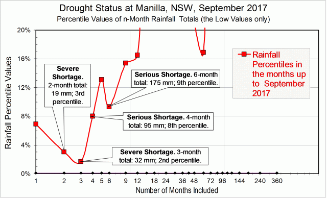
The second graph shows in detail how shortages that are serious or severe have developed during the last six months. These were the monthly rainfall amounts, with the normal amounts in brackets:

April: 24.0 mm (39.3);
May: 55.6 mm (40.3);
June: 62.8 mm (44.3);
July: 13.2 mm (41.4);
August: 13.8 mm (39.5);
September: 5.5 mm (41.2).

As a result, the current situation is as shown below. There are already severe rainfall shortages, at the 2nd or 3rd percentile, in the two-month and three-month totals to date. There are also serious shortages, at the 8th and 9th percentiles, in the four-month and six-month totals to date.

Drought status at Manilla in September 2017

I will update these graphs each month to show how the situation changes.

[Monthly updates were not posted because serious rainfall shortages did not occur in any following months up to March 2018. The next post with a graph and analysis like this one was “Rainfall Shortages up to May 2018” of 15/6/2018.]

[This 2018-19 drought became the worst ever experienced at Manilla. Records for the lowest-ever rainfall totals were broken repeatedly. See, for example (June 2019)  “June breaks more drought records”.]

Annual Rainfall Extremes at Manilla NSW: IV

IV. Some distributions had heavy tails

Graph of history of heavy tails in Manilla annual rainfall

This graph is based on applying a 21-year sampling window to each year in the Manilla rainfall record, then adding smoothing. (See “Note about Sampling” below.)

“Heavy tails”

In the previous postI plotted only the most extreme high and low values of annual rainfall in each sampling window. Now, I choose two rainfall amounts (very high and very low) to define where the “Tails” of the frequency distribution begin. These Tails are the parts that I will call “extreme”. I count the number of values that qualify as extreme by being within the tails.
In this post, I recognise heavy tails, when before I recognised long tails.


Back to the prelude “Manilla’s Yearly Rainfall History”.
Back to Extremes Part I.
Back to Extremes Part II.
Back to Extremes Part III.

Forward to Extremes Part V.


Making the graph

The long-term Normal Distribution

The graph relies on the long-term Normal Distribution curve (“L-T Norm. Dist.” in the legend of the graph). That is, the curve that I fitted earlier to the 134-year record of annual rainfall values at Manilla NSW.
Histogram annual rainfall frequency Manilla NSWThe graph is copied here.

I defined as “Extreme Values” those either below the 5th percentile or above the 95th percentile of the fitted Normal Distribution. That is to say, those that were more than 1.645 times the Standard Deviation (SD = 156 mm) below or above the Mean (M = 652 mm). When expressed in millimetres of annual rainfall, that is less than 395 mm or more than 909 mm.
These ‘Tails’ of the Normal Distribution each totalled 5% of the modeled population, making 10% when added together.

The data

For each year’s 21-year sample, I counted those rainfall values that were lower than 395 mm (for the Low Tail) and those higher than 909 mm (for the High Tail). I added the two to give a count for Both Tails. To get a percentage value, I divided by 21.
I then found the ratio of this value to that of the fitted long-term Normal Distribution by dividing by 5% for each tail, and by 10% for both tails together. Ratios above 1.0 are Heavy Tails, and ratios below 1.0 are Light Tails.
That ratio, when smoothed, is plotted on the main graph at the head of the page.

Results

The resulting pattern of heavier and lighter tails, shown above, is similar to that found by using more and less extreme values, shown in the graph copied here.

Graph of history of extremes of annual rainfallAs before, there were less extremes in the 1900’s, 1910’s, 1920’s and 1930’s.
As before, there were more extremes in the 1940’s and 1950’s.
In the 1890’s, the “Tails” graph did not confirm the more extreme values that had been found earlier.

The 1990’s discrepancy

Extremes had been near normal through the last five decades in the earlier graph. By contrast, the “Tails” graph shows extremes in the most recent decade, the 1990’s, that were just as high as those in the 1950’s. Those two episodes differ, however: in the 1950’s only the high tail was heavy; in the 1990’s, only the low tail was heavy.
(For the 1990’s heavy low tail, see the Note below.)

The inadequacy of the data

Continue reading