IV. Some distributions had heavy tails

This graph is based on applying a 21-year sampling window to each year in the Manilla rainfall record, then adding smoothing. (See “Note about Sampling” below.)
“Heavy tails”
In the previous post, I plotted only the most extreme high and low values of annual rainfall in each sampling window. Now, I choose two rainfall amounts (very high and very low) to define where the “Tails” of the frequency distribution begin. These Tails are the parts that I will call “extreme”. I count the number of values that qualify as extreme by being within the tails.
In this post, I recognise heavy tails, when before I recognised long tails.
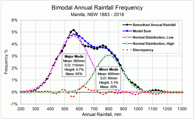
Back to the prelude “Manilla’s Yearly Rainfall History”.
Back to Extremes Part I.
Back to Extremes Part II.
Back to Extremes Part III.
Forward to Extremes Part V.
Making the graph
The long-term Normal Distribution
The graph relies on the long-term Normal Distribution curve (“L-T Norm. Dist.” in the legend of the graph). That is, the curve that I fitted earlier to the 134-year record of annual rainfall values at Manilla NSW.
 The graph is copied here.
I defined as “Extreme Values” those either below the 5th percentile or above the 95th percentile of the fitted Normal Distribution. That is to say, those that were more than 1.645 times the Standard Deviation (SD = 156 mm) below or above the Mean (M = 652 mm). When expressed in millimetres of annual rainfall, that is less than 395 mm or more than 909 mm.
These ‘Tails’ of the Normal Distribution each totalled 5% of the modeled population, making 10% when added together.
The data
For each year’s 21-year sample, I counted those rainfall values that were lower than 395 mm (for the Low Tail) and those higher than 909 mm (for the High Tail). I added the two to give a count for Both Tails. To get a percentage value, I divided by 21.
I then found the ratio of this value to that of the fitted long-term Normal Distribution by dividing by 5% for each tail, and by 10% for both tails together. Ratios above 1.0 are Heavy Tails, and ratios below 1.0 are Light Tails.
That ratio, when smoothed, is plotted on the main graph at the head of the page.
Results
The resulting pattern of heavier and lighter tails, shown above, is similar to that found by using more and less extreme values, shown in the graph copied here.
 As before, there were less extremes in the 1900’s, 1910’s, 1920’s and 1930’s.
As before, there were more extremes in the 1940’s and 1950’s.
In the 1890’s, the “Tails” graph did not confirm the more extreme values that had been found earlier.
The 1990’s discrepancy
Extremes had been near normal through the last five decades in the earlier graph. By contrast, the “Tails” graph shows extremes in the most recent decade, the 1990’s, that were just as high as those in the 1950’s. Those two episodes differ, however: in the 1950’s only the high tail was heavy; in the 1990’s, only the low tail was heavy.
(For the 1990’s heavy low tail, see the Note below.)