II. Platykurtic, Bimodal Annual Rainfall

Manilla’s 134 years of rainfall readings yield the graph above. There are several features to notice.
Back to the prelude “Manilla’s Yearly Rainfall History”.
Back to Extremes Part I.
Forward to Extremes Part III.
Forward to Extremes Part IV.
Forward to Extremes Part V.
A ragged pattern
Despite having as many as 134 annual rainfall values, the graph is still ragged. Some of the 20 mm “bins” near the middle have less than 2% of the observations, while others have over 5%. The pattern has not yet become smooth.
It is not near a normal distribution
Rainfall is thought of as a random process, likely to match a curve of normal distribution. On the first two graphs I have drawn the curve of normal distribution that best fits the data.

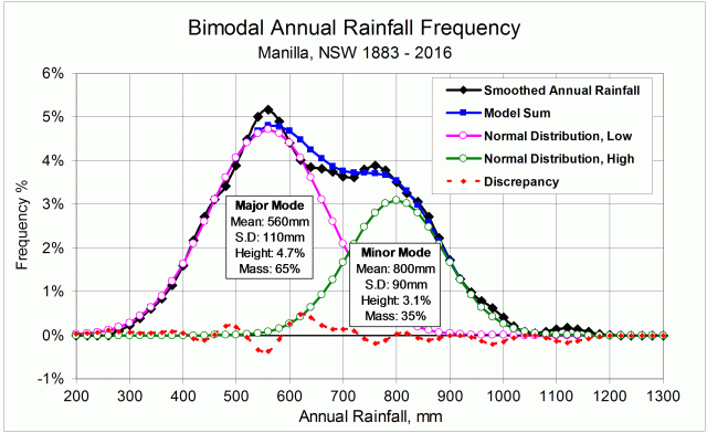
In this second graph, I have smoothed out the ragged shape of the plotted data, using a 9-point Gaussian smoothing. You can see more clearly where the actual curve (black) and the normal curve (magenta) differ. The dotted red line shows the differences directly:
The peak is low;
The shoulders, each side of the “peak”, are high;
Both of the tails are thin.
These three features describe a platykurtic curve: one with low kurtosis. This fact makes the highest and lowest annual rainfalls at Manilla less extreme than would be expected in a normal distribution.
[For an explanation of kurtosis, see the post “Kurtosis, Fat Tails and Extremes”.]
Another departure from normality is that the curve is skewed: the tail on the left is shorter than the one on the right. That is a positive skew, but it is small. (By contrast, most of the rainfall distributions for individual months at Manilla have large positive skew. In them, the peak is well below the mean, and a tail extends to rare high values.)
In summary, four of the leading features of the shape of Manilla’s annual rainfall distribution are:
Mean or average: 652 mm per year.
Standard Deviation (measuring spread or scatter): 156 mm.
Skewness: 0.268 (slightly positive).
Kurtosis: -0.427 (strongly platykurtic).
A platykurtic curve matches the Manilla annual rainfall frequency curve to some extent.
The sum of two Gaussian curves gives a much better match.
Fitting a platykurtic near-normal curve
Much of the poor fit of a normal curve to the data is due to the data having a platykurtic distribution. Being platykurtic produces a reduced peak, high shoulders, and thin tails, as was noted.

In the third graph, I have drawn (in magenta) a new model distribution that is platykurtic. It is a transform of the normal distribution with a weighted sinusoidal correction. The new curve fits much better up both flanks of the data curve. It cannot be made to fit in the peak area between 500 mm and 820 mm.
Fitting a bimodal model made of two normal curves
The shoulders of the smoothed rainfall distribution curve (black) are not simply high; they are higher than the zone in the middle where the peak would normally be. There is a major mode (peaking at 5.1%) on the left, a minor mode (3.9%) on the right, and an antimode (3.7%) between them.