Moments of Manilla’s Yearly Rainfall History

Manilla Annual rainfall history: Four moments

Comparing all four moments of the frequency-distributions

Annual rainfall for Manilla, NSW, has varied widely from decade to decade, but it is not only the mean amounts that have varied. Three others measures have varied, all in different ways.

I based the graph on 21-year sub-populations of the 134-year record, centred on consecutive years. I analysed each sub-population as a frequency-distribution, to give values of the four moments: mean (drawn in black), variance (drawn in red), skewness (drawn in blue) and kurtosis (drawn in magenta).

[For more about the moments of frequency-distributions, see the recent post: “Kurtosis, Fat Tails, and Extremes”. See also the Note below: “Instability in the third and fourth moments.”]

Each trace of a moment measure seems to have a pattern: they are not like random “noise”. Yet each trace is quite unlike the others.

The latest values are on the right. They show that the annual rainfall is now remarkable in all four respects. First, the mean rainfall (black) closely matches the long-term mean, which has seldom happened before. By contrast, the other three moments are now near historical extremes: variance (red) is very low, skewness (blue) very negative, and kurtosis (magenta) very positive.

To my knowledge, such a result has not been observed or predicted, or even suspected, anywhere.

[SEE A REVISED VERSION OF THIS WORK
A revised version of this post uses twelve times as much data. It is “Moments of Manilla’s 12-monthly Rainfall” posted on 15 May 2018.]

Manilla Annual rainfall history: Mean

The mean yearly rainfall (the first moment)

As I have shown before, the mean annual rainfall was low in the first half of the 20th century, and high in the 1890’s, 1960’s and 1970’s. Rainfall crashed in 1900 and again in 1980.

Manilla Annual rainfall history: Variance

Yearly rainfall variance (the second moment)

Continue reading

Annual Rainfall Extremes at Manilla NSW: IV

IV. Some distributions had heavy tails

Graph of history of heavy tails in Manilla annual rainfall

This graph is based on applying a 21-year sampling window to each year in the Manilla rainfall record, then adding smoothing. (See “Note about Sampling” below.)

“Heavy tails”

In the previous postI plotted only the most extreme high and low values of annual rainfall in each sampling window. Now, I choose two rainfall amounts (very high and very low) to define where the “Tails” of the frequency distribution begin. These Tails are the parts that I will call “extreme”. I count the number of values that qualify as extreme by being within the tails.
In this post, I recognise heavy tails, when before I recognised long tails.


Back to the prelude “Manilla’s Yearly Rainfall History”.
Back to Extremes Part I.
Back to Extremes Part II.
Back to Extremes Part III.

Forward to Extremes Part V.


Making the graph

The long-term Normal Distribution

The graph relies on the long-term Normal Distribution curve (“L-T Norm. Dist.” in the legend of the graph). That is, the curve that I fitted earlier to the 134-year record of annual rainfall values at Manilla NSW.
Histogram annual rainfall frequency Manilla NSWThe graph is copied here.

I defined as “Extreme Values” those either below the 5th percentile or above the 95th percentile of the fitted Normal Distribution. That is to say, those that were more than 1.645 times the Standard Deviation (SD = 156 mm) below or above the Mean (M = 652 mm). When expressed in millimetres of annual rainfall, that is less than 395 mm or more than 909 mm.
These ‘Tails’ of the Normal Distribution each totalled 5% of the modeled population, making 10% when added together.

The data

For each year’s 21-year sample, I counted those rainfall values that were lower than 395 mm (for the Low Tail) and those higher than 909 mm (for the High Tail). I added the two to give a count for Both Tails. To get a percentage value, I divided by 21.
I then found the ratio of this value to that of the fitted long-term Normal Distribution by dividing by 5% for each tail, and by 10% for both tails together. Ratios above 1.0 are Heavy Tails, and ratios below 1.0 are Light Tails.
That ratio, when smoothed, is plotted on the main graph at the head of the page.

Results

The resulting pattern of heavier and lighter tails, shown above, is similar to that found by using more and less extreme values, shown in the graph copied here.

Graph of history of extremes of annual rainfallAs before, there were less extremes in the 1900’s, 1910’s, 1920’s and 1930’s.
As before, there were more extremes in the 1940’s and 1950’s.
In the 1890’s, the “Tails” graph did not confirm the more extreme values that had been found earlier.

The 1990’s discrepancy

Extremes had been near normal through the last five decades in the earlier graph. By contrast, the “Tails” graph shows extremes in the most recent decade, the 1990’s, that were just as high as those in the 1950’s. Those two episodes differ, however: in the 1950’s only the high tail was heavy; in the 1990’s, only the low tail was heavy.
(For the 1990’s heavy low tail, see the Note below.)

The inadequacy of the data

Continue reading

Annual Rainfall Extremes at Manilla NSW: III

III. When extreme values were more or less extreme

Graph of history of extremes of annual rainfall

This graph is based on applying a 21-year sampling window to each year in the Manilla rainfall record, then adding smoothing. (See “Note about Sampling” below.)


Back to the prelude “Manilla’s Yearly Rainfall History”.
Back to Extremes Part I.
Back to Extremes Part II.
Forward to Extremes Part IV.

Forward to Extremes Part V.

[In later work, I use kurtosis as a measure of extremes. For example, in “Rainfall Kurtosis vs. HadCRUT4 revised”.]


Making the graph

For each year, I have identified the highest and lowest values of annual rainfall in its 21-year sample. I already know the long-term mean annual rainfall at Manilla: 652 mm. From those values I have plotted the height of the maximum value above the mean (red) and the depth of the lowest value below the mean (green). Both may be called “Extreme Values”.
The difference between the maximum value and the minimum value in each 21-year sample is the Total Range. That also is a measure of Extreme Value, which I graphed in an earlier post.
The Total Range is equal to the sum of the two Extreme Values that are plotted. To make it easy to compare the three measures, I have divided the Total Range by two. I have  plotted that value in blue.

Two discordant results

All three measures agree well except at two dates: 1897 and 1980. On both occasions the Minimum Value (green) was not extreme at all, being only about 200 mm below the long-term mean. The Maximum Value in 1980 was rather extreme (about 330 mm above the mean). The Maximum Value in 1897 was the most extreme value that appears on this graph: 475 mm above the mean!
The pattern of this graph is dominated by this single feature. It is due to just one data item: the annual rainfall reading of 1129 mm in the year 1890, which was the highest ever.

The pattern

For extreme annual rainfalls at Manilla, this graph suggests the following:

They were more extreme than usual at the end of the 19th century and in the 1940’s.
They were less extreme than usual from the 1900’s through to the 1930’s.
They have been no more or less extreme than one should expect through all of the last five decades.

Comment

This graph depends on very simple statistics: the maximum, the minimum and the mean. Such a sparse data set is subject to the effect of chance. Also, although this is not obvious, this graph assumes that other features of the distribution of annual rainfall have not been changing, which is not true. See the post “Moments of Manilla’s 12-monthly Rainfall”.

I have more to say on this topic.

[In later work, I use kurtosis as a measure of extremes. For example, in “Rainfall Kurtosis vs. HadCRUT4 revised”.]


Note about Sampling

I chose a 21-year sampling window to be wide enough to contain enough points for analysis, without losing time-resolution, or losing too many years at each end of the record from 1883 to 2016.
The first mid-year of a sampling window was 1893 and the last, 2006.
To remove jumps in the trace on the graph, I then applied a nine-point Gaussian smoothing function. That further reduced the years that could be plotted to those from 1897 to 2002.

Annual Rainfall Extremes at Manilla NSW: II

II. Platykurtic, Bimodal Annual Rainfall

Histogram annual rainfall frequency Manilla NSW

Manilla’s 134 years of rainfall readings yield the graph above. There are several features to notice.


Back to the prelude “Manilla’s Yearly Rainfall History”.
Back to Extremes Part I.
Forward to Extremes Part III.
Forward to Extremes Part IV.

Forward to Extremes Part V.


A ragged pattern

Despite having as many as 134 annual rainfall values, the graph is still ragged. Some of the 20 mm “bins” near the middle have less than 2% of the observations, while others have over 5%. The pattern has not yet become smooth.

It is not near a normal distribution

Rainfall is thought of as a random process, likely to match a curve of normal distribution. On the first two graphs I have drawn the curve of normal distribution that best fits the data.

Smoothed annual rainfall frequency Manilla NSW

In this second graph, I have smoothed out the ragged shape of the plotted data, using a 9-point Gaussian smoothing. You can see more clearly where the actual curve (black) and the normal curve (magenta) differ. The dotted red line shows the differences directly:

The peak is low;
The shoulders, each side of the “peak”, are high;
Both of the tails are thin.

These three features describe a platykurtic curve: one with low kurtosis. This fact makes the highest and lowest annual rainfalls at Manilla less extreme than would be expected in a normal distribution.

[For an explanation of kurtosis, see the post “Kurtosis, Fat Tails and Extremes”.]

Another departure from normality is that the curve is skewed: the tail on the left is shorter than the one on the right. That is a positive skew, but it is small. (By contrast, most of the rainfall distributions for individual months at Manilla have large positive skew. In them, the peak is well below the mean, and a tail extends to rare high values.)

In summary, four of the leading features of the shape of Manilla’s annual rainfall distribution are:

Mean or average: 652 mm per year.
Standard Deviation (measuring spread or scatter): 156 mm.
Skewness: 0.268 (slightly positive).
Kurtosis: -0.427 (strongly platykurtic).


A platykurtic curve matches the Manilla annual rainfall frequency curve to some extent.

The sum of two Gaussian curves gives a much better match.


Fitting a platykurtic near-normal curve

Much of the poor fit of a normal curve to the data is due to the data having a platykurtic distribution. Being platykurtic produces a reduced peak, high shoulders, and thin tails, as was noted.

Smoothed rainfall frequency and a platykurtic curve

In the third graph, I have drawn (in magenta) a new model distribution that is platykurtic. It is a transform of the normal distribution with a weighted sinusoidal correction. The new curve fits much better up both flanks of the data curve. It cannot be made to fit in the peak area between 500 mm and 820 mm.

Fitting a bimodal model made of two normal curves

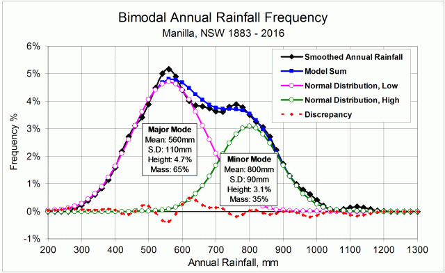
The shoulders of the smoothed rainfall distribution curve (black) are not simply high; they are higher than the  zone in the middle where the peak would normally be. There is a major mode (peaking at 5.1%) on the left, a minor mode (3.9%) on the right, and an antimode (3.7%) between them.

Smoothed rainfall frequency and a bimodal curve

Continue reading

Annual Rainfall Extremes at Manilla NSW: I

I. Better graphs of Manilla’s annual rainfall and its scatter

Manilla 21-year rainfall medians

Background

The first two graphs  are new versions of graphs in an earlier post, published also as an article in “The Manilla Express” (28/2/17) and in the “North West Magazine” (20/3/17).

In that article, I said:
“This Manilla rainfall record is one counter-example to the snow-balling catalogue of reported extreme climatic events.”
My claim was not well supported. While the two graphs showed that recent annual rainfalls have been normal, with little scatter, they do not show whether there were any extreme events.

However, Manilla’s annual rainfall record can be analysed to show extreme events. This post considers the Total Range within a 21-year sampling window as a measure of extremes. Using that measure, extremes were at their highest in the 19th century, before anthropogenic global warming began.

A following post discusses kurtosis as another measure, with a different result.


Back to the prelude “Manilla’s Yearly Rainfall History”.
Forward to Extremes Part II.
Forward to Extremes Part III.
Forward to Extremes Part IV.

Forward to Extremes Part V.


The two improved graphs

The re-drawn graphs of historical records in this post use a 21-year sampling window, as before. They now have an improved smoothing procedure: a 9-point Gaussian curve. (The weights are stated below.)

1. Yearly Rainfall Totals

The first graph (above) represents the normal rainfall as it changes. The earlier version showed the arithmetic mean. The new version uses the median value (the middle, or 50th percentile value) instead.
The new version is less “jumpy” due to better smoothing. The median varies much more than the mean does. All the same, most features of the shape are unchanged: very low annual rainfall from 1915 to 1950; very high rainfall from 1955 to 1982; normal rainfall since 1983. There are some shape changes: rainfall before 1900 does not plot so high; from 1911 to 1913 there is a respite from drought; the highest rainfall by far now appears from 1970 to 1980.

As before, one can say:
“Present rainfall will seem low to those who remember the 1970’s, but the 1970’s were wet times and now is normal. Few alive now will remember that Manilla’s rainfall really was much lower in the 1930’s.”

In addition, this new version makes the pattern of growth and sudden collapse obvious. Collapses amounting to 100 mm came within a few years after both 1900 and 1978. Growth in the 58 years from 1920 to 1978 came at the phenomenal and unsustainable rate of 33 mm per decade. By the 1970’s, elderly residents of Manilla would have seen rainfall increase decade by decade throughout their lives.
(I noted this pattern of growth and collapse in an earlier post about Manilla’s summer rainfall.)

Manilla 21-year rainfall Inter-quartile Range

2. Yearly Near-Mean Rainfall Scatters

The plot on this second graph is changed only by better smoothing. However, the titles are changed. I realised that the Inter-quartile Range is not a good general indicator of spread or, in this case, of reliability of rainfall (as I had assumed). Inter-quartile Range measures the scatter of values that are close the middle: just the middle 50%. My new title refers to “near-mean” scatter. Any values that could be called “extreme” fall very far beyond the Inter-quartile Range.

Two more measures of scatter

An alternative measure of scatter in data is the Standard Deviation. In normally distributed data, the Standard Deviation extends 34% each side of the median (and mean). The “Standard Deviation Range” then extends from the 16th percentile to the 84th percentile. It includes a much larger proportion (68%) of a population than the Inter-quartile Range (50%) does. However, it also says nothing about extremes, which will lie far out in the residual 32% “tails” of the data.

The broadest measure of scatter is the Total Range from the lowest to the highest value. This measure does include any extreme values that exist in the data.
In the present case, each calculation uses a sample that includes only 21 points. The lowest data point is close to the 5th percentile and the highest data point is close to the 95th percentile of a similar continuous curve.

All three measures of scatter graphed

Manilla 21-year rainfall Total Range, Standard Deviation Range and Inter-quartile Range

Continue reading