3-year trends to January 2018

Hot and dry

3-year trends to January 2018

January raw anomaly data (orange)

January 2018, like December, had hot days and hot nights, but had even lower rainfall.

 Fully smoothed data (red)

The latest fully-smoothed data point is for July 2017.
Most variables were normal and static at that time. Dew point was low and falling, while daily temperature range was rather high and rising.


Note:

Fully smoothed data – Gaussian smoothing with half-width 6 months – are plotted in red, partly smoothed data uncoloured, and raw data for the last data point in orange. January data points are marked by squares.
Blue diamonds and the dashed blue rectangle show the extreme values in the fully smoothed data record since September 1999.

Normal values are based on averages for the decade from March 1999.* They appear on these graphs as a turquoise (turquoise) circle at the origin (0,0). A range of anomalies called “normal” is shown by a dashed rectangle in aqua (aqua). For values in degrees, the assigned normal range is +/-0.7°; for cloudiness, +/-7%; for monthly rainfall, +/-14 mm.

 * Normal values for rainfall are based on averages for the 125 years beginning 1883.

Australian climate Quasi-Biennial Oscillations.

Australian temperature and rainfall from 1950

[See the Note below: “2010 data re-posted.”]

The above graphs plot the time series of monthly data for the whole of Australia, smoothed with a Gaussian window of half-width 6 months.
The two independent series of (a) mean maximum monthly temperature anomaly in degrees celsius and (b) total monthly rainfall anomaly in mm are plotted on the same graphs, but the scale for temperature is inverted for easy comparison.
One degree on the left axis corresponds to 10 mm on the right axis, but the zero lines may differ.

There is an obvious sine-wave cycle with a wavelength of between one and three years. (This is the “quasi-biennial cycle” that A.B. Pittock identified in 1971.)
Most peaks and troughs on these independent time series almost coincide, and their relative heights and depths tend to agree. In fact. the correlation between values of temperature and rainfall is poor, but the shapes of the sinusoidal curves match extremely well.
Peaks and troughs on the rainfall curve tend to lead those on the (inverted) temperature curve by one, two, or three months. In these graphs, I have lagged rainfall values one month, to show that many of the peaks and troughs are aligned.

Taking the whole of Australia in the last 60 years, it is fairly clear that:
* points of lowest maximum temperature have generally lagged about one month behind points of highest rainfall;
* points of highest maximum temperature have generally lagged about one month behind points of lowest rainfall.

Given this lag effect, times of lowest rainfall cannot be caused by times of highest temperature, but it is possible that times of highest temperature may be caused by times of lowest rainfall.
I find it plausible that temperature swings would closely follow rainfall swings (but in the opposite sense) due to lack of cooling by evapotranspiration in times of drought and effective cooling by evapotranspiration in times of deluge.

[Note: 2010 data re-posted.
This material appeared originally in a “Weatherzone” forum “Observations of climate variation”, Post #810237 of 27 December 2009.
Since the graphs as posted are lost, due to the action of the “Photobucket” image-hosting web-site, I am re-posting the graphs from my records.]


Data source.
The data was sourced at the following web-page.
http://reg.bom.gov.au/silo/products/cli_chg/
That web-page no longer exists.


[Note posted to “weatherzone”.

I never did find Barrie Pittock’s 1971 article in which he referred (I believe) to a quasi-biennial oscillation in Australian surface climate.
However, here is a detailed discussion of that particular topic:

“Historical El Nino/Southern Oscillation variability in the Australasian region” by Neville Nicholls, Chapter 7 (p151-173) in “El Nino: Historical and Paleoclimatic Aspects of the Southern Oscillation”, Henry F.Diaz and Vera Markgraf (eds.), Cambridge U P, 1992, 476pp.

On p.158, Nicholls has a section headed “Biennial cycle” that refers to papers written in the 1970’s, 1980’s, and 1990’s. He says:

“The biennial cycle is observed over the equatorial Pacific and Indian Oceans and is tightly phase-locked with the annual cycle. It varies in amplitude from cycle to cycle and sometimes changes phase. It is not strictly a 2-year cycle so it may be characterised better as a quasi-biennial cycle…..Rainfall over much of Australia displays a quasi-biennial cycle (e.g.Kidson 1925).”]

December 2017 as in 2016

Blooms of San Pedro Cactus at Manilla NSW

San Pedro Cactus 2017

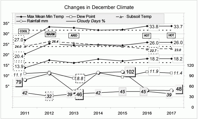
The weather in this December was very like the weather a year ago. Even details were similar. Each had just one 40° day. Each had one night near 25°, about 9° above normal. This December had one hot spell 6.3° above normal: last December had two hot spells 4.8° and 3.6° above normal. Neither had cool spells.
This December’s highest rainfall reading, 15.5 mm (unofficial), was like last December’s 17.8 mm (also unofficial). This month had fewer rain days (5 vs. 12) and longer dry spells.

Weather log for December 2017

Comparing December months

This was one of the hottest Decembers in the new century. The mean daily maximum, at 33.7°, equals that of December 2005, but is beaten by 33.8° last December. The mean daily minimum, at 18.2°, equals that of last December, but is not as warm as the 18.6° of December 2009. By contrast, December 2011 was the coldest, with a mean maximum of only 27.0°, and a mean minimum of only 13.9°.
This month’s subsoil temperature (23.0°) was very cool; one of four December values more than a degree below normal.
Like last December, this month was not very moist, but not very sunny either.
The rainfall of 48.2 mm was practically the same as in December 2016 and 2013. It is at the 35th percentile: not high, but high enough to prevent shortages.

Climate in December months

The Year 2017 was warm and dry

In this record (2000 to 2017), Manilla’s average annual temperature this year (18.65°) shows it to be the third warmest, after 2014 (19.01°) and 2009 (18.85°). The coolest was 2008 (17.19°), which was also cool globally. (Apart from 2008, Manilla annual temperatures do not follow global temperatures closely: the hottest year globally (2016) was not a very warm year here.)
Like the previous two years, 2017 had night temperatures half a degree below the normal value. Day temperatures, which had been near normal in 2015 and 2016, became a degree warmer. This year’s subsoil temperature (19.80°) was cool, very much cooler than in 2013 (22.19°).

It was a year of very low rainfall: 517 mm, which is at the 20th percentile, and 135 mm below the average (652 mm). Three even lower rainfall totals have occurred in the last sixteen years: 366 mm in 2002 (2nd percentile), 495 mm in 2009 (16th percentile), and 447 mm in 2014 (8th percentile).
Manilla yearly rainfall history: four momentsThis unusually high ratio of very dry years agrees with other patterns seen in Manilla’s annual rainfall. That is, in the moments of the frequency distributions. Recently, Manilla’s annual rainfall has had (i) very high kurtosis, showing increased extremes (“fat tails”), and (ii) negative skewness, showing that these extremes are low extremes, not high extremes.


Data. A Bureau of Meteorology automatic rain gauge operates in the museum yard. From 17 March 2017, 9 am daily readings are published as Manilla Museum, Station 55312.  These reports use that rainfall data when it is available, but it is not.  The gauge last reported on 24 September 2017.

All data, including subsoil at 750 mm, are from 3 Monash Street, Manilla.

3-year trends to December 2017

Hot days and nights

3-year trends to December 2017

December raw anomaly data (orange)

December 2017 had hot days and hot nights, but the subsoil remained cold. Rainfall was low, while other measures of moisture were near normal.

 Fully smoothed data (red)

The latest fully-smoothed data point is for June 2017. By that time, all variables were within the normal range except for dew point. Even dew point was in the centre of the range of low values that has become “normal” since 2010. Three variables were static: daily maximum temperature, subsoil temperature, and rainfall. Cloudiness, dew point, and daily temperature range. were moving towards aridity. Daily minimum temperature was falling.


Note:

Fully smoothed data – Gaussian smoothing with half-width 6 months – are plotted in red, partly smoothed data uncoloured, and raw data for the last data point in orange. January data points are marked by squares.
Blue diamonds and the dashed blue rectangle show the extreme values in the fully smoothed data record since September 1999.

Normal values are based on averages for the decade from March 1999.* They appear on these graphs as a turquoise (turquoise) circle at the origin (0,0). A range of anomalies called “normal” is shown by a dashed rectangle in aqua (aqua). For values in degrees, the assigned normal range is +/-0.7°; for cloudiness, +/-7%; for monthly rainfall, +/-14 mm.

 * Normal values for rainfall are based on averages for the 125 years beginning 1883.

Rainfall kurtosis vs. HadCRUT4 Scatterplots

These scatterplots and Connected Scatterplots support a relationship between the kurtosis of annual rainfall at Manilla NSW and the de-trended smoothed HadCRUT4 series of global temperatures.

Scatterplot rainfall kurtosis vs. HadCRUT all data

[SUPERSEDED
This post had inadequated data. It is now superseded by a section in the post “Rainfall kurtosis vs. HadCRUT4, revised” of 20 May 2018.]

The raw data, as observed

The first scatterplot compares (y-axis) all the calculated unsmoothed values of kurtosis of annual rainfall at Manilla, NSW with (x-axis) the unsmoothed values of the HadCRUT4 series of global near-surface temperature at those dates.
[I have plotted rainfall values lagged by five years on all of the scatterplots shown. This lagging makes little difference to the first two scatterplots.]

On this first graph, the fitted linear trend barely supports a positive relation of kurtosis to temperature. The slope is low (1.05) and the R-squared only 0.16. There is an aberrant cloud of points in the top left corner.

Scatterplot rainfall kurtosis vs. HadCRUT detrended (all data)

The raw data, HadCRUT4 de-trended

This graph takes a first step towards a better model for the relationship: the secular trend of the temperature series (that is, the global warming) is removed. For comparison, I have not re-scaled the x-axis.
Although still very weak, the relation is much enhanced. The slope (2.35) is twice as steep and the R-squared (0.24) increased by 50%.

Connected Scatterplot rainfall kurtosis vs. HadCRUT all data

Smoothed data, HadCRUT4 de-trended

This third graph uses smoothed data. The HadCRUT4 series is  “decadally-smoothed” (as published) with a 21-point binomial filter to remove high frequency noise. The rainfall data, already damped by its 21-year sampling window, has been further smoothed with a 9-point Gaussian filter.
This graph is a Connected Scatterplot, that shows the trajectory of the rainfall-temperature relation with the passing of time.

Line chart rainfall kurtosis vs. HadCRUT (detrended)Smoothing both data sets has given a much closer relation. The R-squared value is almost doubled again, to 0.43, and the slope is increased to 3.70. The date labels show that the relation before 1910 was different from that at later dates. (This had also been clear in the Dual axis line chart, copied here, from the post “Rainfall Kurtosis Matches HadCRUT4”.)

Connected Scatterplot rainfall kurtosis vs. HadCRUT from 1908

Smoothed data, HadCRUT4 de-trended, from 1908 to 2002

In this final graph, I have discarded the first eleven years. The linear regression based on smoothed values from 1908 to 2002 has a steep slope of 5.21 and a respectable R-squared value of 0.84.

I had prepared similar graphs for lag values of rainfall kurtosis from zero up to nine. The lag value of five years tends to maximise the slope and the R-squared values.
Choice of a five-year lag tends to form hair-pin loops in the trace, while shorter lags give wider clockwise loops and longer lags give wider anti-clockwise loops.
The lag value of five years implies that the Manilla annual rainfall kurtosis value for a given year matches the de-trended HadCRUT value that occurs five years later.

[Back to the main post on this topic: “Rainfall kurtosis matches HadCRUT4”.]