3-year trends to August 2016

Parametric plots of smoothed climate variables at Manilla
“August 2016 cool and wet”

Trends to August 2016

August raw anomaly data (orange)

August 2016 was marked by low mean daily maximum temperature and high total rainfall. On the first graph the data point is in the cold wet “flooding rains” corner. However, the other five variables are close to normal.

 Fully smoothed data (red)

Fully-smoothed data is now available for the summer of 2015-16. Most variables became static in that season, but cloudiness increased, dew point fell, and subsoil temperature rose.
Most variables were close to normal: rainfall, cloudiness, daily temperature range and subsoil temperature. Daily maximum and minimum temperatures were rather high, while dew point was low. [Low dew point anomalies near the line (y = -x – 3) rather than (y = -x) may be due to an instrument error, since corrected.]


Note:

Fully smoothed data – Gaussian smoothing with half-width 6 months – are plotted in red, partly smoothed data uncoloured, and raw data for the last data point in orange. January data points are marked by squares.
Blue diamonds and the dashed blue rectangle show the extreme values in the fully smoothed data record since September 1999.

Normal values are based on averages for the decade from March 1999.* They appear on these graphs as a turquoise (turquoise) circle at the origin (0,0). A range of anomalies called “normal” is shown by a dashed rectangle in aqua (aqua). For values in degrees, the assigned normal range is +/-0.7°; for cloudiness, +/-7%; for monthly rainfall, +/-14 mm.

 * Normal values for rainfall are based on averages for the 125 years beginning 1883.

Predict weather from ENSO?

(Someone asked me to set down my thoughts about this.)

“Droughts and flooding rains” *

The climates of places in Australia cycle from hot, arid and dry, to cold, humid and wet every couple of years. (Dorothea Mackellar said she loved a sunburnt country “of droughts and flooding rains”*) This is a kind of quasi-biennial oscillation (QBO).  For more about the QBO, see this post, and the links in it. The cycles get weaker and stronger, more droughty or more rainy, and sometimes take about one year, sometimes three or more.

The climate of the Pacific Ocean has similar cycles, called the Southern Oscillation, discovered by Gilbert Walker a century ago. The pressure difference between Darwin and Tahiti oscillates in a way that reflects other widespread changes in climate. This is now called the El Niño – Southern Oscillation (ENSO) and it is monitored by sea-surface temperature east of Nauru in the Pacific Ocean, called NINO3.4. Now that we have up-to-date data on NINO3.4, the public has been led to believe that the data can be used to forecast Australian weather. It really can’t.

Problem No.1: Weather varies from place to place.

Every district in Australia has different weather, so one size does not fit all. Wasyl Drosdowsky made a map defining the regions that have consistent relationships to ENSO and other indices, but nobody has taken up the idea. (I would if I was boss of the Bureau of Meteorology!) Drosdowsky’s regions are rather similar to the States, but Victoria and the southern half of South Australia form a single region.

Problem No.2: Forecast is too late.

The ENSO cycle does not predict a cycle in any part of Australia because it happens at about the same time, and it takes a month or more to collate the data. Weather prediction from ENSO is always late. Consequently, there is a business to predict ENSO some months ahead. These predictions are very unreliable. Then the predictions of ENSO values are used to predict Australian weather, with vague statements of which regions will be affected.

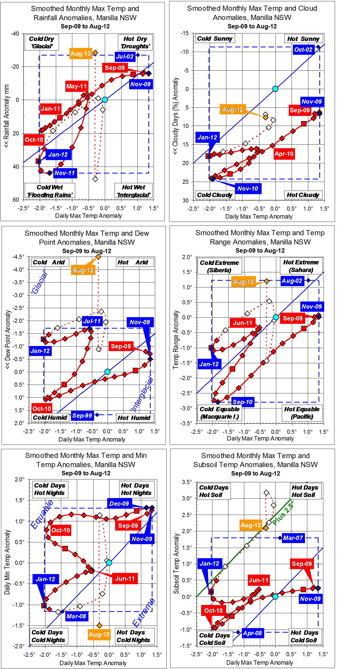
To make matters worse, my Manilla data from 1999 shows that my weather happens in advance of the ENSO changes. I compared the ENSO log from 1999 to 2011 with smoothed daily maximum temperature anomaly, (1 month ahead)  smoothed monthly rainfall anomaly, (2 months ahead) and smoothed early morning dew point anomaly(3 months ahead). If droughts and deluges happen before peaks and troughs of ENSO at other places in Australia, this makes prediction from ENSO even less likely to work.

[Note added 14/07/2015. Updated graphs comparing the ENSO log from 1999 to 2014 with smoothed daily maximum temperature anomaly and smoothed monthly rainfall anomaly at Manilla are in this post. Manilla’s climate has not related very well to ENSO since mid-2011.]

[Note added 10/10/2019. Updated data confirm that ENSO lagged Manilla rainfall by 2 months from 1999 to August 2011, then failed to relate to Manilla rainfall after September 2011.
See: “21-C Rain-ENSO-IPO: Line graphs” and “21-C Rain ENSO IPO: Scatterplot”.
According to Power et al.(1999)Australian rainfall usually fails to relate to ENSO when the IPO goes positive, as it did from 2014 to 2017 (and 2018?).]


* By arrangement with the Licensor, The Dorothea Mackellar Estate, c/- Curtis Brown (Aust) Pty Ltd.


Data are cheap; information is expensive!


Originally posted on 12/5/2013 to a thread “ENSO Discussion 2013” on a “weatherzone forum.

3-year trends to March 2014

Parametric plots of smoothed climate variables at Manilla

“Plunge toward ‘flooding rains’ *Trends to March 2014.

Raw values of climate anomalies for March 2014 are nearly all in the bottom left corner “flooding rains” after months in the opposite corner “droughts”. Daily minimum temperature remains high: nights are warm.
Fully-smoothed values for September 2013 show that the drought was becoming as severe as in 2002. The dew point anomaly reached a new record low value of -3.94°.


* By arrangement with the Licensor, The Dorothea Mackellar Estate, c/- Curtis Brown (Aust) Pty Ltd.


Note: Fully smoothed data – Gaussian smoothing with half-width 6 months – are plotted in red, partly smoothed data uncoloured, and raw data for the last data point in orange. January data points are marked by squares. Blue diamonds and the dashed blue rectangle show the extreme values in the fully smoothed data record since September 1999.

3-year trends to September 2012

Parametric plots of smoothed climate variables at Manilla

“Still Very Dry Air”Trends to September 2012.

In September, daily maximum temperatures finally rose above normal. As in August, Dew Points (humidity) remained extremely low, daily minimum temperature very low, rainfall low, and daily temperature range very high. Cloudiness finally fell below normal, and subsoil temperature fell towards normal.

Fully-smoothed data (in red) now include March 2012. All variables for that month show a retreat from the “flooding rains” climate peak. Because the daily minimum temperature anomaly did not reach a minimum in March as I expected, the sequence of peaks for individual variables must be amended as follows:
Nov-11: Rainfall (max); Subsoil temp (min);
Dec-11: Temp range (min); Dew Pt (max);
Jan-12: Temp max (min);
Feb-12: Temp min (min).
The February 2012 value of smoothed minimum daily temperature anomaly (-1.11 degrees) was not quite as low as the record set in March 2008 (-1.17 degrees).

Note: Fully smoothed data – Gaussian smoothing with half-width 6 months – are plotted in red, partly smoothed data uncoloured, and raw data for the last data point in orange. January data points are marked by squares. Blue diamonds and the dashed blue rectangle show the extreme values in the fully smoothed data record since September 1999.

3-year trends to August 2012

Parametric plots of smoothed climate variables at Manilla

“Dry Air: Warm Soil”Trends to August 2012.

Daily maximum temperatures remained just below normal in August, as in May, June, and July. Cloudiness was also stable, at about 8% above normal.
From July to August:
* Rainfall went from very high to very low;
* Dew Point went from low to extremely low;
* Temperature Range went from low to high;
* Daily min temps went from very high to very low;
* The subsoil remained extraordinarily warm.
The subsoil temperature anomaly has moved with the anomaly of maximum air temperature for eight months, but is tracking 2.5 degrees higher. This relation is shown by a green line on the bottom left graph.

Fully-smoothed data (in red) now include the whole summer season ending February 2012. At Manilla, this covered a “flooding rains” climate peak that was very much wetter, and somewhat cooler than that a year earlier. The variables reached peaks in sequence as follows:
Nov-11: Rainfall (max); Subsoil temp (min);
Dec-11: Temp range (min); Dew Pt (max);
Jan-12: Temp max (min);
Mar-12: Temp min (min).
Peaks for some variables are not in the usual sequence.

Note: Fully smoothed data – Gaussian smoothing with half-width 6 months – are plotted in red, partly smoothed data uncoloured, and raw data for the last data point in orange. January data points are marked by squares. Blue diamonds and the dashed blue rectangle show the extreme values in the fully smoothed data record since September 1999.