3-year trends to September 2017

More arid

3-year climate trends to September 2017

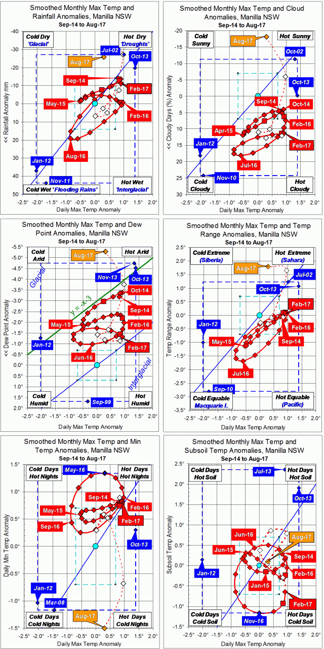
September raw anomaly data (orange)

In September 2017 all moisture indicators except cloudiness showed even greater aridity (high up on the graphs) than in August. Daily maximum temperature anomaly (x-axis in all graphs) had now risen very high, but that of the subsoil (lower right graph) had fallen. Daily minimum temperature anomaly (lower left graph) remained extremely low.

 Fully smoothed data (red)

The latest fully-smoothed data point is that for March 2017.
At that time, the climate was warm and almost static, after a minor peak in aridity. Although later anomaly values (only partially smoothed) are subject to noise, three of them have raced away towards aridity: dew point fell, daily temperature range rose, and daily minimum temperature fell.


Note:

Fully smoothed data – Gaussian smoothing with half-width 6 months – are plotted in red, partly smoothed data uncoloured, and raw data for the last data point in orange. January data points are marked by squares.
Blue diamonds and the dashed blue rectangle show the extreme values in the fully smoothed data record since September 1999.

Normal values are based on averages for the decade from March 1999.* They appear on these graphs as a turquoise (turquoise) circle at the origin (0,0). A range of anomalies called “normal” is shown by a dashed rectangle in aqua (aqua). For values in degrees, the assigned normal range is +/-0.7°; for cloudiness, +/-7%; for monthly rainfall, +/-14 mm.

 * Normal values for rainfall are based on averages for the 125 years beginning 1883.

Dry Air in Winter 2017

Photo of red Eucalyptus flowers

Eucalyptus leucoxylon in winter

This winter had remarkably dry air. The lowest early morning dew point was -10.0°, and the winter mean was -0.5°. Both were record low values. Through the season, the dew point got further and further below the early morning temperature, ending five degrees lower.

Daily maximum and minimum temperatures were near normal. However, they were more than a degree cooler than in the recent winters of 2009 and 2013.

Graphical log for winter 2017

With dry air came a wide daily temperature range of 16.3°, second only to 17.5° in the winter of 2002. It also brought sunny weather, with only 32% cloudy mornings. While that was near the average for my “normal” decade 1999-2008, it was lower than in any recent winter. The winters of the last decade, 2007-2016, were much more cloudy, averaging 45% cloudy mornings. Winter 2016 had 53%!

There were four brief spells of rain this winter, none with heavy rain. They were spaced about seventeen days apart. That sequence had begun in autumn, with heavier falls then. After the 4th of August there was no rain at all.

The total rainfall of 89.8 mm was at the 27th percentile, well below the winter average of 125 mm. Five recent winters had similar amounts of rain: 2000 (98 mm), 2001 (107 mm), 2003 (102 mm), 2004 (97 mm) and 2006 (104 mm). Two were much drier: 2002 (44 mm) and 2011 (55 mm).

Climate for winter 2017


Data. A Bureau of Meteorology automatic rain gauge operates in the museum yard. From 17 March 2017, 9 am daily readings are published as Manilla Museum, Station 55312.  These reports use that rainfall data when it is available. All other data, including subsoil at 750 mm, are from 3 Monash Street, Manilla.

August 2017 arid and sunny

Photo of a honey-eater feeding

Noisy Miner in Emu Bush

Very few days in August were cloudy, and only one day, the 4th, had some rain: 13.6 mm. Extremely dry air produced a 21st-century record low dew point of minus 10.0 degrees on the 20th. The dry air and clear skies dried out the soil, and also made for wide ranges of temperature. Twelve days were more than 20° warmer than their nights. The actual temperatures, however, were not extreme. Weekly average temperatures remained normal until falling to 3.3° lower in the final days.
Frosts (below +2.2° in the screen) happened on 17 mornings, just two more than normal.

Weather log

Comparing August months

Arid August months like this occurred in 2012 and 2013, but not since then. The mean early morning dew points in 2012 (-2.2°) and this time (-2.8°) were record values, far below the normal value of +2.2°. This month was also very sunny, had little rain, and had a daily temperature range of 17.9°, a record for August.
Temperatures were close to normal. The daily maximum (19.8°) was a degree above normal, and the daily minimum (1.9°) was a degree below normal.
The total rainfall of 13.8 mm (20th percentile) was far below the August average (40 mm). Added to the low total for July (13.2 mm), the two-month total is only 27.0 mm, which is at the 6th percentile. That makes it the first serious rainfall shortage of any duration since October 2015, when the 30-month total had been at the 6th percentile. For two-month rainfall totals, there has not been such a shortage since nearly four years ago (September 2013).

Climate graph for August


Data. A Bureau of Meteorology automatic rain gauge operates in the museum yard. From 17 March 2017, 9 am daily readings are published as Manilla Museum, Station 55312.  These reports use that rainfall data when it is available. All other data, including subsoil at 750 mm, are from 3 Monash Street, Manilla.

3-year trends to August 2017

Arid and sunny

3-year climate trends to August 2017

August raw anomaly data (orange)

In August 2017 all moisture indicators except rainfall showed even greater aridity (high up on the graphs) than in July. Daily minimum temperature anomaly (lower left graph) fell extremely low, but both the daily maximum temperature anomaly (x-axis in all graphs) and that of subsoil (lower right graph) were just slightly above normal.

 Fully smoothed data (red)

Fully-smoothed data points now include summer 2016-17. The daily maximum temperature anomaly peaked in February 2017 at +0.9°, much the same temperature as in the previous two peaks: February 2016 and October 2014. The daily minimum temperature anomaly was just about to peak, but the subsoil temperature anomaly was rising persistently.

Moisture anomaly variables, which had moved strongly towards arid in the spring, peaked in aridity during the summer:

Lowest rainfall, in January, was just 13 mm below normal;
least cloudiness, in February, was still 11% above normal;
lowest dew point, in November, was 1.7° below normal;
widest daily temperature range, in January, was only 0.1° wider than normal.

Although aridity reached peaks, this was not an arid summer. The peak values cited were not far from normal, and the graphs show that more arid times occurred within the previous two years.


Note:

Fully smoothed data – Gaussian smoothing with half-width 6 months – are plotted in red, partly smoothed data uncoloured, and raw data for the last data point in orange. January data points are marked by squares.
Blue diamonds and the dashed blue rectangle show the extreme values in the fully smoothed data record since September 1999.

Normal values are based on averages for the decade from March 1999.* They appear on these graphs as a turquoise (turquoise) circle at the origin (0,0). A range of anomalies called “normal” is shown by a dashed rectangle in aqua (aqua). For values in degrees, the assigned normal range is +/-0.7°; for cloudiness, +/-7%; for monthly rainfall, +/-14 mm.

 * Normal values for rainfall are based on averages for the 125 years beginning 1883.

Annual Rainfall Extremes at Manilla NSW: IV

IV. Some distributions had heavy tails

Graph of history of heavy tails in Manilla annual rainfall

This graph is based on applying a 21-year sampling window to each year in the Manilla rainfall record, then adding smoothing. (See “Note about Sampling” below.)

“Heavy tails”

In the previous postI plotted only the most extreme high and low values of annual rainfall in each sampling window. Now, I choose two rainfall amounts (very high and very low) to define where the “Tails” of the frequency distribution begin. These Tails are the parts that I will call “extreme”. I count the number of values that qualify as extreme by being within the tails.
In this post, I recognise heavy tails, when before I recognised long tails.


Back to the prelude “Manilla’s Yearly Rainfall History”.
Back to Extremes Part I.
Back to Extremes Part II.
Back to Extremes Part III.

Forward to Extremes Part V.


Making the graph

The long-term Normal Distribution

The graph relies on the long-term Normal Distribution curve (“L-T Norm. Dist.” in the legend of the graph). That is, the curve that I fitted earlier to the 134-year record of annual rainfall values at Manilla NSW.
Histogram annual rainfall frequency Manilla NSWThe graph is copied here.

I defined as “Extreme Values” those either below the 5th percentile or above the 95th percentile of the fitted Normal Distribution. That is to say, those that were more than 1.645 times the Standard Deviation (SD = 156 mm) below or above the Mean (M = 652 mm). When expressed in millimetres of annual rainfall, that is less than 395 mm or more than 909 mm.
These ‘Tails’ of the Normal Distribution each totalled 5% of the modeled population, making 10% when added together.

The data

For each year’s 21-year sample, I counted those rainfall values that were lower than 395 mm (for the Low Tail) and those higher than 909 mm (for the High Tail). I added the two to give a count for Both Tails. To get a percentage value, I divided by 21.
I then found the ratio of this value to that of the fitted long-term Normal Distribution by dividing by 5% for each tail, and by 10% for both tails together. Ratios above 1.0 are Heavy Tails, and ratios below 1.0 are Light Tails.
That ratio, when smoothed, is plotted on the main graph at the head of the page.

Results

The resulting pattern of heavier and lighter tails, shown above, is similar to that found by using more and less extreme values, shown in the graph copied here.

Graph of history of extremes of annual rainfallAs before, there were less extremes in the 1900’s, 1910’s, 1920’s and 1930’s.
As before, there were more extremes in the 1940’s and 1950’s.
In the 1890’s, the “Tails” graph did not confirm the more extreme values that had been found earlier.

The 1990’s discrepancy

Extremes had been near normal through the last five decades in the earlier graph. By contrast, the “Tails” graph shows extremes in the most recent decade, the 1990’s, that were just as high as those in the 1950’s. Those two episodes differ, however: in the 1950’s only the high tail was heavy; in the 1990’s, only the low tail was heavy.
(For the 1990’s heavy low tail, see the Note below.)

The inadequacy of the data

Continue reading