Annual Rainfall Extremes at Manilla NSW: V

V. Extremes marked by high kurtosis

Manilla annual rainfall kurtosis

This graph shows how the extreme values of annual rainfall at Manilla, NSW have varied, becoming rarer or more frequent with passing time.
The graph quantifies the occurrence of extreme values by the kurtosis of 21-year samples centred on successive years.

The main features of the pattern are:
* Two highly leptokurtic peaks, showing times with strong extremes in annual rainfall values. One is very early (1897) and one very late (1998).
* One broad mesokurtic peak, in 1938, showing a time with somewhat weaker extremes.
* Broad platykurtic troughs through the 1910’s, 1920’s, 1950’s, 1960’s and 1970’s, decades in which extremes were rare.
All these features were evident in the cruder attempts to recognise times of more and less occurrence of extremes in Parts I, II, III and IV of this series of posts. This graph is more precise, both in quantity and in timing.

Superseded

ALL the results shown in this post are based on sparse data. They are superseded by results based on much more detailed data in the post “Relations Among Rainfall Moments”.

However, kurtosis (the fourth moment of the distribution) does not distinguish extremes above normal from those below normal. It is known that some early dates at Manilla had extremes that were above normal, and some late dates had extremes that were below normal.

Use of skewness

Extremes above normal are distinguished from those below normal by the third moment of the distribution, that is, the skewness.
Manilla Annual rainfall history: SkewnessThe post “Moments of Manilla’s Yearly Rainfall History” shows graphs of the time sequence of each of the four moments, including the skewness (copied here) and the kurtosis ( the main graph, copied above). The skewness function, like the kurtosis function, relates to the most extreme values of the frequency distribution, but to a lesser extent (by the third power, not the fourth).

I have shown the combined effect of kurtosis and skewness on the occurrence of positive and negative extremes in this data set in the connected scatterplot below.

Manilla rain skew vs.kurt

The early and late times of strong extremes were times of strongly positive and strongly negative skewness respectively. As kurtosis fell rapidly from the initial peak (+0.9) in 1897 to slightly platykurtic (-0.4) in 1902, the skewness also fell rapidly, from +0.7 to +0.3.
Much later, in mirror image, values were almost the same in 1983 as in 1902, then kurtosis rapidly rose while skewness rapidly fell, until kurtosis reached +0.9 and skewness -0.3 by 1998.
Between 1902 and 1983, while kurtosis remained below -0.2, the pattern was complex. In the decades of strong platykurtosis (below -0.9) there were extremes of skewness: +0.7 in 1919 and -0.3 in 1968.
Note that the skewness range was as high in times of low kurtosis as in times of high kurtosis, and the same applies to kurtosis range in relation to skewness. Conversely, when either moment was near its mean, the range of the other was not high.


See also:
“Rainfall kurtosis matches HadCRUT4” and “Rainfall kurtosis vs. HadCRUT4 Scatterplots”.

Australian climate Quasi-Biennial Oscillations.

Australian temperature and rainfall from 1950

[See the Note below: “2010 data re-posted.”]

The above graphs plot the time series of monthly data for the whole of Australia, smoothed with a Gaussian window of half-width 6 months.
The two independent series of (a) mean maximum monthly temperature anomaly in degrees celsius and (b) total monthly rainfall anomaly in mm are plotted on the same graphs, but the scale for temperature is inverted for easy comparison.
One degree on the left axis corresponds to 10 mm on the right axis, but the zero lines may differ.

There is an obvious sine-wave cycle with a wavelength of between one and three years. (This is the “quasi-biennial cycle” that A.B. Pittock identified in 1971.)
Most peaks and troughs on these independent time series almost coincide, and their relative heights and depths tend to agree. In fact. the correlation between values of temperature and rainfall is poor, but the shapes of the sinusoidal curves match extremely well.
Peaks and troughs on the rainfall curve tend to lead those on the (inverted) temperature curve by one, two, or three months. In these graphs, I have lagged rainfall values one month, to show that many of the peaks and troughs are aligned.

Taking the whole of Australia in the last 60 years, it is fairly clear that:
* points of lowest maximum temperature have generally lagged about one month behind points of highest rainfall;
* points of highest maximum temperature have generally lagged about one month behind points of lowest rainfall.

Given this lag effect, times of lowest rainfall cannot be caused by times of highest temperature, but it is possible that times of highest temperature may be caused by times of lowest rainfall.
I find it plausible that temperature swings would closely follow rainfall swings (but in the opposite sense) due to lack of cooling by evapotranspiration in times of drought and effective cooling by evapotranspiration in times of deluge.

[Note: 2010 data re-posted.
This material appeared originally in a “Weatherzone” forum “Observations of climate variation”, Post #810237 of 27 December 2009.
Since the graphs as posted are lost, due to the action of the “Photobucket” image-hosting web-site, I am re-posting the graphs from my records.]


Data source.
The data was sourced at the following web-page.
http://reg.bom.gov.au/silo/products/cli_chg/
That web-page no longer exists.


[Note posted to “weatherzone”.

I never did find Barrie Pittock’s 1971 article in which he referred (I believe) to a quasi-biennial oscillation in Australian surface climate.
However, here is a detailed discussion of that particular topic:

“Historical El Nino/Southern Oscillation variability in the Australasian region” by Neville Nicholls, Chapter 7 (p151-173) in “El Nino: Historical and Paleoclimatic Aspects of the Southern Oscillation”, Henry F.Diaz and Vera Markgraf (eds.), Cambridge U P, 1992, 476pp.

On p.158, Nicholls has a section headed “Biennial cycle” that refers to papers written in the 1970’s, 1980’s, and 1990’s. He says:

“The biennial cycle is observed over the equatorial Pacific and Indian Oceans and is tightly phase-locked with the annual cycle. It varies in amplitude from cycle to cycle and sometimes changes phase. It is not strictly a 2-year cycle so it may be characterised better as a quasi-biennial cycle…..Rainfall over much of Australia displays a quasi-biennial cycle (e.g.Kidson 1925).”]

Moments of Manilla’s Yearly Rainfall History

Manilla Annual rainfall history: Four moments

Comparing all four moments of the frequency-distributions

Annual rainfall for Manilla, NSW, has varied widely from decade to decade, but it is not only the mean amounts that have varied. Three others measures have varied, all in different ways.

I based the graph on 21-year sub-populations of the 134-year record, centred on consecutive years. I analysed each sub-population as a frequency-distribution, to give values of the four moments: mean (drawn in black), variance (drawn in red), skewness (drawn in blue) and kurtosis (drawn in magenta).

[For more about the moments of frequency-distributions, see the recent post: “Kurtosis, Fat Tails, and Extremes”. See also the Note below: “Instability in the third and fourth moments.”]

Each trace of a moment measure seems to have a pattern: they are not like random “noise”. Yet each trace is quite unlike the others.

The latest values are on the right. They show that the annual rainfall is now remarkable in all four respects. First, the mean rainfall (black) closely matches the long-term mean, which has seldom happened before. By contrast, the other three moments are now near historical extremes: variance (red) is very low, skewness (blue) very negative, and kurtosis (magenta) very positive.

To my knowledge, such a result has not been observed or predicted, or even suspected, anywhere.

[SEE A REVISED VERSION OF THIS WORK
A revised version of this post uses twelve times as much data. It is “Moments of Manilla’s 12-monthly Rainfall” posted on 15 May 2018.]

Manilla Annual rainfall history: Mean

The mean yearly rainfall (the first moment)

As I have shown before, the mean annual rainfall was low in the first half of the 20th century, and high in the 1890’s, 1960’s and 1970’s. Rainfall crashed in 1900 and again in 1980.

Manilla Annual rainfall history: Variance

Yearly rainfall variance (the second moment)

Continue reading

A drought has begun

A year ago, I showed that Manilla was far from being in a drought. That is not true now. There are severe shortages of rain.

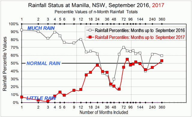
Rainfall status at Manilla, September 2016 and September 2017.

The first graph has rainfall totals up the left margin. They are not expressed in millimetres but as percentile values, Along the bottom margin is the number of months included in calculating each rainfall total.

On the graph, I have compared the rainfall situation today, September 2017, plotted in red with that of September 2016, plotted in grey. Much has changed.

Take, for example, the 12-month (one-year) rainfall total. Rainfall totals for 12 month periods are directly above the value “12” at the bottom of the graph, near the label “Number of Months included”. In data for the month of September 2016 (grey), the 12-month total (actually 802 mm) had been at the 80th percentile, which was very high. In up-to-date data for the month of September 2017 (red), the 12-month total (actually 484 mm) is at the 17th percentile, which is very low.
Although rainfall totals for  periods longer than 12 months have not fallen so much, nearly all of them have fallen. Three that have not are those for 30 months, 36 months and 42 months. They were already low, due to including in them some months of low rainfall several years ago, in 2013 and 2014.

So far, real shortages have occurred mainly within the last 12 months. Beyond that, the two-year rainfall total of 1285 mm, for example, is still near normal, plotting at the 48th percentile.

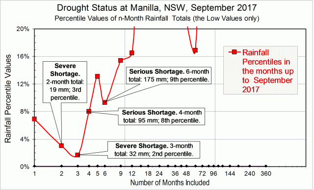
The second graph shows in detail how shortages that are serious or severe have developed during the last six months. These were the monthly rainfall amounts, with the normal amounts in brackets:

April: 24.0 mm (39.3);
May: 55.6 mm (40.3);
June: 62.8 mm (44.3);
July: 13.2 mm (41.4);
August: 13.8 mm (39.5);
September: 5.5 mm (41.2).

As a result, the current situation is as shown below. There are already severe rainfall shortages, at the 2nd or 3rd percentile, in the two-month and three-month totals to date. There are also serious shortages, at the 8th and 9th percentiles, in the four-month and six-month totals to date.

Drought status at Manilla in September 2017

I will update these graphs each month to show how the situation changes.

[Monthly updates were not posted because serious rainfall shortages did not occur in any following months up to March 2018. The next post with a graph and analysis like this one was “Rainfall Shortages up to May 2018” of 15/6/2018.]

[This 2018-19 drought became the worst ever experienced at Manilla. Records for the lowest-ever rainfall totals were broken repeatedly. See, for example (June 2019)  “June breaks more drought records”.]

Annual Rainfall Extremes at Manilla NSW: IV

IV. Some distributions had heavy tails

Graph of history of heavy tails in Manilla annual rainfall

This graph is based on applying a 21-year sampling window to each year in the Manilla rainfall record, then adding smoothing. (See “Note about Sampling” below.)

“Heavy tails”

In the previous postI plotted only the most extreme high and low values of annual rainfall in each sampling window. Now, I choose two rainfall amounts (very high and very low) to define where the “Tails” of the frequency distribution begin. These Tails are the parts that I will call “extreme”. I count the number of values that qualify as extreme by being within the tails.
In this post, I recognise heavy tails, when before I recognised long tails.


Back to the prelude “Manilla’s Yearly Rainfall History”.
Back to Extremes Part I.
Back to Extremes Part II.
Back to Extremes Part III.

Forward to Extremes Part V.


Making the graph

The long-term Normal Distribution

The graph relies on the long-term Normal Distribution curve (“L-T Norm. Dist.” in the legend of the graph). That is, the curve that I fitted earlier to the 134-year record of annual rainfall values at Manilla NSW.
Histogram annual rainfall frequency Manilla NSWThe graph is copied here.

I defined as “Extreme Values” those either below the 5th percentile or above the 95th percentile of the fitted Normal Distribution. That is to say, those that were more than 1.645 times the Standard Deviation (SD = 156 mm) below or above the Mean (M = 652 mm). When expressed in millimetres of annual rainfall, that is less than 395 mm or more than 909 mm.
These ‘Tails’ of the Normal Distribution each totalled 5% of the modeled population, making 10% when added together.

The data

For each year’s 21-year sample, I counted those rainfall values that were lower than 395 mm (for the Low Tail) and those higher than 909 mm (for the High Tail). I added the two to give a count for Both Tails. To get a percentage value, I divided by 21.
I then found the ratio of this value to that of the fitted long-term Normal Distribution by dividing by 5% for each tail, and by 10% for both tails together. Ratios above 1.0 are Heavy Tails, and ratios below 1.0 are Light Tails.
That ratio, when smoothed, is plotted on the main graph at the head of the page.

Results

The resulting pattern of heavier and lighter tails, shown above, is similar to that found by using more and less extreme values, shown in the graph copied here.

Graph of history of extremes of annual rainfallAs before, there were less extremes in the 1900’s, 1910’s, 1920’s and 1930’s.
As before, there were more extremes in the 1940’s and 1950’s.
In the 1890’s, the “Tails” graph did not confirm the more extreme values that had been found earlier.

The 1990’s discrepancy

Extremes had been near normal through the last five decades in the earlier graph. By contrast, the “Tails” graph shows extremes in the most recent decade, the 1990’s, that were just as high as those in the 1950’s. Those two episodes differ, however: in the 1950’s only the high tail was heavy; in the 1990’s, only the low tail was heavy.
(For the 1990’s heavy low tail, see the Note below.)

The inadequacy of the data

Continue reading