Droughts and flooding rains at Manilla NSW were related in a way that is remarkable and unexpected.
Part II. Scatter-plots
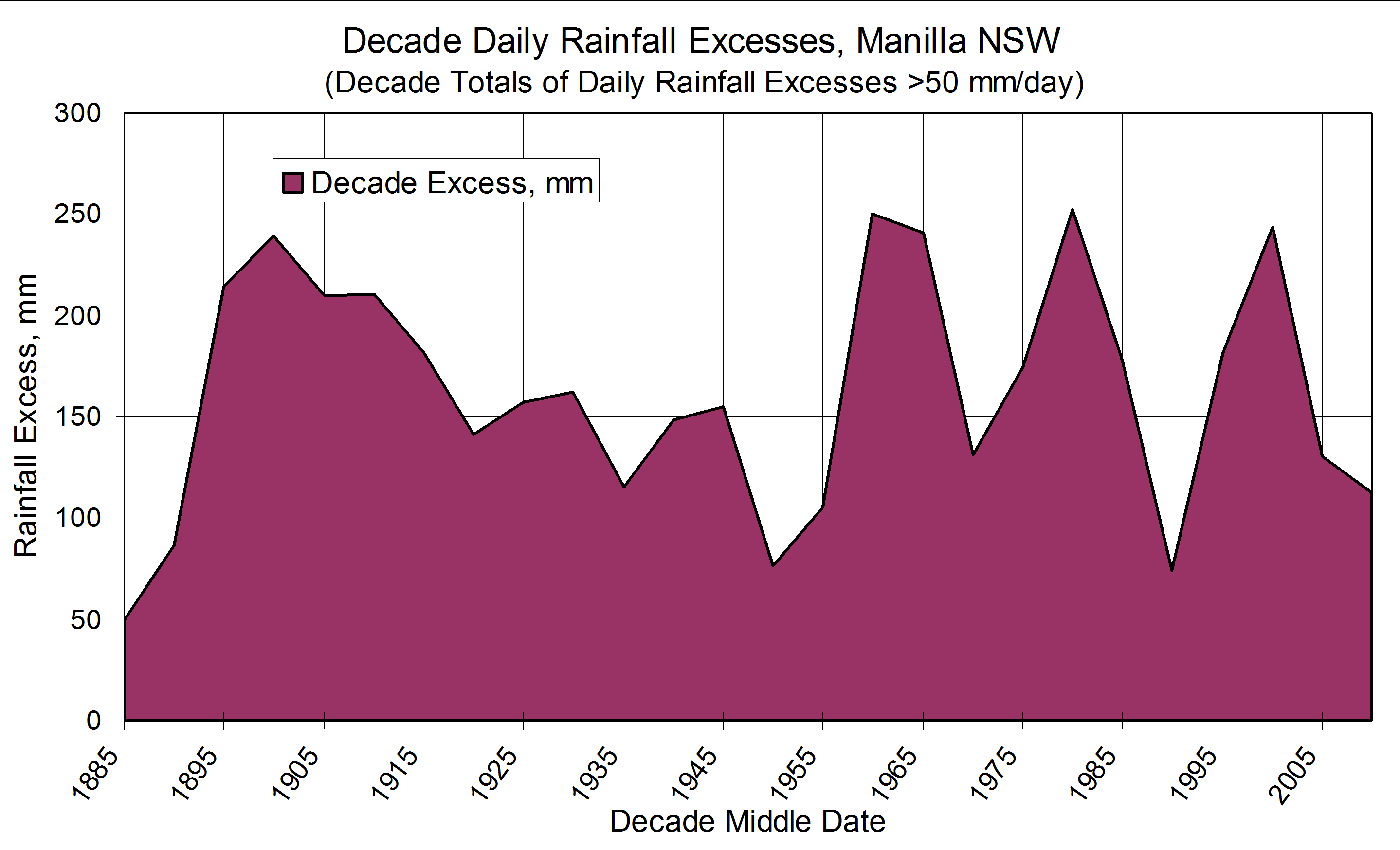
[Back to Part I: Graphical logs]
I have made scatter plots to see how much correlation there is between the two data sets: the frequency % of severe 12-month drought and the total decadal daily rainfall excesses over 50 mm, when lagged five years. (For data details, see Note 1, below.)
A. The first 70% of the data
The first scatter-plot includes only the first 70% of the data, from 1890 to 1975, which showed matching patterns on the graphical log copied below. I have broken the data points into two groups: the aberrant group 1940 to 1955 (red) and the fourteen best-matched points (blue). The trend line that best fits those fourteen points is y = 0.028x + 0.407, with R-squared = 0.898. However, I have been able to fit the trend line y = 0.030x, that shows y proportional to x, without making R-squared worse than 0.892.
Similarly, the four decades centred on 1940, 1945, 1950 and 1955, had y = 0.050x, with R-squared equal to 0.902.
Expressed in words: for fourteen of the first eighteen data points, the frequency % of severe 12-month droughts remained close to 0.03 times the decade total of daily rainfall (>50 mm/day) measured five years earlier. For the other group of four adjacent points, the number was not 0.03, but 0.05.
B. All the data

The second scatter plot shows data for all 25 (five-year overlapped) decades. There is a “shot-gun” pattern, as expected. Continue reading