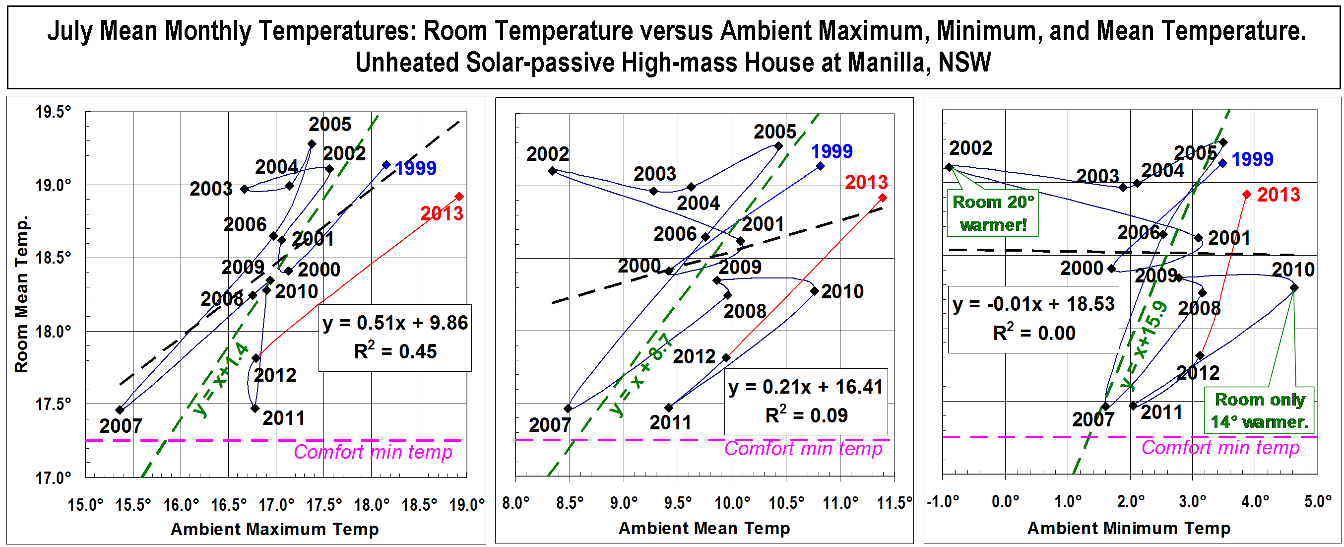
I have now 15 years of January average temperature data for my house at Manilla, North-west Slopes, NSW. These graphs show how the house temperature relates to the outdoor (or ambient) maximum, mean, and minimum temperatures.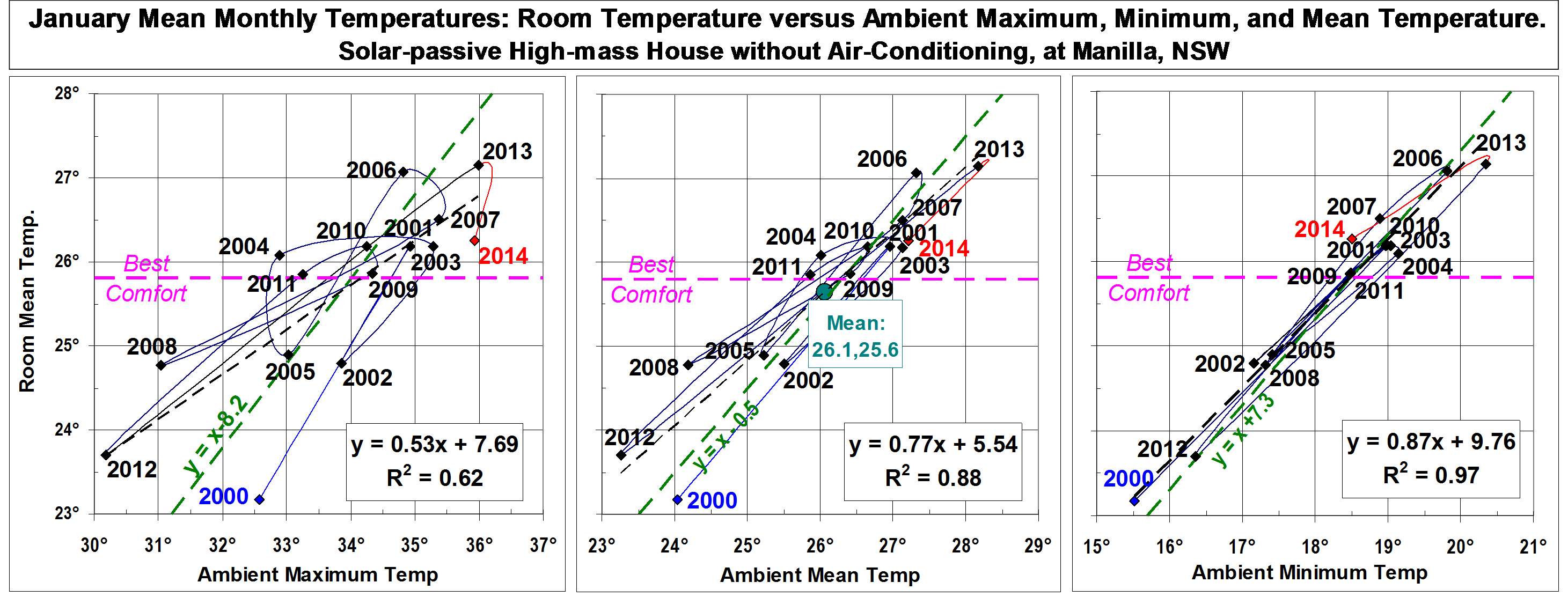
The house is not too hot and not too cold
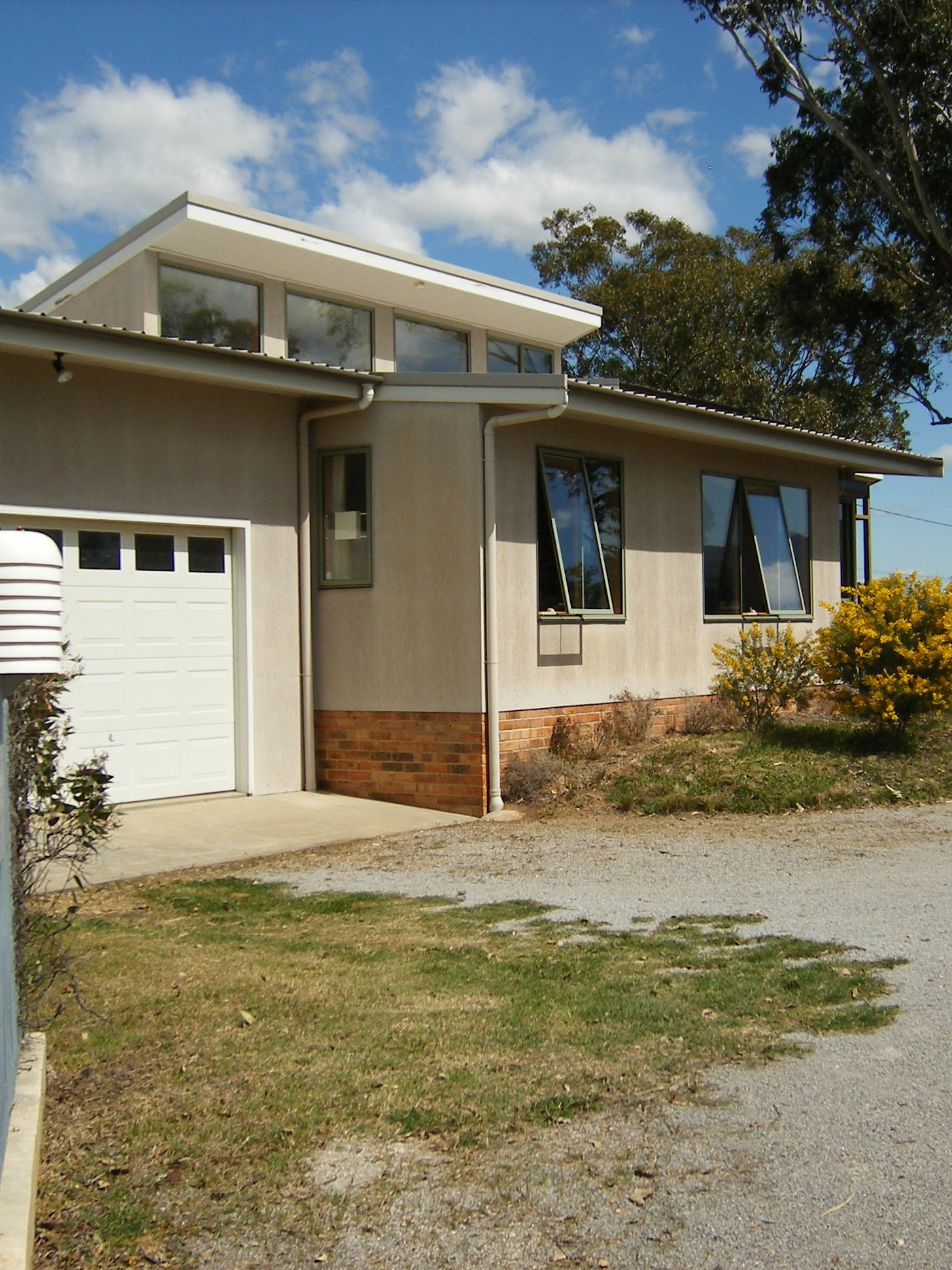
House at Monash St Manilla from NE
In January (the hottest month) the rooms* in this solar-passive house do not heat up much during the day, nor do they cool down much at night. Since the indoor temperature always rises and falls just one or two degrees from the mean, only the mean is shown. Green lines on the graphs, which are drawn to pass through the middle of each cloud of data points, show by how much (on the average) the indoor temperatures have differed from the outdoor maximum, mean, and minimum temperatures. On the middle graph the green line shows that the rooms have been 0.5° cooler than the mean temperature outdoors. The left graph shows that the rooms have been 8.2° cooler than the daily maximum outdoor temperatures. The right graph shows that the rooms have been 7.3° warmer than the daily minimum overnight temperatures.
The design of the house aimed to protect those living there from excessive summer heat. It may seem that reducing the mean temperature by only half a degree is a failure. Not so! The January mean temperature at this site (26.1°) is near the middle of the adaptive comfort zone for this month, and so is the indoor mean temperature (25.6°). The house succeeds in keeping the indoor temperature comfortable in the heat of the day, when that outdoors is an uncomfortable 34 degrees. The high thermal mass that achieves this has the unfortunate result that the minimum indoor temperature overnight (not shown) is some five degrees warmer than the outdoor minimum. However, on average, it is still a comfortable 23.5 degrees. (Curiously, no-one knows the best room temperature for sleep.) Continue reading