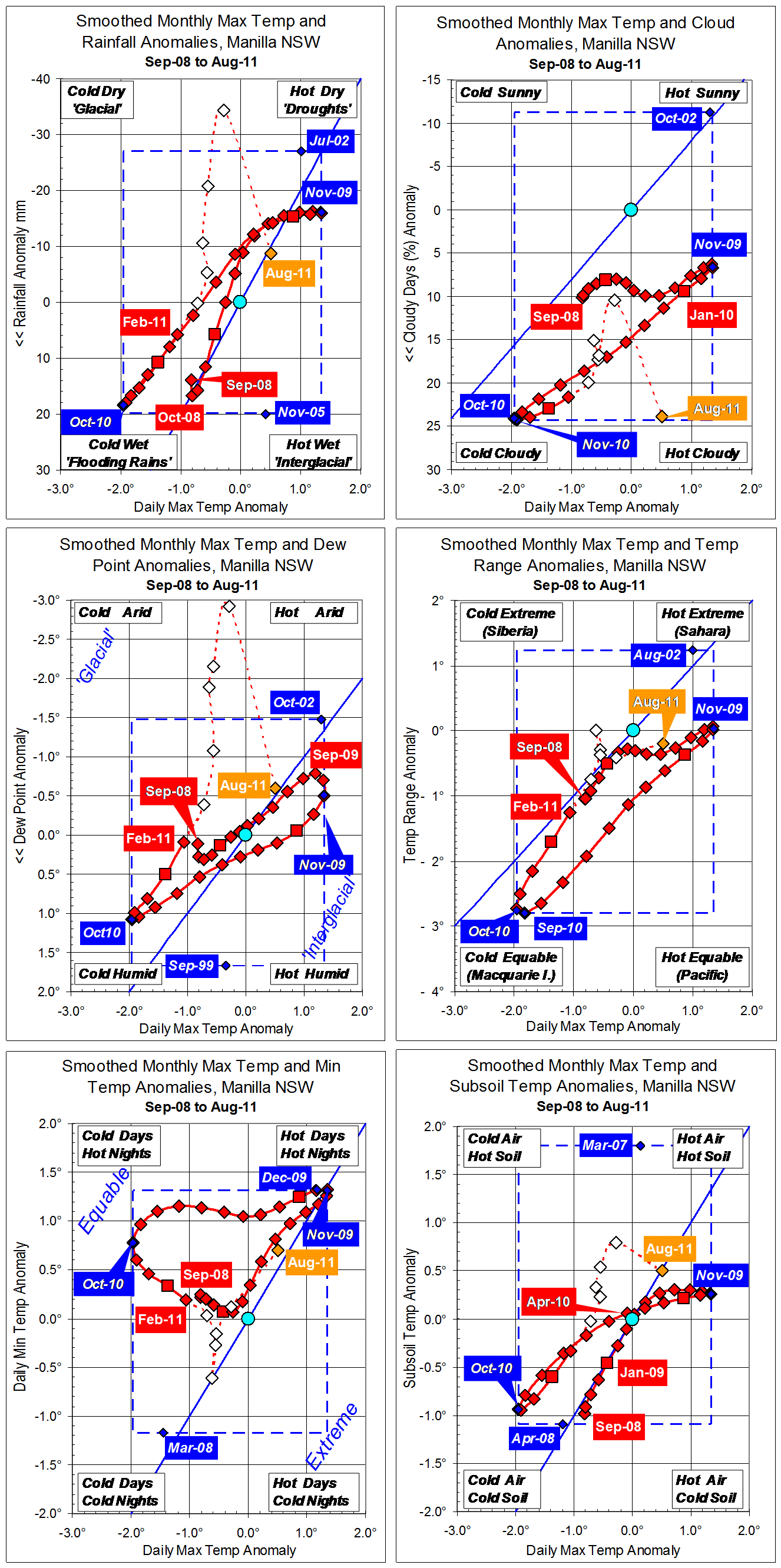
Parametric plots of smoothed climate variables at Manilla
“Paradoxical Trends.”

September values are paradoxical.They show sudden reversals of trend and unusual relationships between the attributes.
Daily maximum temperature anomaly (x-axis, all graphs), which had been accelerating upwards, fell suddenly below normal.
Monthly rainfall anomaly (y-axis, top left graph), from very low in July, became extremely high.
Cloudiness (top right graph) fell suddenly to a value that was normal three years ago, but not since.
Dew Point anomaly (centre left), having been briefly near normal in August, resumed a trend to extreme aridity.
Temperature range anomaly (centre right) hovered near normal.
Daily minimum temperature anomaly (bottom left) suddenly fell even faster than that of daily maximum temperature
Subsoil temperature anomaly (bottom right), which had been above normal, fell along with daily maximum temperature anomaly.
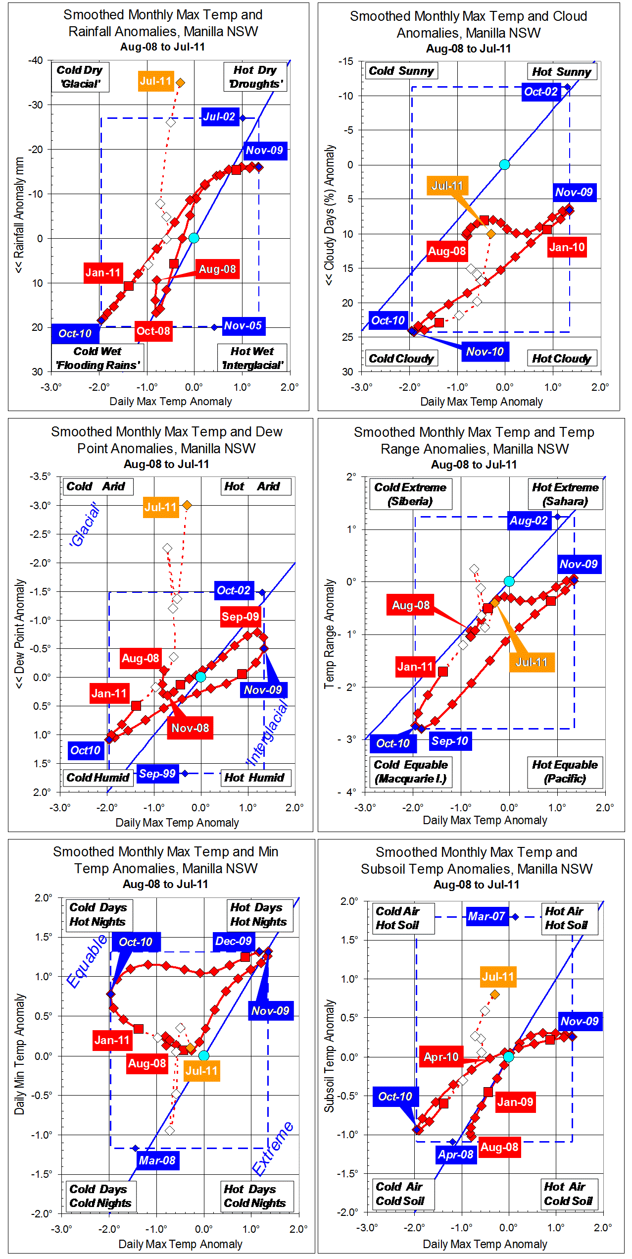
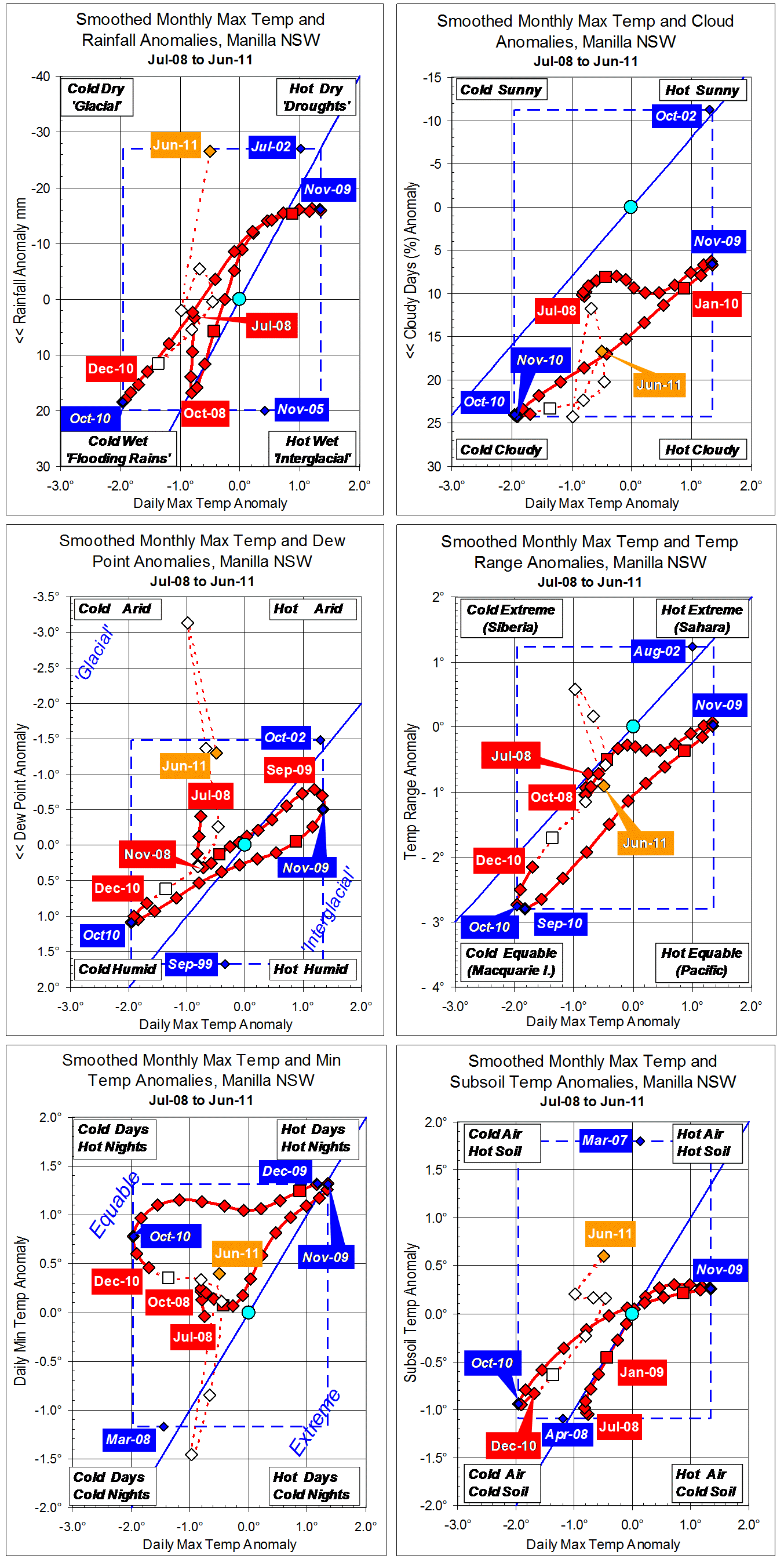
Note: Fully smoothed data – Gaussian smoothing with half-width 6 months – are plotted in red, partly smoothed data uncoloured, and raw data for the last data point in orange. January data points are marked by squares. Blue diamonds and the dashed blue rectangle show the extreme values in the fully smoothed data record since September 1999.