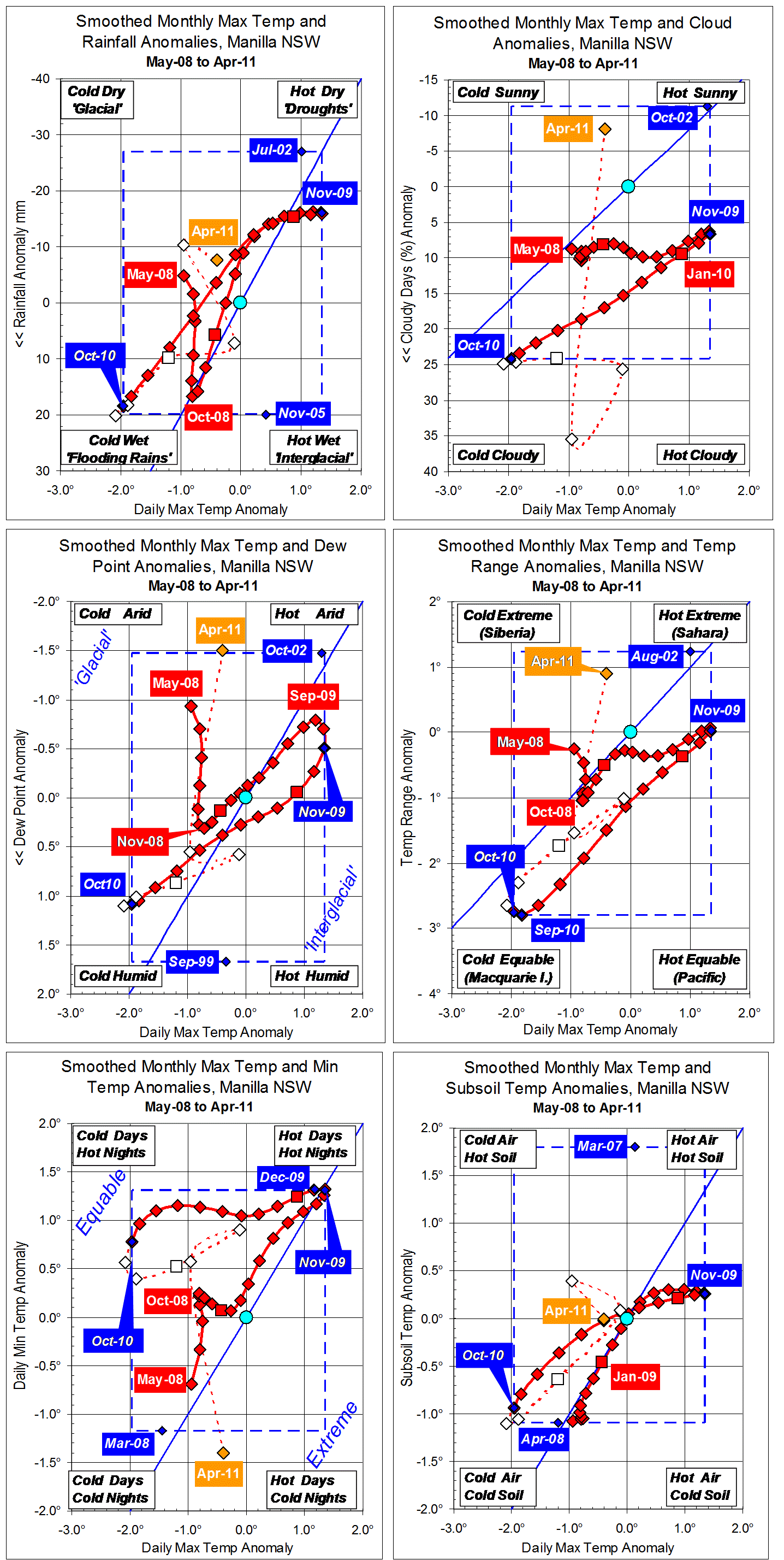
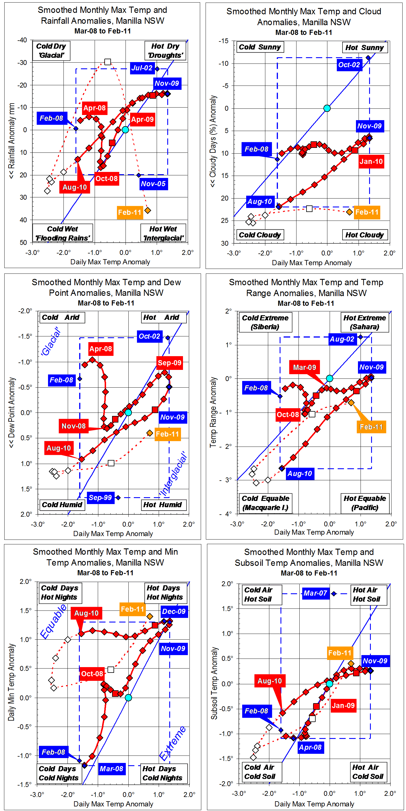
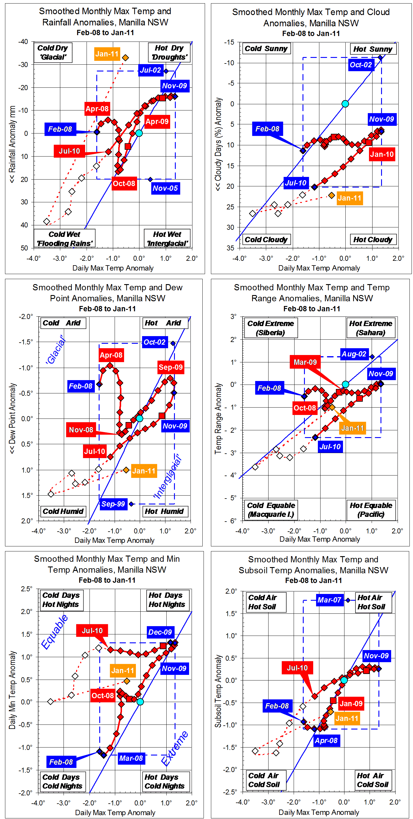
Parametric plots of smoothed climate variables at Manilla
“Sudden Rise in Temperatures”
In the current plots we see final smoothed trends for the winter (JJA) of 2010.
Daily Maximum Temperature
On each plot, the x-axis has the anomaly of mean daily maximum temperature. In winter 2010 the smoothed temperature anomaly fell very rapidly to near the earlier record low smoothed value. Partially smoothed later values suggest that an extreme negative temperature anomaly came in November 2010. The raw value for February 2011 is remarkably high.
Rainfall
Rainfall anomalies are plotted (inverted) on the y-axis of the first graph. Fully-smoothed winter values were all positive, rising with falling maximum temperature. Later values generally rose rapidly to an apparent positive extreme in November.
Cloudiness
During winter of 2010 the anomaly of percent cloudy days rose to yet a new record for fully-smoothed values. It continued to rise to an apparent extreme in October 2010, since when it has remained extremely high.
Early morning Dew Point
The Dew Point anomaly was positive and rapidly rising in winter. It seems to have peaked at less than a record value in October 2010. By February the anomaly was much less positive.
Daily Temperature Range
The temperature range anomaly fell during winter to yet a new negative record for smoothed data. It continued to fall to an apparent negative peak in October 2010. The raw value for February and the little-smoothed value for January are right back near normal.
Daily minimum temperature
Winter daily minimum anomalies remained little below the peak of December 2009. Later values traced an arc through the “Equable” zone of the graph, until February’s raw value was again near the December 2009 peak (“Hot Days; Hot Nights”).
Subsoil temperature
The winter subsoil temperature anomaly was below zero and falling quite rapidly. It then accelerated downwards to an apparent negative extreme in November 2010. By February, the raw value was back higher than any point on the 3-year trace.
Note: Fully smoothed data – Gaussian smoothing with half-width 6 months – are plotted in red, partly smoothed data uncoloured, and raw data for the last data point in orange. January data points are marked by squares. Blue diamonds and the dashed blue rectangle show the extreme values in the fully smoothed data record since September 1999.