House June warmth profiles: IV

Part IV: Solar gain in the clear-story


In a solar-passive house, do clear-story windows trap much heat?
How about overcast days?

Graph of clear-story temps, 2 days

[This post repeats some data of an earlier post, headed  “Part III: Daily temperature cycles, east wing”. Please refer to that post for more details.]

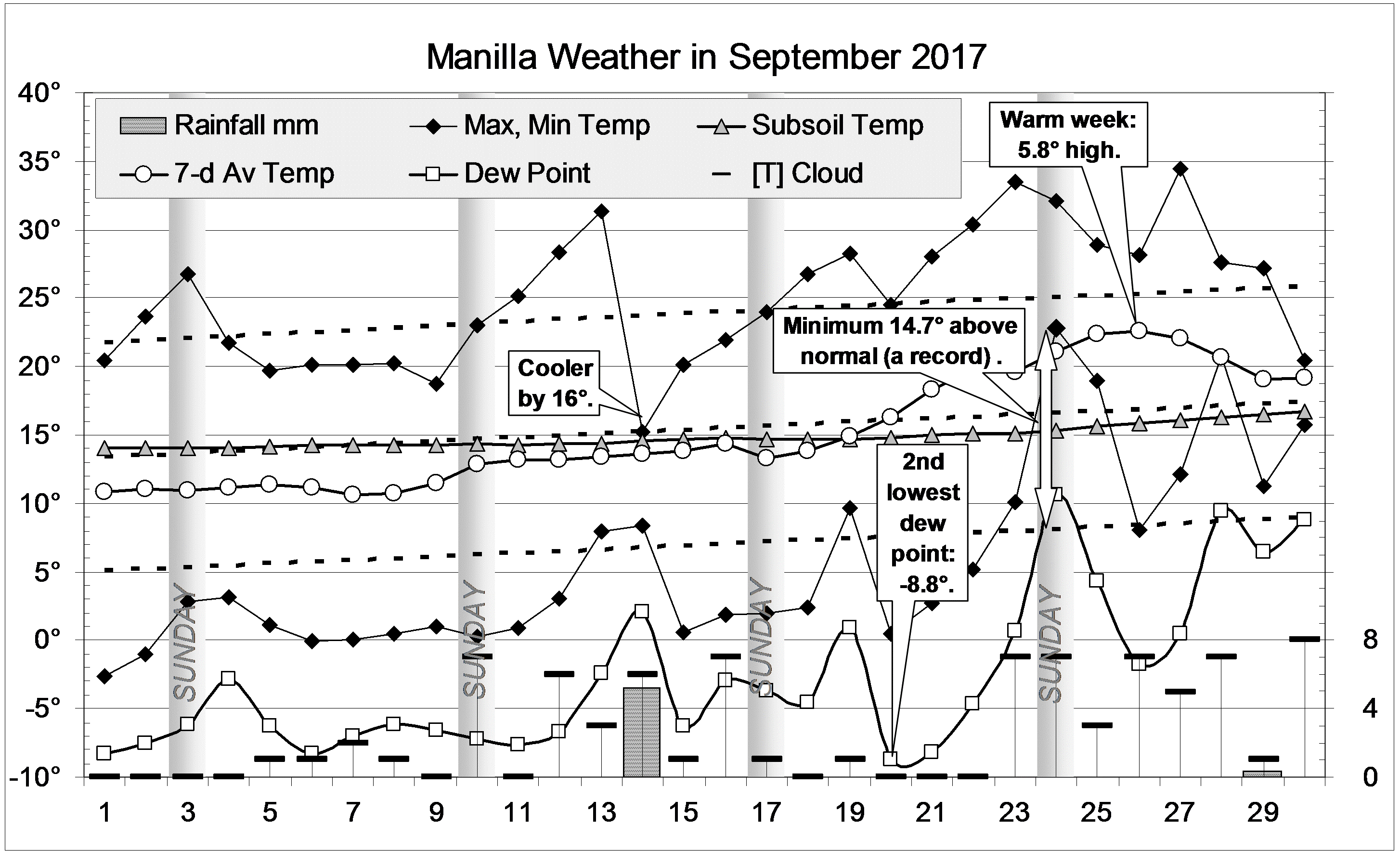
The graph above shows records of temperature for two days in mid-winter. Records of cloud cover (plotted in purple) show that the first day was overcast and the second mainly sunny.
Through the sunny second day, the temperature readings taken just inside the clear-story windows (black) rose and fell just like the outdoor temperature (red), but they were much higher. I have drawn a dotted red line at a temperature 13.5° higher than outdoors. It fits well to the clear-story temperature (black) on that day. During the previous day, which was overcast, the dotted red line does not fit. It is about 6° higher than the actual clear-story temperature.
By experiment, I found that I could make a model (plotted in green) that would match the actual clear-story temperature as the cloud cover changed. As well as adding 13.5° to the outdoor temperature, I subtracted two thirds of the cloud cover measured in octas. As plotted (green), this model matches the clear-story temperature through both days. At two data points there was a mis-match: those points have not been plotted.

 Graph of clear-story temps, 5 days

The second graph shows all five days of the experiment. My model of temperature in the clear-story space (plotted green), fits the actual readings (black) on all days.

Photo of clear-story area with winter sun and a fan

Clear-story fan set for winter

The model includes one other feature: the maximum temperature that I allow is 26°. That also matches. As mentioned in Part III, a thermostat turns on fans at 26°. That prevented the temperature from rising higher.

Comment

A solar passive house is likely to gain more winter heat if it has north-facing windows in a clear-story above room level. It may also lose more heat. If so, the cost of the clear-story design may not be justified.
This experiment shows that, in this particular house during one harsh winter, the clear-story performed very well.

People may be as surprised as I was at the closely-matching pattern of outdoor and clear-story temperatures in mid-winter, and at how very much warmer the clearstory was: more than thirteen degrees warmer in fine weather.
It may also provoke some thought that the match persisted in overcast weather, but with the clearstory being only eight degrees warmer than outdoors in that case.

Back to Part I: Average temperature values.
Back to Part II: The two-storied west wing’s daily temperature cycles
Back to Part III: the single-storied east wing’s daily temperature cycles

Kurtosis, Fat Tails, and Extremes

sketch demonstrating kurtosis

PLATYKURTIC left; LEPTOKURTIC right

Why must I explain “kurtosis”?

Manilla 21-year rainfall mediansThe annual rainfall at Manilla, NSW has changed dramatically decade by decade since the record began in 1883. One way that it has changed is in the amount of rain each year, as shown in this graph that I posted earlier.

Another way, unrelated to the amount of rain, is in its kurtosis. Higher kurtosis brings more rainfall values that are extreme; lower kurtosis brings fewer. We would do well to learn more about rainfall kurtosis.

[A comment on the meaning of kurtosis by Peter Westfall is posted below.]

Describing Frequency Distributions

The Normal Distribution

Many things vary in a way that seems random: pure chance causes values to spread above and below the average.
If the values are counted into “bins” of equal width, the pattern is called a frequency-distribution. Randomness makes this pattern form the unique bell-shaped curve of Normal Distribution.

Histogram of annual rainfall frequency at Manilla NSWThe values of annual total rainfall measured each year at Manilla have a frequency-distribution that is rather like that. This graph compares the actual distribution with a curve of Normal Distribution.

Moments of a Normal Distribution: (i) Mean, and (ii) Variance

The shape of any frequency-distribution is described in a simple way by a set of four numbers called moments. A Normal Distribution is described by just the first two of them.
The first moment is the Mean (or average), which says where the middle line of the values is. For Manilla annual rainfall, the Mean is 652 mm.
The second moment is the Variance, which is also the square of the Standard Deviation. This second moment says how widely spread or scattered the values are. For Manilla annual rainfall, the Standard Deviation is 156 mm.

Moments of other (non-normal) distributions: (iii) Skewness, and (iv) Kurtosis

The third moment, Skewness, describes how a frequency-distribution may have one tail longer than the other. When the tail on the right is longer, that is called right-skewness, and the skewness value is positive in that case. For the actual frequency-distribution of Manilla annual rainfall, the Skewness is slightly positive: +0.268. (That is mainly due to one extremely high rainfall value: 1192 mm in 1890.)
Kurtosis is the fourth moment of the distribution. It describes how the distribution differs from Normal by being higher or lower in its peak (but see the comments below) or its tails, as compared to its shoulders.
As it was defined at first, a Normal Distribution had the kurtosis value of 3, but I (and Excel) use the convention “excess kurtosis” from which 3 has been subtracted. Then the excess kurtosis value for a Normal Distribution is zero, while the kurtosis of other, non-normal distributions is either positive or negative.

Smoothed rainfall frequency and a platykurtic curveManilla’s total frequency distribution of annual rainfall has a Kurtosis of -0.427. As shown here (copied from an earlier post), I fitted a curve with suitably negative kurtosis to Manilla’s (smoothed) annual rainfall distribution.

Platykurtic, Mesokurtic, and Leptokurtic distributions

Karl Pearson invented the terms: platykurtic for (excess) kurtosis well below zero, mesokurtic for kurtosis near zero, and leptokurtic for kurtosis well above zero.
The sketch by W S Gosset at the top of this page shows the typical shapes of platykurtic and leptokurtic curves.
(See the Note below: ‘The sketch by “Student”‘.)

In the two graphs that follow, I show how a curve of Normal Distribution can be modified to be leptokurtic (+ve) or platykurtic (-ve) while remaining near-normal in shape. (See the note “Constructing the kurtosis adjuster”)
In both of these graphs, I have drawn the curve of Normal Distribution in grey, with call-outs to locate the mean point and the two “shoulder” points that are one Standard Deviation each side of the mean.

A leptokurtic curve

A leptokurtic (+ve) curve

By adding the “adjuster curve” (red) to the Normal curve, I get the classical leptokurtic shape (green) as was sketched by Gosset. It has a higher peak, lowered shoulders, and fat tails. The shape is like that of a volcanic cone: the peak is narrow, and the upper slopes steep. The slopes get gentler as they get lower, but not as gentle as on the Normal Curve.

A platykurtic curve

A platykurtic (-ve) curve

Continue reading

September 2017 even more arid

Trellised vine photo

Blooming Wonga-Wonga Vines

Despite more cloud, September was even more arid than August. Weekly temperatures remained normal until the last week, which was remarkably warm. There were some notable events. The 13th, the first 30°-day of the season, was followed by a day more than 16° cooler. Extremely low humidity early on the 20th made the dew point (-8.8°) almost as low as the record set last month. Among minimum overnight temperatures that were near zero, the one on the 24th (22.8°) set a record by being 14.7° higher than normal.
The number of frosts (below +2.2° in the screen) was 13 (a September record), almost as many as in August. Perhaps the frost on the 20th was the last of the season. That is the normal date for it.
There was 5.2 mm of rain on the 14th, and an estimated 0.3 mm on the 29th. (The automatic gauge at the Museum was down by then.)

Weather log

Comparing September months

The mean daily maximum of 25.0° was rather high, fully 5° higher than last year. With a mean daily minimum (5.7°) that was rather low, the daily temperature range reached the record wide value of 19.3°.
Extremely dry air was shown by a mean early-morning dew point of 2.7°, the lowest September value, 8.1° below normal.
The total rainfall of 5.5 mm (estimated) was very far below the September average (41 mm), at the 8th percentile. That is a serious rainfall shortage. The current rainfall totals for four months (95 mm) and for six months (175 mm) are also serious rainfall shortages. Even worse are the totals for two months (19 mm) and for three months (33 mm): they are severe rainfall shortages.
Similar severe shortages occurred in October 2013, May 2008, and May 2005. Extreme shortages last occurred in the six-month drought of 2002.

Climate graph for September


Data. A Bureau of Meteorology automatic rain gauge operates in the museum yard. From 17 March 2017, 9 am daily readings are published as Manilla Museum, Station 55312.  These reports use that rainfall data when it is available.  The gauge last reported on 24 September 2017.

All other data, including subsoil at 750 mm, are from 3 Monash Street, Manilla.