House at Monash St Manilla from NW
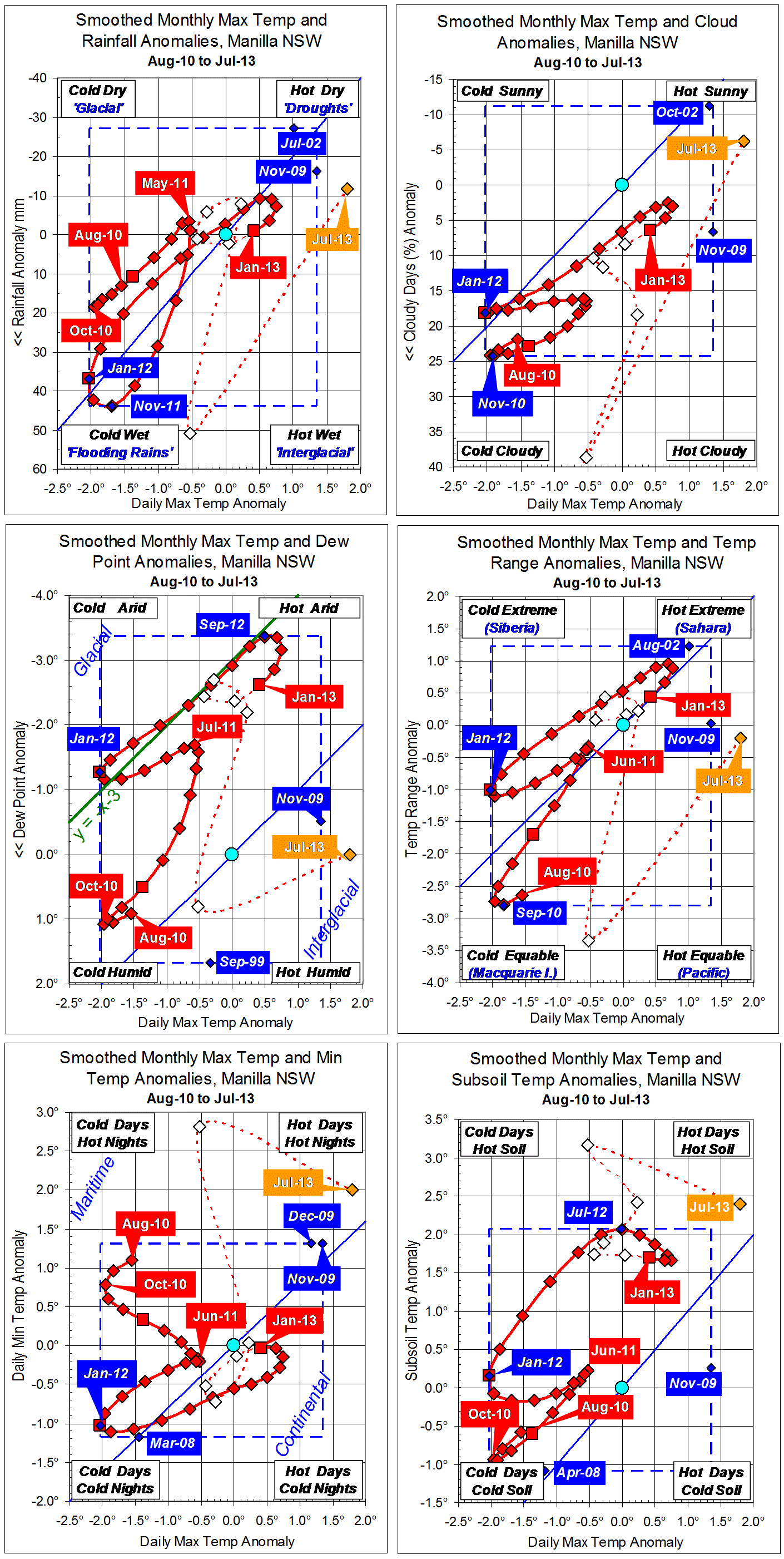
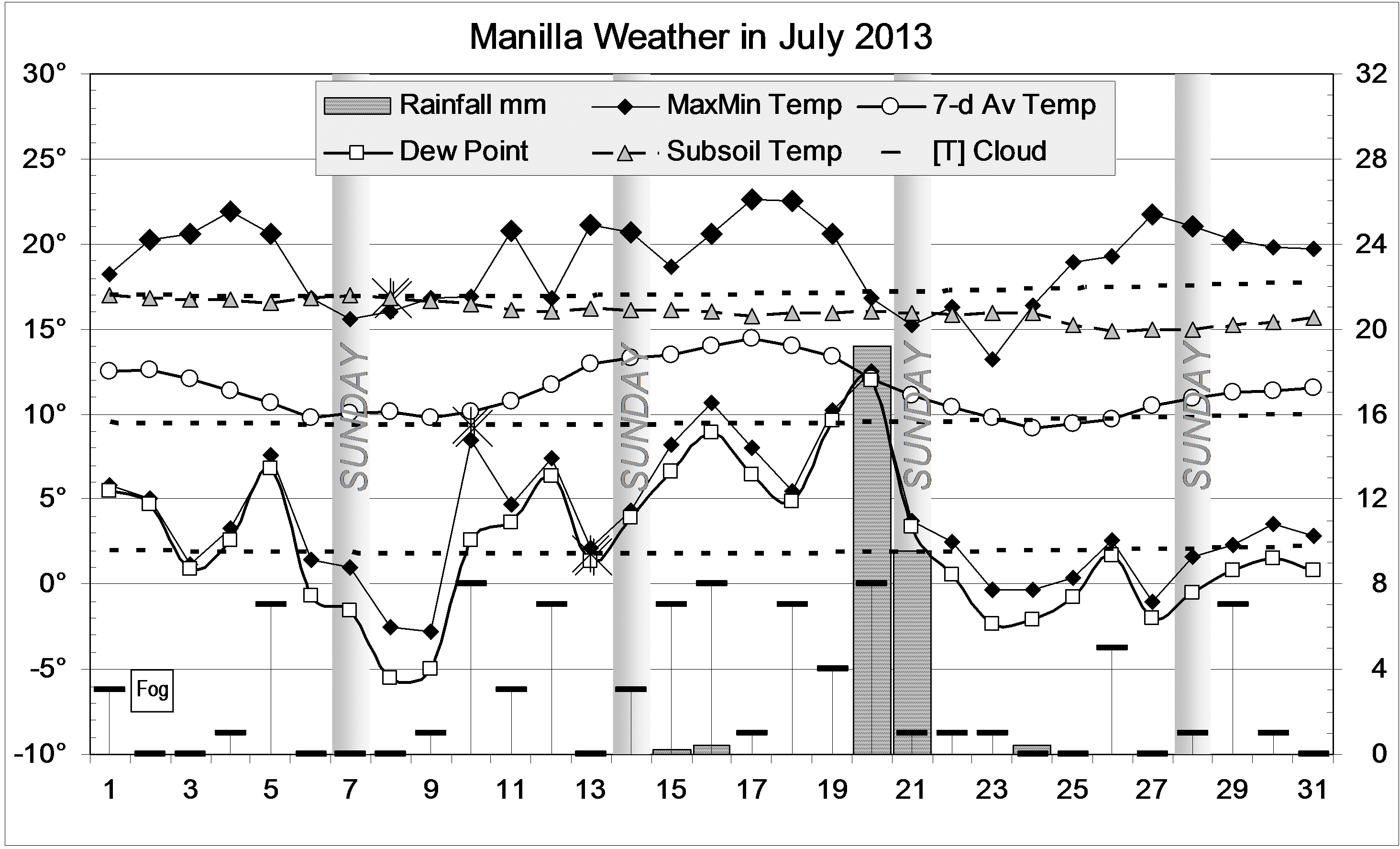
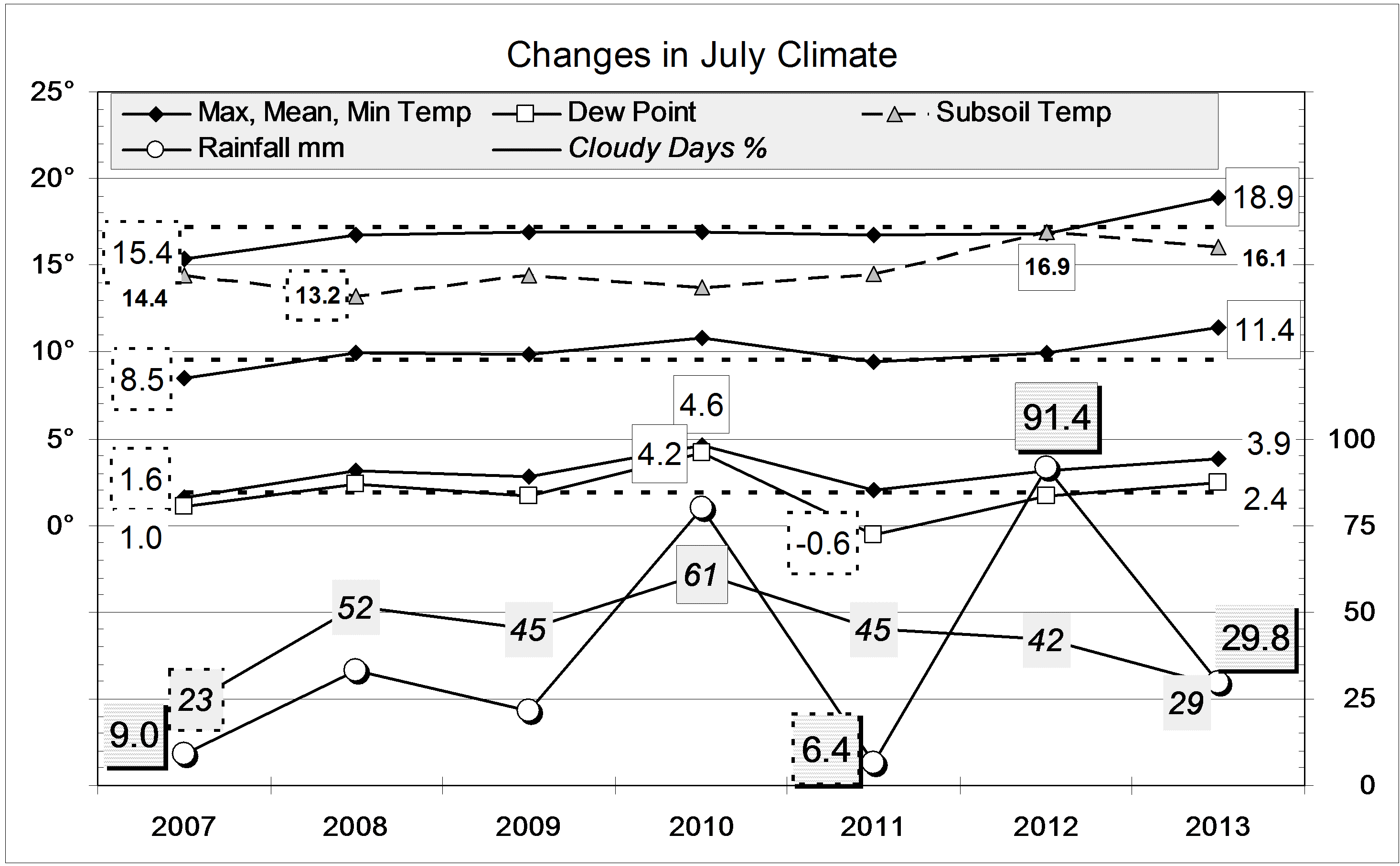
I have fifteen years of temperature data for my high-mass, solar passive, unheated house at Manilla, NSW, Australia. This article has been posted previously here. These graphs show how July temperatures indoors relate to those outdoors. Indoor maxima and minima are not shown, because they are consistently between one and two degrees above and below the indoor mean.
 The house is much warmer (dashed green lines)
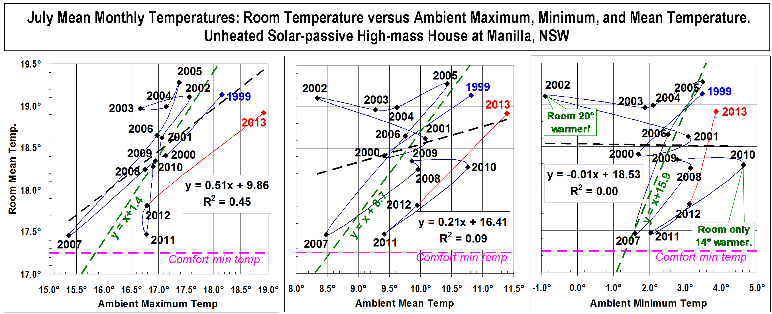
In July, the rooms* in this solar-passive house, heated only by the sun, are much warmer than outdoors. This is shown by the green lines on the graphs, which are drawn to pass through the middle of each cloud of data points. The middle graph shows that, as an average over 15 July months, the rooms have been 8.7 degrees warmer than outdoors. The left graph shows that the rooms have even been 1.4 degrees warmer than the daily maximum outdoor temperatures. The right graph shows that the rooms have been nearly sixteen degrees warmer than the daily minimum overnight temperatures. To stay warm in this way the house must have absorbed many hundreds of kilowatt hours of heat from the sun. I have burned a few kilowatt hours of grid power to maintain my comfort, but this cannot have warmed the house by as much as one tenth of a degree in any month. Continue reading