
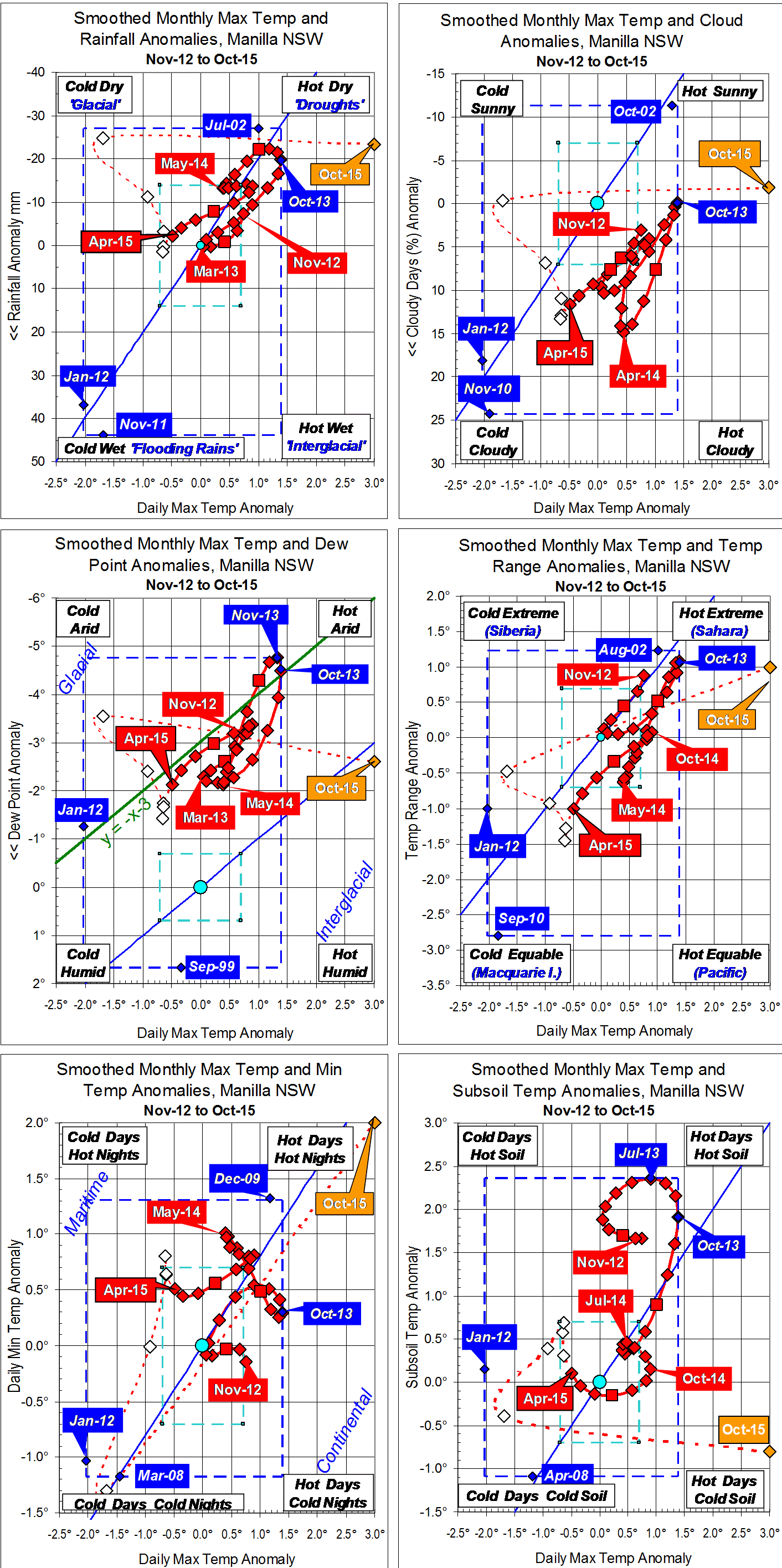
Fully smoothed data – Gaussian smoothing with half-width 6 months – are plotted in red, partly smoothed data uncoloured, and raw data for the last data point in orange. January data points are marked by squares.
Blue diamonds and the dashed blue rectangle show the extreme values in the fully smoothed data record since September 1999.

Wow, looks like you had to expand the grid so Oct 15 would not be “off the charts”!